

|
Latest Updates: New thread, no updates (06/14/2013) about : This thread is a companion thread for the new Web Design & Development thread in the Cavern of Cobol. If you have coding questions do not post them here. What can I post? Current web projects, old web projects, online portfolio reviews, mockups, prototypes, etc. What to expect? Honest, unbiased, reviews from strangers on the internet. Some people in the thread may be involved in your industry (they should indicate this) so pay attention to the replies you get. Take negative critiques with a grain of salt and improve your design! How to ask for a critique
Critique Example Intro I designed a website which will be used to host funny articles and a forum. It should be so funny that people will give me $10 to have a forum account. Design Criteria
Images  Links http://www.somethingawful.com Oh My Science fucked around with this message at 06:37 on Jun 15, 2013 |
 #
?
Jun 15, 2013 05:45
#
?
Jun 15, 2013 05:45
|
|

|

|
| # ? Apr 24, 2024 11:40 |
|
|
Reserved.
|
|
#
?
Jun 15, 2013 05:46
|
|
|
Thread died? Could use some critique.
|
|
#
?
Aug 10, 2013 11:44
|
|

|
People are really protective of their websites. Whenever I've offered to look over someones really messy website I've always received ultra-defensive responses akin to 'gently caress off it's mine', as if they are Gollum and I'm asking to borrow their ring or something. Also I guess developers hang out more in SHSC than here?
|
|
#
?
Aug 10, 2013 14:28
|
|
|
Yup, I have a project wrapping up that can be used to kick start the thread. Don't be afraid goons, you don't have to be a developer to post something here.
|
|
#
?
Aug 10, 2013 16:28
|
|
|
Me too but for the reason I posted above I am reluctant to go first as I am a massive hypocrite. Although I can a post a WIP of our work site re-design, mainly for feedback on the interface as it's very content-bare still. I want to add in a tiled thumbnail gallery to showcase our work but a lot of it is difficult to show off as a static image, so I'm working on an interactive solution which is reaaally time-consuming. I only started 'learning' web design about a week ago since every agency locally are uninspiring and time-inefficient. Creepy Goat fucked around with this message at 17:44 on Aug 10, 2013 |
|
#
?
Aug 10, 2013 17:41
|
|
|
I will throw my new portfolio site up for some opinions. I may ignore them but there you go! https://www.moneyspiderdesign.com
|
|
#
?
Aug 10, 2013 18:44
|
|
|
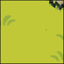
General I think that you can get rid of the homepage entirely - default to the portfolio page. When you're showing off your work, put as little inbetween your viewers and your work as possible. The grass in your header image doesn't go all the way across my screen - if you can figure a way to stretch that, it'd be better. Do similarly for the footer, if you can. Something visual to set it apart from the rest of the page would be great, like a different background color. Big, tall footers are hip right now, you might go that route. Maybe remove "powered by wordpress"? It takes away from the work you put in to customize the page, and the service you're selling, unless you change your pitch a bit to talk about how you're a wordpress customizer. You could probably spice up the font you use for titles a bit - grab a web font somewhere, or at the very least use something sans-serif and modern for the fallback. I'm viewing it from Firefox 23, and the custom font you don't have set up ("Marker Felt"). e: get rid of your search box. You don't have enough content that people will be searching effectively with it. It also only seems to search blogposts at the moment. Bio Page I'd also put some background color behind the text on your bio page. Use the same color as the background you use for portfolio items. On the bio page, change the title from "Bio" to "Reed Buck", and increase the size a bit. Portfolio I think you should either go with the lightbox when you click on items in your portfolio, or drive people to a different page - not both. I think you'll probably want to do the latter, unless you can provide unique links to lightboxed stuff, if that makes sense. You'd do well to add some detail describing your work, too - how big the customer was, how long your timeline was, and whether you just did design, or implementation, or both Contact Contact forms are... lame, in my opinion. Give them an email address, a facebook page, a twitter account, and maybe a phone number, and let them contact you on time. Just be responsible about answering in a timely manner! MrSaturn fucked around with this message at 19:30 on Aug 10, 2013 |
|
#
?
Aug 10, 2013 19:25
|
|
|
MrSaturn posted:Great critique Thanks for that and I am def going to implement a lot of what you suggest. The one thing I will say is the grass was meant to taper off, perhaps it makes it seem like a glitch, making it stretch is much easier than what I did! Yeah going to add my social media poo poo to the header and a list on the contact page. Thanks again I really do appreciate it. Edit: I made some wholesale changes... and managed to implement most of what was recommended thanks MrSaturn 
thegasman2000 fucked around with this message at 00:53 on Aug 11, 2013 |
|
#
?
Aug 10, 2013 19:38
|
|
|
Dump the blog and contact pages, and either incorporate a reduced about page into the header, or rewrite it. Former is maybe better, as you've paddeded the bio for no good reason. As you've moved the portfolio to the front page, all the links are an irrelevance. It's a single-page site. Note that because of this, WordPress is massive overkill, and you could just build a completely static one-page site. The header is too big relative to the information it contains, and it pushes the work below the fold; also, the style doesn't match that of the work. Also the web address/business name is barely referenced anywhere on-site. The colour scheme isn't right. In particular, you have grey text on a dark background, which is difficult to read. Also, the body text line height is too small (the 'f' overlap with the line below is particularly obvious). There is quite a lot wrong with the typography (eg tiny amounts of text set in a condensed font and not visually tied to other page elements), but that's one easy fix to make it look slightly better. The project images are minute, and there is no context. --- If you want this to be a business, the site needs to be approached as a business site. A potential client needs to know what the business is, what you can do for them, what you're especially good at, why the work you produce will help their business, why you are a better choice than any of the myriad other designers available, &c. Heirachy of information should be: - Moneyspider Design name (branding if that is extant). - What you as Moneyspider Design does/specialises in/etc (NOT what you like to do in your spare time, NOT where you went to school, NOT what your previous jobs were, NOT a portrait). - Contact info for Moneyspider Design (in descending order of importance: email and phonenumber, then twitter, then others. Skype is fairly important if you're getting non-UK work). - Previous work, in easily-viewable format. Edit: Set up an email address as well. Don't use gmail. RobertKerans fucked around with this message at 15:28 on Aug 12, 2013 |
|
#
?
Aug 12, 2013 15:12
|
|
|
thegasman2000 posted:I will throw my new portfolio site up for some opinions. I may ignore them but there you go! Where is your logo? First thing any client wants to see on a website is who the company is. Your logo needs to be up front, legible and ready to represent your business. I don't see it anywhere at the moment which leads me to wonder a couple of things 1) What is this company? 2) What does this company do? Speaking of what is this company and what does it do? I land on your portfolio page immediately. Which is a good thing. But there's no context. Re-write your bio, and make it short. Then slap that bad boy above your portfolio so people see it right away. Think of something you can pitch to someone on an elevator. Two sentences (three tops) that describes who you are and what your work is so your visitors know what to expect. Are you print, web? Design and develop? Videographer? All of the above? Don't assume a visitor will instantly want to click on your portfolio items and puzzle out what your work means. You need to include the image of the portfolio item along with the description when a visitor clicks on 'read more'. At the moment, I click on "read more", I go to another page with maybe a sentence of information and no image for context. Also, aside from clicking on 'Home' how is a visitor going to get back to your portfolio page? I agree with most everything RobertKerans has already said, and want to underline that you might want to ditch the blog or start writing relevant, interesting and unique content for it on a regular basis. Otherwise, if you aren't going to bother with the blog or if your content isn't attracting visitors, you are better off without it. An empty blog hurts your site more than no blog at all. And if you're going to dump the blog, then you are probably better off not fussing with Wordpress unless, like RobertKerans said, you're a Wordpress theme designer. Any way you could get better looking social media icons? The ones you have are blurry and there's some weird artifacts going on to the right of the Facebook icon. You can grab some icons here: http://www.webdesigntunes.com/freebies/funny-social-media-icons-sets/ Since you are using Wordpress, and if you don't plan to get rid of it, take advantage of its Jetpack plugin and use Jetpack's contact form. You can drop that thing anywhere on your page if you know even a little bit of PHP and if you couple the form with Akismet, you can prevent some douchebag from phishing your email address. I'd also recommend you put your contact form on your single portfolio page. Your contact page is useless right now because it's just a sentence with an arrow on it.
|
|
#
?
Aug 12, 2013 23:36
|
|
|
I've got to concur with most of what's been said before me, so rather than reiterate those thoughts I'd like to instead ask you, what is the deal with the header? Not just the weird grass layout, but rather the entire thing. Why realistic grass when everything else is illustrated/vector art? Why are these creatures talking on phones, how do they tie in to you brand, moneyspider design? Why the curve to the graphic when all your other elements are boxed or circles? To me it doesn't make sense. The entire design is based on your header as its foundation, and in my opinion that foundation seems rife with cracks. E: don't know if it makes any difference, but I'm a professional designer by trade. I currently run my own design firm, and I am a creative director for a goon owned start up. As the OP says, take these thoughts with a grain of salt. Good luck man, hope it works out for you. RGBRIOT fucked around with this message at 02:02 on Aug 13, 2013 |
|
#
?
Aug 13, 2013 01:59
|
|

|
Creepy Goat posted:Although I can a post a WIP of our work site re-design, mainly for feedback on the interface as it's very content-bare still. The small logo looks like it has some hard edges on the rounded corners. Your AA might be getting cut off around the corners, or you might not have used the rounded box took or something. Favicon could use more work; it blends right in with my browser:  I didn't understand that the left/right arrows under "What We Do" and "Who We Are" were carousels for more features; I thought they just went to the next section. You have a lot of whitespace in those areas, so I'd just lay all those out vertically and not use any carousel. This icon was hard for me to understand at first as being "computer, tablet, mobile". I'd use a more standard representation. Actually, I'm not a fan of the entire icon set. I'd add some photos of the personnel to the "Who We Are" section.
|
|
#
?
Aug 13, 2013 11:21
|
|

|
Creepy Goat posted:Although I can a post a WIP of our work site re-design, mainly for feedback on the interface as it's very content-bare still. I want to add in a tiled thumbnail gallery to showcase our work but a lot of it is difficult to show off as a static image, so I'm working on an interactive solution which is reaaally time-consuming. I only started 'learning' web design about a week ago since every agency locally are uninspiring and time-inefficient. It's not bad for a beginner. Put some gutter between the side bar and the main content. Also, while I like that the menu doesn't appear until you move down, it's a little jarring to go from having to click a little button to go to the next slide of content to suddenly having to move over to the menu on the side to navigate. You may want to consider also including the up/down navigation that you started with to maintain consistency, but keep the side bar if you'd like or make it present 100% of the time. An indicator in said navigation of what page you're on will help too, like a bullet or something.
|
|
#
?
Aug 13, 2013 14:16
|
|


|
Hey Creepy Goat, Is the menu supposed to be cropped like that when a browser window is below a certain size? I can see more of the menu when I expand the window, but I typically don't browse in full-size windows. I enjoyed looking at the layout, otherwise. edit: looking at this in Firefox.
|
|
#
?
Aug 13, 2013 16:57
|
|

|
Suspicious Dish, what particularly about the icons don't you like? Generally the people we are 'selling' to are not the most tech-savvy so I tried to make the icons 'friendly' looking. Everyone I've shown so far in that target market has liked them, so I'd be interested to hear some critique. I do need to update some of the assets like the favicon- the wonder of dropbox hosting is that the folder is synced to the files on my computer. I literally hit export from photoshop or illustrator and it automatically updates the file on the site. It's awesome. Regarding white space, we're still deciding on text and image content to go in so it will begin filling up. I used the carousel to accommodate extra 'slides' that will likely be added in the future. I am trying to get someone better at drawing than myself to do some illustrations for the Who We Are section too. Transmogrifier I was toying with the idea of putting a 'down arrow' and header under each section and usin parallex scrolling to make each section flow into one-another, so that will be something I address once I've learnt how to do it. I did have a horizontal navbar previously but I just didn't like the aesthetic of it. Good point on the indicator, I totally forgot about that and even found myself clicking the same section twice without even registering that was something I could fix. Just checked the cropping of the menu in Chrome and it's present too, didn't even think to try shrinking the window for testing purposes. Is there a go-to method for fixing that? The menu is pinned in place on the page, Creepy Goat fucked around with this message at 20:12 on Aug 13, 2013 |
|
#
?
Aug 13, 2013 20:05
|
|
|
Creepy Goat posted:Suspicious Dish, what particularly about the icons don't you like? Generally the people we are 'selling' to are not the most tech-savvy so I tried to make the icons 'friendly' looking. Everyone I've shown so far in that target market has liked them, so I'd be interested to hear some critique. It's not about being tech-savvy: the icons don't really look like what they represent. Icons should be completely unambiguous. Also, and this is far more critical, they lack any kind of weight or depth. They're not very well drawn, either. This is carried on through the whole site in terms of typography and layout. There is no depth, no weight, no real differentiation based upon visual importance, no dynamism or energy. As a result, it is somewhat visually discomforting. On the plus side, and this is a massive plus, you have a basic architectural structure that will work, with careful styling. You need to look a lot more carefully at good minimal sites (in terms of colour balance, page layout, font choice etc), and why they work well. If you want something to read, this is good. Also, get your content, and build from that, DON'T build the site and then decide what content to put in, this is doing things rear end-backward. As it is, get content up, and stress-test your design with it. quote:I do need to update some of the assets like the favicon- the wonder of dropbox hosting is that the folder is synced to the files on my computer. I literally hit export from photoshop or illustrator and it automatically updates the file on the site. It's awesome. Yeah, it is, absolutely. Similar setups are what I push now for brochure sites, and [generally] it's miles better than WP etc for folio sites. EDIT: Also, don't even think about carousels/etc, and especially not parallax. Sort out the site colour,layout and typography-wise before adding fancy poo poo that, in the latter case, you've never used before. Parallax is useful for specific things* if you know what you're doing and have good reasons. It not something that can be effectively used to polish flawed designs. * this, for example. https://www.youtube.com/watch?v=NN5j4Lk-C6I RobertKerans fucked around with this message at 23:37 on Aug 13, 2013 |
|
#
?
Aug 13, 2013 21:20
|
|
|
I was going to write more, but I had to do something so I decided to post what I had. But yes, the icon set is bad because it cost me work to figure out what I was looking at. My initial reading of this was a bunch of oddly shaped eggs. While initial CRTs from the 50s may have that round curve, they didn't have one that dramatic, and today's displays don't look like that either. The tablet and phone seem to be floating in space, above where the monitor is sitting on. Look at the double border at bottom of the phone, and look at where the monitor bezel meets the arm under it. It's inconsistent and feels wrong. Compare with Dropbox's or LayerVault's representation (scroll to the bottom). Dropbox is trying to be hand-drawn and curves here and there, but is still fairly iconic. LayerVault takes a different approach with a stylized isometric view, but again, no curves. The bezel goes all the way around the device, it just doesn't exist at the bottom. Also, this is just a curiosity, both tend to use laptops. I know you're trying to take a simplistic and stylized approach, but that doesn't mean it has to look so unnatural. Take a second look at what your monitor and iDevice actually look like, and you might be able to realize why it's so unnatural. This is what our icon designer did for our "video displays":  Stylized, but clear. Well, I guess you're on a white background so it doesn't really matter, but the innards of the paper and brush aren't actually white. You can also seem through the line of the paint blob through the brush, which is inconsistent with the rest of your icon's style. Well, either that or it's supposed to mark where the brush has its paint applied, in which case I'd move it away from the edge of the paint as it looks wrong. Creepy Goat posted:Regarding white space, we're still deciding on text and image content to go in so it will begin filling up. Welp. Creepy Goat posted:I used the carousel to accommodate extra 'slides' that will likely be added in the future. Welp. I'd urge you to think again and recommend that you just flow them out vertically. Scrolling is a lot natural for a scan than a carousel that requires a click to go to the next section, and can easily be confused with back/next arrows to go to the next top-level section, like I was. Creepy Goat posted:I am trying to get someone better at drawing than myself to do some illustrations for the Who We Are section too. Illustrations of people just seem weird. Personal photos look a lot better. See something like Endless Mobile's team page for inspiration.
|
|
#
?
Aug 13, 2013 22:09
|
|
|
Icon resources: Icon Finder - searchable by keyword, vector/bitmap, free/premium, license and size. Mostly what you'd expect... lots of tech icons. The Noun Project - for absolutely everything else. This'll be a good resource for your particular project, Creepy Goat
|
|
#
?
Aug 13, 2013 22:13
|
|
|
Thanks, that's a lot of useful information. The company itself is recently founded as a splinter from our previous place of work, and we don't have anybody with an ounce of knowledge about graphic design so it's a bit of a learning curve. Are there any recommended blogs or recent publications on website interaction? I'm used to physical print (brochures, portfolios, presentation briefs etc) and moving to web has a lot of similarities but far more significant differences. Okay I'll ditch the carousels. Okay I'll ditch the carousels.I really like LayerVault's approach, as our logo design came from the idea of putting a product (the cube) onto a screen (the flat box) and developed from there. Using more shapes and icons with depth would probably fit our (currently still evolving) brand a lot better. The Noun Project is fantastic even just for inspiration. It's a lot more work than I would have guessed, but I need to learn since I don't think we'll be able to hire a designer anytime soon so it's worth putting in the hours to learn. I think the most important step right now is to sit down and consolidate all of the content that we want on the site and put it down on paper. I tend to jump off at the deep-end quite often, so it helps for someone to tell me to stop and go back to the basics else I get frustrated. Creepy Goat fucked around with this message at 23:45 on Aug 13, 2013 |
|
#
?
Aug 13, 2013 23:42
|
|
|
Creepy Goat posted:Are there any recommended blogs or recent publications on website interaction? I'm used to physical print (brochures, portfolios, presentation briefs etc) and moving to web has a lot of similarities but far more significant differences. I use both of these regularly: http://uxmyths.com/ http://nngroup.com/
|
|
#
?
Aug 13, 2013 23:45
|
|
|
I've started on designing my animation/illustration portfolio site, and I could use some criticism before I start investing more time on it. I am the cartoon character, which is animated at 12FPS by switching the SVG images using JavaScript. The main content (images with links to more detail/bigger views/full project) is on the tablet, which can be controlled by scroll wheeling anywhere or the scrollbar, which I'm unsure if I should put on the main window, or in the tablet too. The tablet is probably going to be a frame, very slightly rotated, so it looks a bit more natural. There's overlapping, animated, foreground elements over the tablet, which should be easy enough to manipulate when animating the background too. My speech bubble is just a short description of the image current on the screen. I'm hoping to try and smartly crop the window to focus in on the main content when the window is resized, to fit with a variety of devices. If the screen is too small, then the tablet content will be square on the page, disabling everything else, and the bubble will be just below; this can also be used as a selectable mode. The entire page may be able to resize some amount, maybe. Style test:  Planning out layout:  Now there's a lot of stuff that could go wrong with this. The animation script may be way too intensive, my idea was to either continually swap the SVG images based on whatever animation is being played every 12th of a second, or make a giant SVG spritesheet and crop it every 12th of a second instead. I'm assuming SVG is compatible with most modern browsers and devices, as well as all that other shite I'm going to have to program. My main worry is that the animation might be too resource heavy on older machines or the such. My main audience is probably animation and game studios, of which I would assume most have decent enough computers, kept updated. I think SVG compatibility is probably my bottleneck on supporting older devices. I could use any criticism on colours, style, how feasible this is, what I could do to achieve some of my goals, the appropriateness of it, and anything really.
|
|
#
?
Aug 14, 2013 21:57
|
|
|
Megaspel posted:I could use any criticism on colours, style, how feasible this is, what I could do to achieve some of my goals, the appropriateness of it, and anything really. What kind of animation do you specialize in? If it has nothing to do with the web I would probably forgo fancy designs and stick to a more traditional / minimalist portfolio site. Unless done amazingly well, your plan could impact the user experience of your site and be a unnecessary distraction. Your goal should be to draw peoples attention to your portfolio work, not the container it's in. Edit: I think you could still plaster your face all over the background if it fits the overall look. It would have to be removed for mobile devices, which you've already covered. Oh My Science fucked around with this message at 00:30 on Aug 15, 2013 |
|
#
?
Aug 15, 2013 00:19
|
|
|
My knee jerk reaction to that is that while it's an interesting idea, it's not really that good for what you want to do. You're looking to build a portfolio to show off your animations, right? Don't make the portfolio be the animation - make it a simple, elegant, easy vehicle for people to see your existing work. Not a distraction.
|
|
#
?
Aug 15, 2013 00:24
|
|
|
MrSaturn posted:My knee jerk reaction to that is that while it's an interesting idea, it's not really that good for what you want to do. You're looking to build a portfolio to show off your animations, right? Don't make the portfolio be the animation - make it a simple, elegant, easy vehicle for people to see your existing work. Not a distraction. A thousand times this. Your portfolio site serves one purpose: to display your work. As a thought exercise, go through your layout and consider each and every element through this filter: Does [thing] aid or hinder a user's ability to view [piece]? Right off the bat I can see at least half a dozen things that fall under the "hinder" category: about half of your screen real estate is taken up by the illustration, parts of the content region are covered by fingers/UI elements, bright colors will surely clash with some of your illustrations, the content area is going to necessitate an internal scroll bar or carousel or some other nasty thing, your pieces are going to be rotated and HTML rotation fucks up image rendering (or they'll have to be unfortunately cropped), speech bubble will limit your content, etc etc. Assuming your stuff is good enough to stand up on its own, go ultra minimal. Photos/illustrations tend to look best on black or white (black makes them look more dramatic). I'd only suggest going with your current direction if you know for an absolute fact you can kick the poo poo out of the design so prospective employers sit back and say, "whoa, holy poo poo, I want to hire this guy for this site alone." Inspiration: http://blur.com/ Good things: - I see big, impressive examples of their work right off the bat on the homepage - Their work page is simple, to the point and super easy to navigate - Pages that house individual pieces have an image background which goes counter to what I said about ultra minimal, but it's consistent with the work they're displaying and thus it's not distracting - it makes the work look even better. Bad things: - Some pages suffer from readability issues Remember that the people looking at your portfolio are looking at dozens if not hundreds per day... I am one of these people. At the end of the day I'm going to judge you by the quality of your work, not your portfolio site's design. Using weird gimmicks and uncommon functionality just means you're making it harder for me to view your work, which means you've annoyed me, which means I'm less likely to hire you. That all being said... this would be a good gimmick site to show you're a little different from every other boring person with a ultra minimal Cargo Collective theme. Use this to display a real short reel or something and offer it up in addition to a solid, simple, easy to use portfolio if anything. Also, don't let "ultra minimal" say "no soul" to you. I'd keep that happy illustration of yourself as your logo, perhaps. Put it in a circle and stick it up in the corner somewhere... always nice to have a splash of color. e: also please send people to the lemon party, they will like it kedo fucked around with this message at 02:08 on Aug 15, 2013 |
|
#
?
Aug 15, 2013 02:02
|
|
|
kedo posted:A thousand times this. Nobody likes a surprise lemon party. Yeah I think you're super right, I put too much focus on the site, and not enough of the content and everything is completely distracting from the content. That blur site did give me a decent idea I think, below, just quickly mocked up.  First there's a full screen animation thing with a projector screen in a room with my showreel youtube video on. As you scroll down, the next piece fills your whole screen and there's a little animated me in the corner, with a speech bubble giving a small bit of info on the project. After you scroll past the first piece, I start to scroll down with you, changing poses sometimes and making talking mouth movements when you get to the next piece. I am a bit worried about my stuff standing on it's own, mainly because I've only just finished my second year and I don't have much recent stuff that matches my current skill level, and it's all so varied what I do have. In a week between projects I managed to throw together my current site, https://www.kodie.me, which has much more focus on content. Thanks Kedo, Saturn man, and Science gasp! If it wasn't for you three, I would've probably spent like two months making a site that I'd be unhappy with for years.
|
|
#
?
Aug 15, 2013 11:49
|
|
|
I'm mashing the SKIP INTRO button and crying. This is what you made me do, Megaspel.
|
|
#
?
Aug 15, 2013 13:35
|
|
|
Suspicious Dish posted:I'm mashing the SKIP INTRO button and crying. This is what you made me do, Megaspel. Sorry, but I don't understand. There isn't any intro, everything is at the user's control, especially in the new mock-up.
|
|
#
?
Aug 15, 2013 13:53
|
|
|
Megaspel posted:I am a bit worried about my stuff standing on it's own, mainly because I've only just finished my second year and I don't have much recent stuff that matches my current skill level The solution is to work on more stuff! ")
|
|
#
?
Aug 15, 2013 15:04
|
|
|
kedo posted:The solution is to work on more stuff! A thousand times this. Employers like to see what you work on your own time, not what you did during school.
|
|
#
?
Aug 15, 2013 18:14
|
|
|
Transmogrifier posted:A thousand times this. Employers like to see what you work on your own time, not what you did during school. That will all come in time, right now I have other stuff on my plate I need to deal with first. I'm quite aware of what I need to include in my portfolio.
|
|
#
?
Aug 15, 2013 18:50
|
|
|
Been really hectic the past week, but squeezed in some updates today. Probably need to re-think some of the text formatting when I get a chance, but everything else seems to have gone down well with those that have seen it. Let me know what you think! Working on some new icons as well, one for each sub-header (Create, Develop, Support, Home, Think, Help), and four for the 'Our Work' section that will allow people to navigate between different types of work (Web, Video, etc). I was thinking of making the sub-header sections do the same thing, but I'll get to that when I've got the Our Work bit complete as that's more important right now.
|
|
#
?
Aug 21, 2013 17:08
|
|
|
Quick feedback, I'll do more if I have time later: � Some stuff overlaps the header when you scroll. Check your content z-indexing ��letter-space: -4 looks real ugly. Try like -1 or 2 at most. ��Don't launch a site with anything that says "under construction," it would be better to just not include that section. ��You might want to set the minimum height for the landing section (at least) to browser height. Maybe other sections as well.
|
|
#
?
Aug 21, 2013 17:15
|
|
|
Thanks made the z-axis and spacing fixes, but how do I go about making the landing page browser height? The whole site would look far better if I could make each section browser height, I'm just not sure how to do it!
|
|
#
?
Aug 21, 2013 18:13
|
|
|
Creepy Goat posted:Thanks made the z-axis and spacing fixes, but how do I go about making the landing page browser height? The whole site would look far better if I could make each section browser height, I'm just not sure how to do it! Javascript. Can't do it with CSS alone. For example using jQuery: code:e2: Oh, you're using Adobe Muse. Have fun with that. code your sites by hand kedo fucked around with this message at 18:31 on Aug 21, 2013 |
|
#
?
Aug 21, 2013 18:25
|
|
|
I made the silly assumption of thinking it would be easy to design in Muse, then clean up / tweak code in Dreamweaver. I was sorely mistaken. I'll probably go in and re-do everything by hand when I have the time, I've just barely had an hour to myself this month. I tried to do it with div but refused to work so I'll try JS, cheers.
|
|
#
?
Aug 21, 2013 18:38
|
|
|
kedo posted:Can't do it with CSS alone. Sure you can.
|
|
#
?
Aug 22, 2013 00:09
|
|
|
 I give up.
|
|
#
?
Aug 22, 2013 15:51
|
|
|
I just launched an e-commerce website (with a companion blog) entirely devoted to selling framed silver dollar coins. It's run through Shopify, and I'm currently using one of their free templates because I know very little about web design. It's very barebones at the minute, and I'm wondering if it's too minimalist. My site is not necessarily aimed at coin collectors, but more towards people who might have a passing interest in coins (~the general public), so I'd like it to be broadly accessible/appealing. I guess I'm looking for feedback on the general layout of the site, my copy, and whether I should work on getting better pictures. Any advice is greatly appreciated. http://www.silverdollarco.net
|
|
#
?
Aug 29, 2013 02:58
|
|
|

|
| # ? Apr 24, 2024 11:40 |
|
|
Although basic it does the job. One thing you can do right away is change the body background to #ede8e8 in order to match the content background color. Maybe it's just me but it looks a million times better without the dark background surrounding the content.
|
|
#
?
Aug 29, 2013 04:03
|
|