


|
snucks posted:This is the horrifying age we live in. QFT So, in the ten years I lived in Los Angeles, I took a LOT of photos . . . and a lot of those photos were of art. Sometimes I would see my reflection in the framed glass. That inspired me to make this "Gallery Selfie" out of some of the pics. 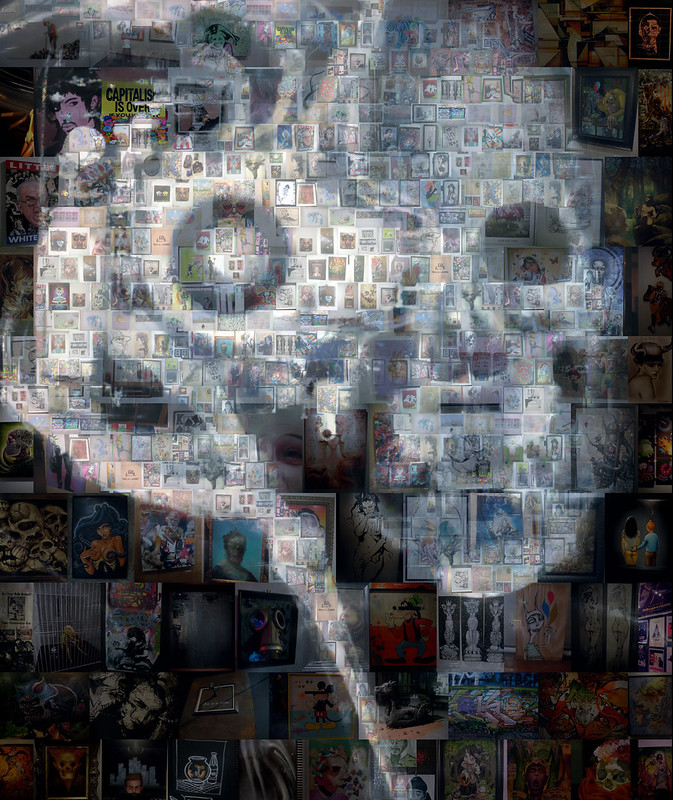 Full res here.
|
 #
¿
Jul 4, 2015 01:26
#
¿
Jul 4, 2015 01:26
|
|


|

|
| # ¿ Apr 25, 2024 21:38 |
|
|
Really silly photoshop demo I did recently.
|
|
#
¿
Jan 20, 2016 22:11
|
|
|
Frown Town posted:
This is fantastic! Can you share some of your workflow? Tips? Here is a quick flyer I did for my friend's event in Fresno. 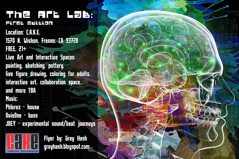
|
|
#
¿
Feb 11, 2016 00:02
|
|

|
Frown Town posted:Sure! Sadly I flattened many layers so I don't have great visual representation of any of this (maybe will re-visit and put something together when I'm less crunched for time).. I use Photoshop, but same concepts can be used in whatever digital painting program you've got. Thanks so much for this! So much good advice!! Lately, I have been designing tattoos for people. The original drawings are from a sketchbook recently lost. Now I am working on painting over the scanned drawings but am wondering if there are specific techniques for creating tattoos in photoshop. As in - stick to line drawings vs. the airbrush or paintbrush?.... I am not sure if there any rules for this as tattoo artists just basically copy the image they are given. Hatching lines too close together seems to be a bad idea however. Anyone have experience creating tattoos in photoshop???
|
|
#
¿
Feb 20, 2016 20:52
|
|
|
Flyer design mockup that the band is now considering for an album cover instead. EDIT: A few slight tweaks. Put the moons up in the corner. 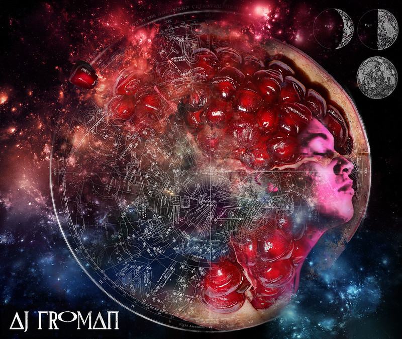 Since it might actually end up as an album cover, C&C is very much needed. Animated GIF progress here: 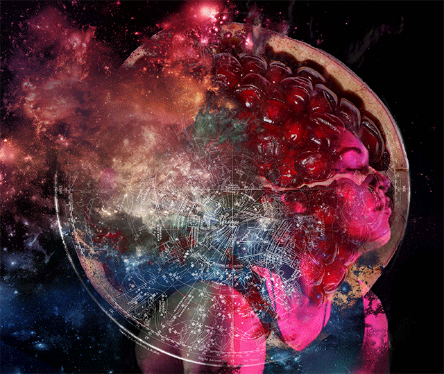
sigma 6 fucked around with this message at 00:53 on Mar 8, 2016 |
|
#
¿
Mar 7, 2016 14:44
|
|
|
Humboldt Squid posted:There's tons of basic digital painting tutorials on Deviantart, pintrest, tumblr etc. that will go over that. Thanks for this!
|
|
#
¿
Mar 9, 2016 03:13
|
|
|
Is that Orko from He Man? Here is another flyer prototype but I liked the first one much better. 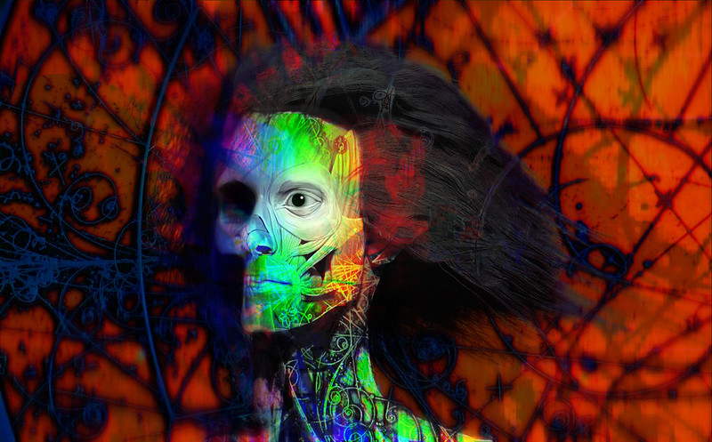
|
|
#
¿
Mar 11, 2016 05:14
|
|
|
Oh right. Completely forgot about Final Fantasy. Used to play that on my NES... or SNES... can't remember. Anybody else tried out polybrush? It is a lot of fun! https://www.youtube.com/watch?v=g4_h1FTiQ_g ...also free for the time being!
|
|
#
¿
Mar 11, 2016 23:12
|
|
|
moonraker posted:Nice work looks great Thanks but it is my least favorite of the 3 mockups I have made. Turned my drawing into a 3rd flyer mockup. Not really sure if it is working. Especially not sure about the smoke element. Help please!! I feel like I suck at graphic design. Font will be fixed soon. 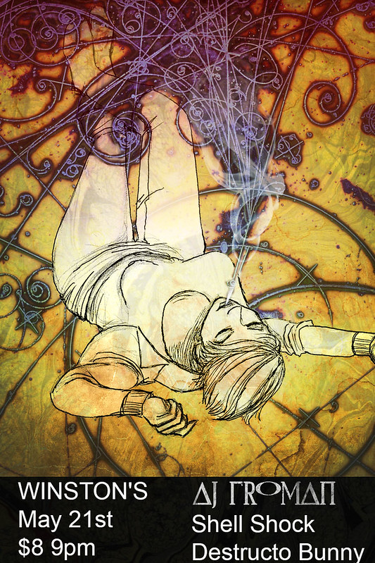 All three in order here. Definitely like the 1rst and 3rd best. 
sigma 6 fucked around with this message at 20:56 on Mar 15, 2016 |
|
#
¿
Mar 15, 2016 20:51
|
|
|
Crossposted from the 3d thread and draw every day thread. This was a class demo which I wanted to finish up outside of class. The hand drawn reference on the right is the starting point: 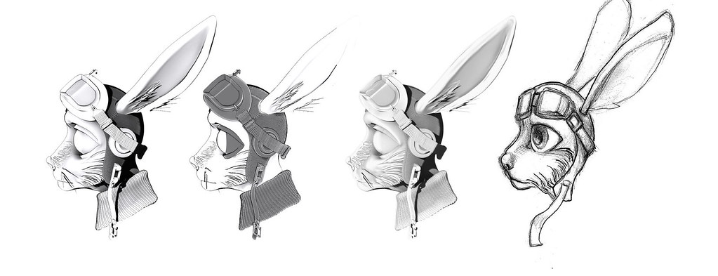 Some toon shading tests: 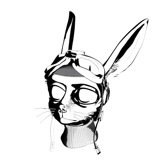 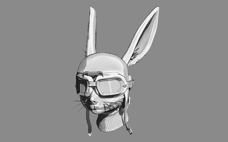 Here is a keyshot render. 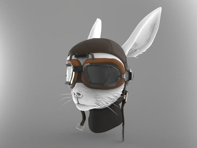 and the final result so far. 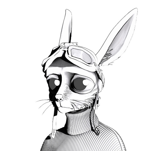 Still not entirely happy with it so C&C is welcome. sigma 6 fucked around with this message at 04:47 on Jul 1, 2016 |
|
#
¿
Jul 1, 2016 04:38
|
|
|
Point clouds can be beautiful. https://vimeo.com/183507561
|
|
#
¿
Sep 25, 2016 02:27
|
|
|
What magic is this? https://www.youtube.com/watch?v=qU-6jATa2Q8 Seriously though... I am trying to follow his process and my mind is melting.
|
|
#
¿
Oct 14, 2016 20:43
|
|
|
Do you guys have any favorite tutorials for creating digital concept art? Usually the OP posts resources in these kinds of threads but I don't see that here. Photoshop is incredibly powerful and there is staggering amount of information out there. Where do I even begin??
|
|
#
¿
Oct 16, 2016 20:43
|
|
|
GreatJob posted:I uh, usually just type into Google whatever I want to know and it's often small, specific things...Usually just typography effects like turning letters into honey, making my own leather texture, stuff like that. I knew about Ctrl +Z but it isn't so much the basics I need. More like intermediate to advanced I think. Although Photoshop has changed a LOT over the years, I am very familiar with the basics of how the software works. I am somewhat mystified by "Wootha's" advanced use of adjustment layers for concept art however. Maybe I am just still really fuzzy on what each adjustment layer is capable of. https://www.youtube.com/watch?v=qU-6jATa2Q8 Also confused about when to photobash or when to paint. Christian Lorenz Scherur makes photobashing look like painting and I would like to be able to seamlessly integrate photos as easily as he does. Then there is the question of when to paint vs. when to photobash (?) gmc9987: I am specifically looking for photoshop tutorials in creating concept art landscapes. That Bioshock stuff is pretty amazing!
|
|
#
¿
Oct 17, 2016 00:13
|
|
|
"So many show their teeth these days". #inktober zombie.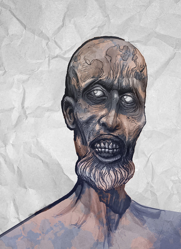
|
|
#
¿
Oct 19, 2016 08:50
|
|
|
C & C requested.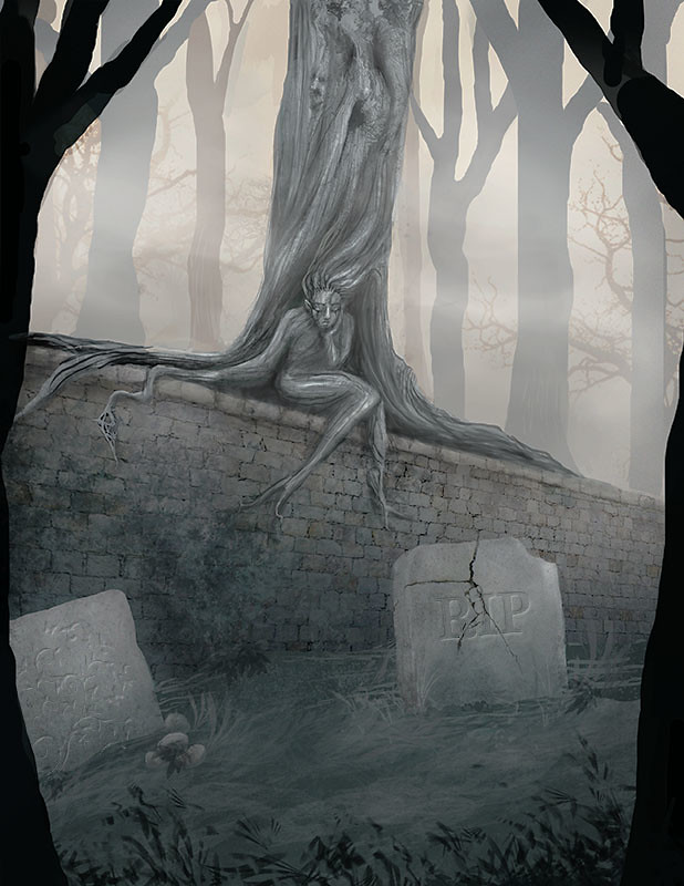
|
|
#
¿
Nov 11, 2016 11:04
|
|
|
Thanks. I added that last because the stones looked far too plain with nothing on them. Definitely need to work on the lettering.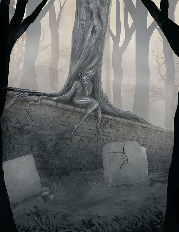
sigma 6 fucked around with this message at 19:21 on Nov 11, 2016 |
|
#
¿
Nov 11, 2016 19:12
|
|
|
Design for album cover.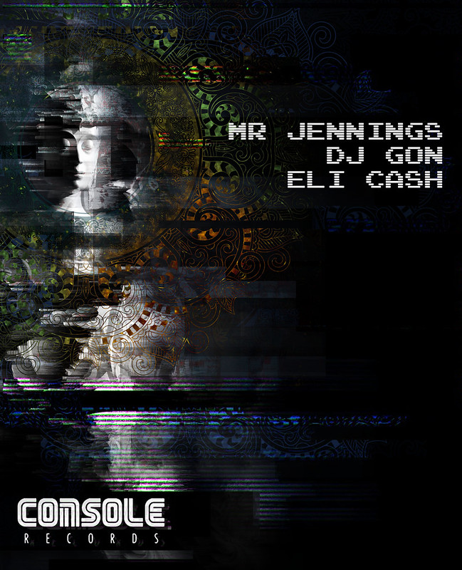
|
|
#
¿
Jan 23, 2017 06:08
|
|
|
Another go at album art.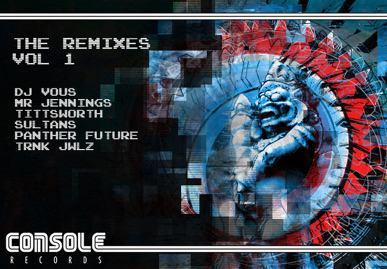 or 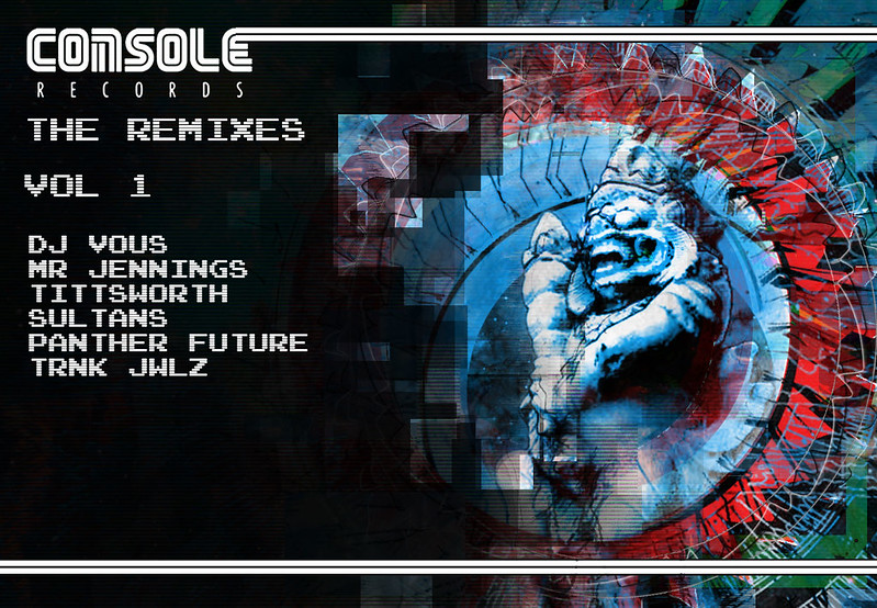
sigma 6 fucked around with this message at 07:23 on Jan 30, 2017 |
|
#
¿
Jan 30, 2017 05:27
|
|
|
|
|
#
¿
Feb 15, 2017 10:43
|
|
|
Sucks to lose layers but I think it forces you to be a much better painter. Can you tell me how you use the smudge brush? Do you modify the brush in some way or use the defaults? Anthony Jones had a custom smudge brush I loved years ago but I have never been able to replicate the results and I know it was something relatively simple. Right now my photoshop painting looks like bad marker drawings because there isn't enough blending.
|
|
#
¿
Apr 8, 2017 21:10
|
|
|
Elsa posted:Hey it occurred to me that I didn't answer this completely. And it's easy to do a GifCam demo real quick Thank you soooo much for this. I was on the fence about the Kyle brush pack but you have sold me. Here is some content. Not sure if I posted the final here. Thinking about doing a second one in anticipation of Vol 2. Here is the actual album if anyone is interested.
|
|
#
¿
Apr 27, 2017 23:42
|
|


|
Revisiting an old project and trying to learn Marvelous Designer for the jacket. So far it is very difficult to get the results I want. Leather jacket ended up looking more like the puffy pirate shirt from Seinfeld. Ugh. Concept here.  Quick stab at adding the monowheel. 
|
|
#
¿
Jun 1, 2017 21:12
|
|
|
Went back and worked on an old sketch again. I sometimes wonder how much 2d concept work is necessary before just jumping into 3d. Like... am I just reworking the 2d stuff when I know I should be spending time just doing it right in 3d? 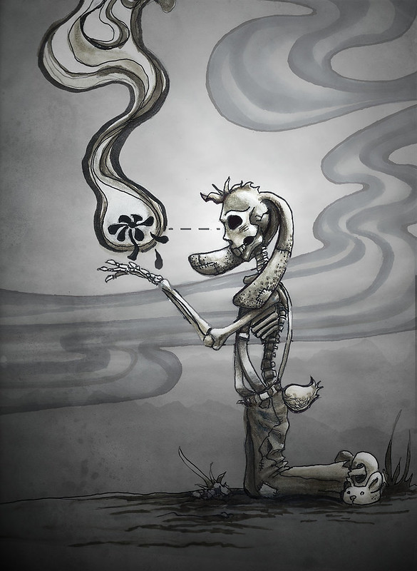 When does prototyping become procrastinating? 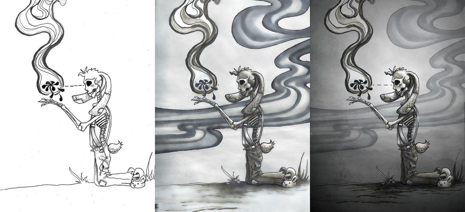
|
|
#
¿
Aug 17, 2017 03:49
|
|
|
It's a workflow thing I am trying to figure out. Some people "sketch" in zbrush and skip the 2d part completely. For other people, they spend a long time designing in 2d before going moving on to a 3d version. Or some just use a mood / reference board vs. 2d concept art painting. Hell - more and more people are starting in zbrush and then painting over that for the final image. Good example of going from a 2d illustration to a 3d model. Design by Craola.   Why am I tweaking a painting, when I can make the model and then move a light? Also - a quick flyer. Not sure if I like it. Might be taking the band's name too literally.  sigma 6 fucked around with this message at 10:35 on Aug 17, 2017 |
|
#
¿
Aug 17, 2017 05:25
|
|
|
a hole-y ghost posted:In this case, I suggested it because your drawing is from flat profile, which won't translate well to 3D. The example you posted worked well even though it's only one view because it's from an angle. The point of my suggestion is if you're going to spend a lot of time sketching 2D stuff for it, the time might be better spent getting several 2D rough-ish sketches, all from different angles. I totally get what you are saying. This is also what modeling sheets are for. However, if it is going to be rendered at the same angle, it shouldn't matter much. Sorta more feel like I can ideate / concept AND create the final product faster in 3d. Everything 3d except for the initial thumbnails and /or a medium sized value study. I feel like lighting and color are infinitely easier for me to create in 3d vs. repainting something over and over in the concept stage.
|
|
#
¿
Aug 17, 2017 20:55
|
|
|
Would love some critique on this flyer design. Don't have much time to make fixes. Their show is the Sunday after next!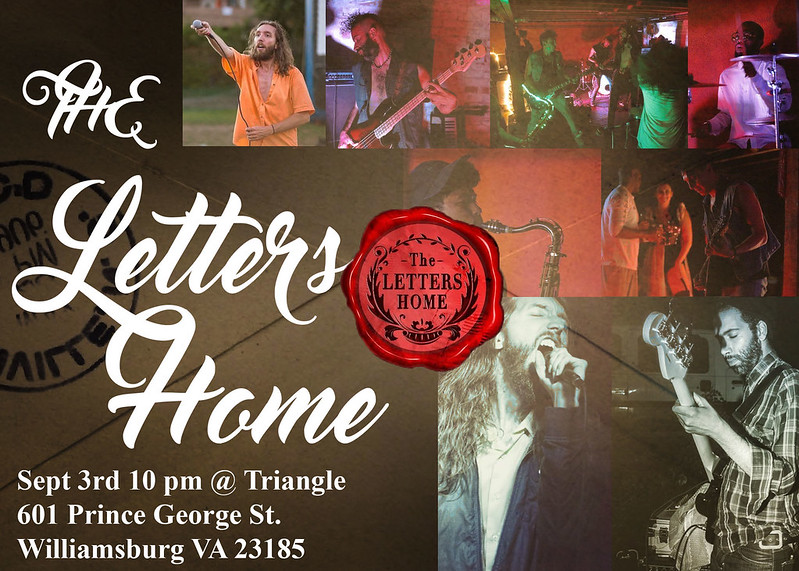 heh - wasn't happy with the envelope. 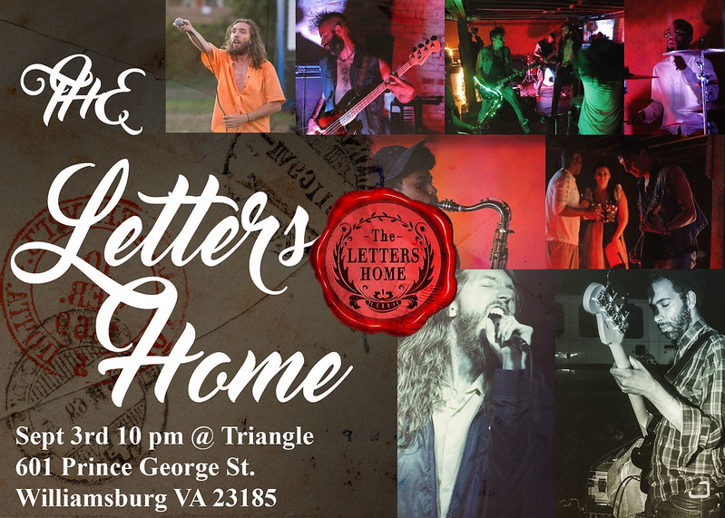 http://thelettershome.com/ sigma 6 fucked around with this message at 02:04 on Aug 27, 2017 |
|
#
¿
Aug 27, 2017 01:48
|
|
|
coolusername posted:It might be worth making the information (Sept 3rd etc.) more prominent, versus having the big 'The Letters home' taking up all the focus. Yeah - I kinda hate that the name is repeated twice. Once in the lettering and once on the seal.
|
|
#
¿
Aug 27, 2017 03:28
|
|
|
My friend goes: "Make me a tattoo design of a snake eating it's tail and make it look cool." Several hours later... 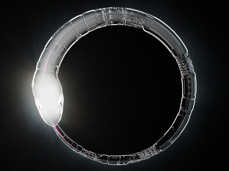 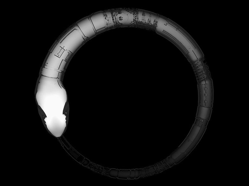
sigma 6 fucked around with this message at 07:40 on Aug 31, 2017 |
|
#
¿
Aug 31, 2017 07:13
|
|
|
Little character doodle.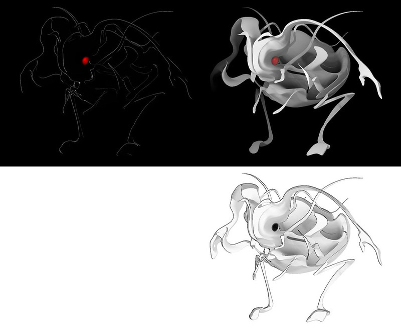
|
|
#
¿
Sep 6, 2017 08:32
|
|
|
Sociopastry posted:
This is kinda badass.
|
|
#
¿
Nov 18, 2017 01:50
|
|

|
Album cover design I am playing around with.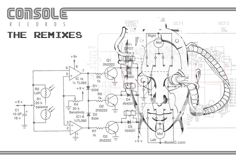
|
|
#
¿
Jan 16, 2018 06:26
|
|
|
a hole-y ghost posted:I think people that were in their teens and 20s at the time largely associate it with a lovely job market, high crime rate, and high drug use. Cue "vaporwave" love of all things which belong on a Trapper Keeper cover. Not that I can talk. The client for the remix album directed me to make it... 80s arcade style... hence "Console Records". Ugh.
|
|
#
¿
Jan 23, 2018 19:43
|
|
|
Quick cave troll in zbrush.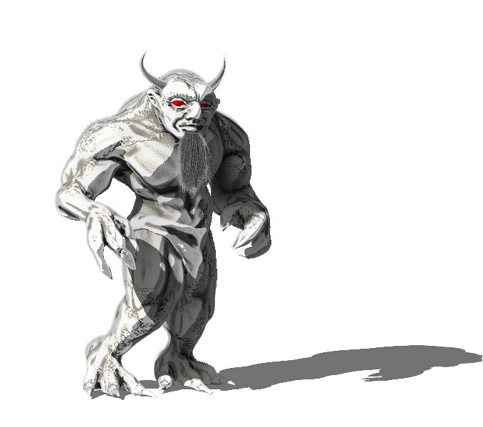
|
|
#
¿
Feb 25, 2018 03:38
|
|
|
Duck Party posted:https://www.youtube.com/watch?v=U_86PaNHDBg&t=2s This is awesome. Music is a little loud / mildly annoying but content is awesome overall. Thanks.  1.5 hour speed sculpt.
|
|
#
¿
Apr 7, 2018 20:35
|
|
|
I want to turn this into a photoshop painting. I have photo reference. What would you guys do other than just painting over the drawing in photoshop? I mean - are there workflows going from pencil to photoshop illustration which work better than others? Or techniques which speed up the workflow other than just putting the pencil layer on multiply to use as reference for painting layers underneath it? 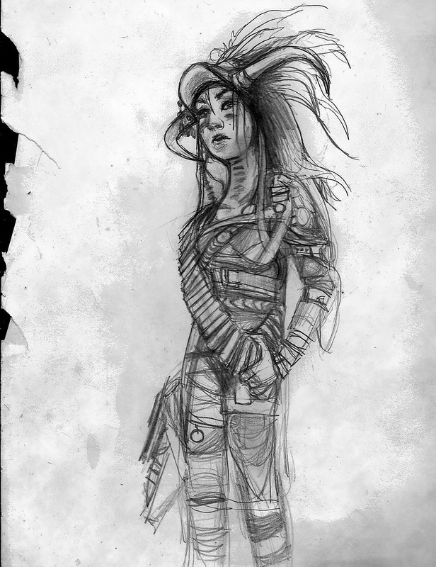
|
|
#
¿
May 20, 2018 01:43
|
|
|
Argue: Can you explain this a little better or point me to a video? I have never heard of this before.
|
|
#
¿
May 22, 2018 09:57
|
|
|
Argue posted:If you want to keep the line art and be able to manipulate it to your liking, rather than setting the layer to multiply, I much prefer the technique of using the image itself as a selection mask, inverting it, and filling it with black. Then you can lock transparency and change the lines to exactly the color you want without worrying about the multiplicative effect against the underlying color (although you'd still have to worry about the lines being partially transparent). I think if you follow up with painting over it you can use this method to lose the line art as well. This one.
|
|
#
¿
Jun 18, 2018 04:13
|
|
|
Old project I brought into keyshot to play with.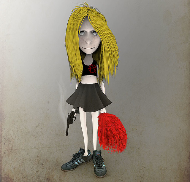 Older zbrush render for comparison. 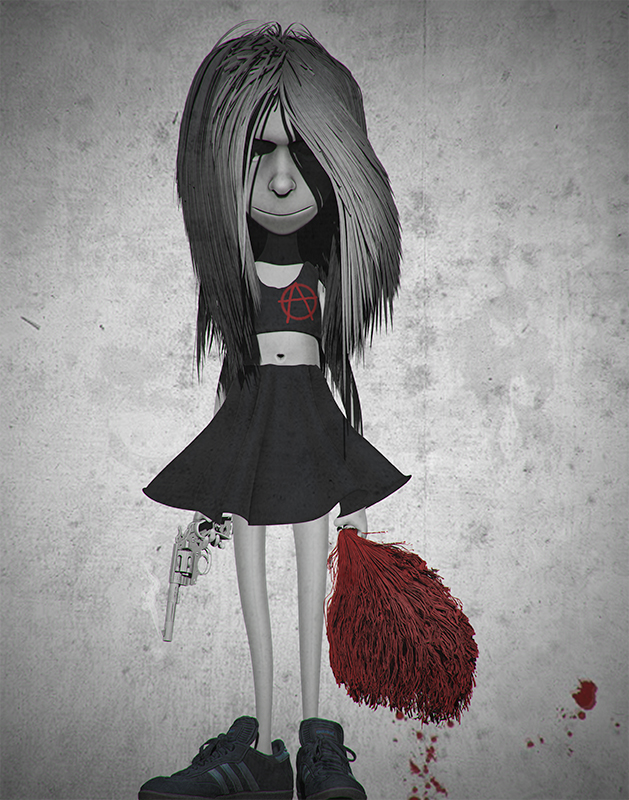 update: 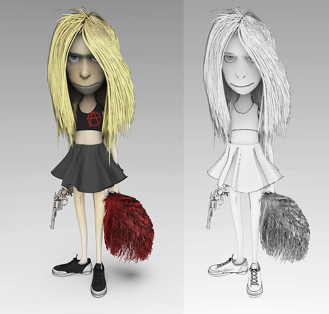
sigma 6 fucked around with this message at 11:52 on Jul 15, 2018 |
|
#
¿
Jul 14, 2018 09:46
|
|
|

|
| # ¿ Apr 25, 2024 21:38 |
|
|
I know greeble covered stuff is ultra cheesy. Trying to master workflows to make it less cheesy and easier to teach. Modeled in Zbrush and rendered in Keyshot.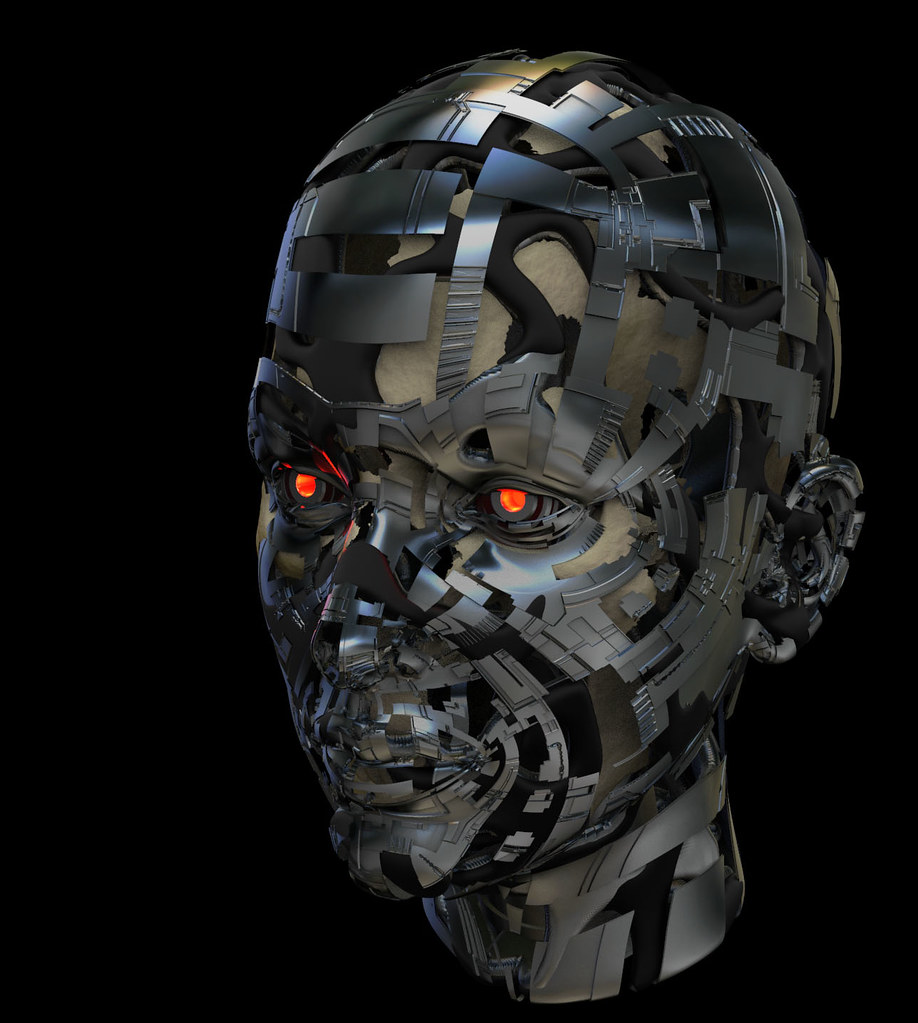 Earlier Zbrush render for comparison. 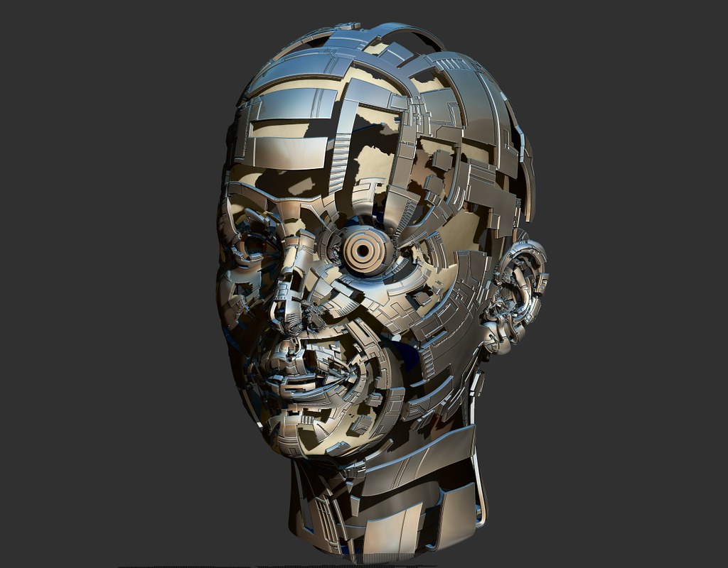 One more in keyshot. 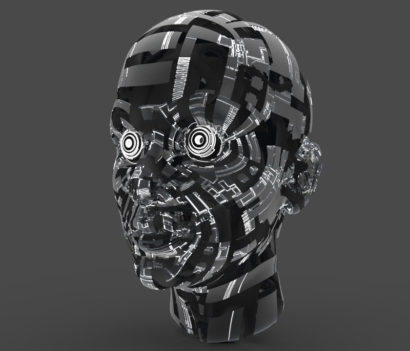
sigma 6 fucked around with this message at 21:00 on Jul 29, 2018 |
|
#
¿
Jul 29, 2018 18:09
|
|