|
|
 #
?
Jun 13, 2015 17:13
#
?
Jun 13, 2015 17:13
|
|


|

|
| # ? Apr 23, 2024 22:08 |
|
|
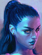
loga mira posted:Nice, reminds me of that guy who could draw cities from memory. This is gorgeous. I mean, yeah, it's horrifying too, but the shading is gorgeous.
|
|
#
?
Jun 13, 2015 17:57
|
|


|
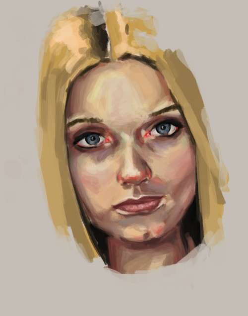
Slowly, but surely, I improve. First a couple of speed doodles (With blueline still on it, because I wanted to show how the pose improved/didn't) Mindflayer Monk.  Bug Dude of some description (Peaceful, although it doesn't look it.  ) ) And trying to improve on my digital pencilling, with a face study. 
|
|
#
?
Jun 13, 2015 18:50
|
|
|
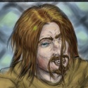
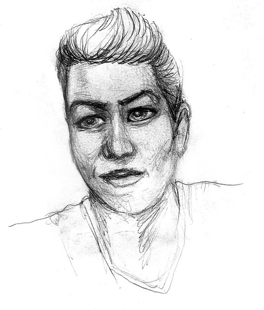
^ Looks like you're using some method of head construction, but you're also skipping the part about basic proportions. In the book or tutorial or whatever, check where it talks about how wide an average head is, measured in eyes most likely, and how tall it is compared to its width, or something like that. Bored posted:This is gorgeous. I mean, yeah, it's horrifying too, but the shading is gorgeous. drat thanks. Glad it's horrifying and yeah, that was a shading exercise.
|
|
#
?
Jun 13, 2015 23:47
|
|

|
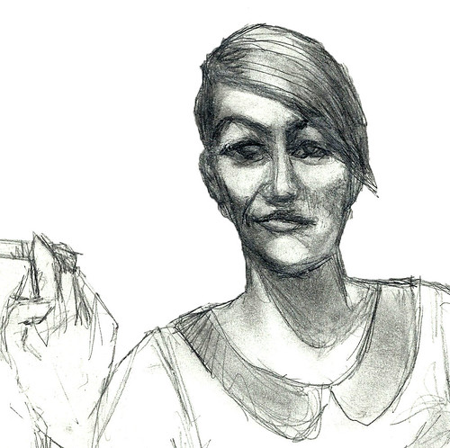
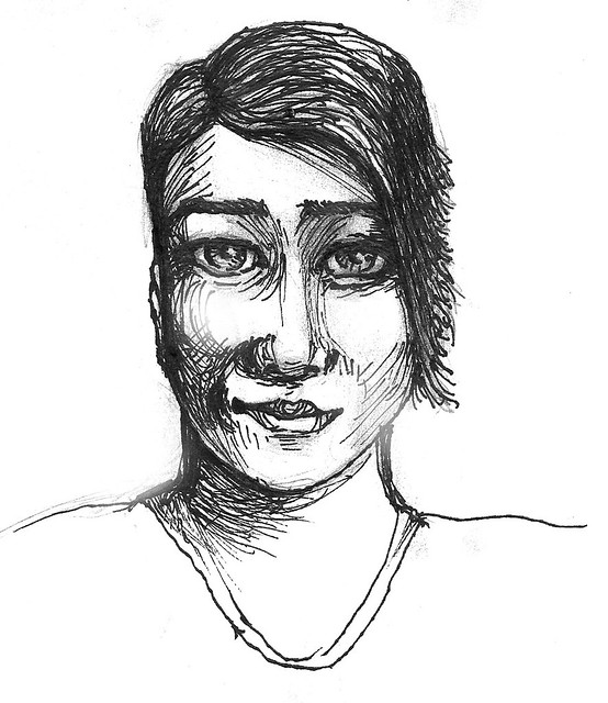
loga mira posted:^ Looks like you're using some method of head construction, but you're also skipping the part about basic proportions. In the book or tutorial or whatever, check where it talks about how wide an average head is, measured in eyes most likely, and how tall it is compared to its width, or something like that. I was going to say "Easily fixed, 90% of that is the nose", and repost, but then Krita shat itself while cutting and moving, and appears to have hung (Joy). But yeah, I see where you're coming from, and 90% of it is the nose/upper cheeck, the other 10% being the chin. Anything on the other drawings? FAKE EDIT: Managed to get Krita not to crap itself for moving (I need a new gfx card... *sigh* ), so here's an at least partially fixed version. Only partially, there's a fair bit of the fiddly kind of cleanup to do. 
|
|
#
?
Jun 14, 2015 00:29
|
|
|
So this is actually the national costume of a county nearby. I didn't include the shoes, which were black with oversized buckles. I thought it was enough of a witch costume as it is. 
|
|
#
?
Jun 14, 2015 01:17
|
|

|
^The apron looks convincing to me. somehow it looks better than other fabric stuff you've posted, maybe the folds are more realistic, more weight to them. JamieTheD posted:I was going to say "Easily fixed, 90% of that is the nose", and repost, but then Krita shat itself while cutting and moving, and appears to have hung (Joy). But yeah, I see where you're coming from, and 90% of it is the nose/upper cheeck, the other 10% being the chin. Anything on the other drawings? Krita is a buggy piece of poo poo, the only useful thing about it is the seamless texture drawing mode. Try Clip Studio, get the trial, digital painting version is only $50 and they have frequent sales. For other drawings, try drawing each shape, like the side of an arm or a tentacle, with one continuous stroke instead of many small ones. That would make it look cleaner, and will be harder of course. Spend some time on the sketch to make it more precise and again cleaner, the the sketch is not supposed to look vague, it's the blueprint for your drawing. Draw the hands, don't shy away from things you don't know how to draw, instead look at your own hand or Google some photos. For pencilling and inking, maybe switch to physical tools for now. Using physical tools you'll get better much faster, it's more natural, it's less frustrating. Get lots of cheap paper, several technical pens of various sizes (I use microns) and maybe a brush pen like the pentel brush pen. And a pencil of course. E. And then of course you can digitally color your drawings and correct them. I usually just take a photo, so no scanner needed. loga mira fucked around with this message at 02:46 on Jun 14, 2015 |
|
#
?
Jun 14, 2015 02:43
|
|
|
|
|
#
?
Jun 14, 2015 09:20
|
|


|
Was able to sneak in a few more hours on this tonight
|
|
#
?
Jun 14, 2015 10:15
|
|

|
Humboldt Squid posted:Was able to sneak in a few more hours on this tonight That is a very luxurious rhino. The contrast could probably stand a boost, but you might be able to just fix that afterwards with levels/curves. Cross-posting from the Making Comics thread, I'm doing a comic strip now called At the Zoo (http://www.atthezoocomic.com). It's intended to be very traditional and newspaperish (B&W strips with continuity during the week, Sunday in color). Here's what it looks like so far:     
|
|
#
?
Jun 14, 2015 14:21
|
|

|
loga mira posted:^The apron looks convincing to me. somehow it looks better than other fabric stuff you've posted, maybe the folds are more realistic, more weight to them. Thanks! Though I'm still not satisfied with it. This theme has been good practice because I'm loving struggling with it. The hardest part is trying to see the shape in my head. Most dresses are just one big plane crunched and folded and my brain keeps saying "these folds make no sense AT ALL why is it crinkly there why do the shadows fall at the top and the bottom and sometimes midfold too?" I needed to step back and do what I know for a bit to get a better handle on this. 
|
|
#
?
Jun 14, 2015 19:02
|
|
|
neonnoodle posted:At the Zoo nice
|
|
#
?
Jun 15, 2015 14:47
|
|
|
I have a ways to go, but I started this today.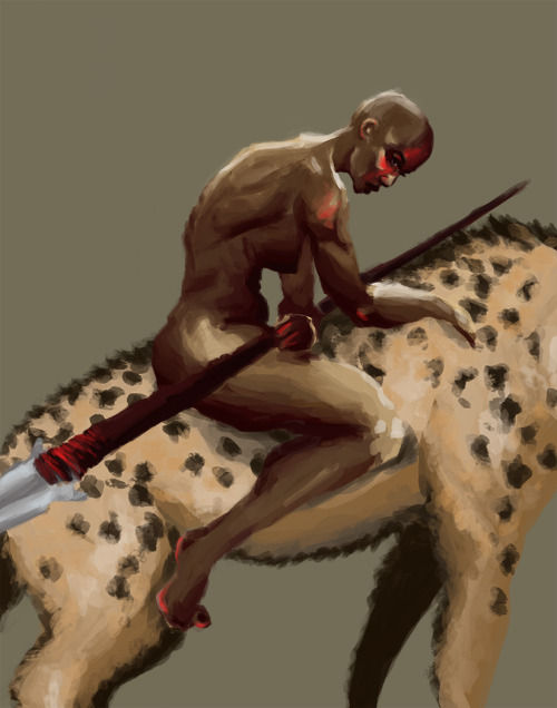
|
|
#
?
Jun 15, 2015 23:26
|
|
|
16x20 WIP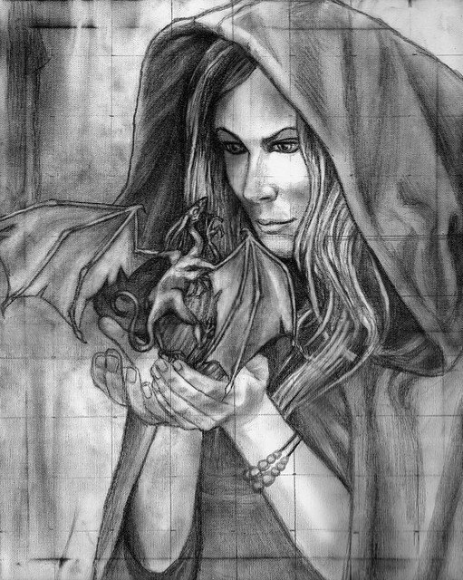 CnC welcome. (16x20 is a BITCH to scan / assemble) sigma 6 fucked around with this message at 09:24 on Jun 16, 2015 |
|
#
?
Jun 16, 2015 09:04
|
|
|
Day twooooooo. I'm sick of working on it but I really want to see something finished for once.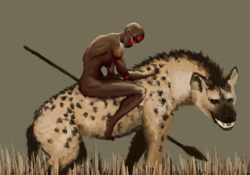
|
|
#
?
Jun 17, 2015 02:21
|
|
|
 First time seriously spending more than half an hour drawing in the last five years and my first time painting digitally. I want to make this a habit. It felt sooooo good. This is still under work - I've erased the knees about a half dozen times. Any feedback would be greatly appreciated. Also, when I was working on this in photoshop the colors were a lot less saturated. When I went to save it they suddenly became more orangey. Is there a way to prevent that?
|
|
#
?
Jun 17, 2015 02:22
|
|
|
smallmouth posted:Day twooooooo. I'm sick of working on it but I really want to see something finished for once. Looks great so far! I am envious of anyone who can speed paint. So, I feel your pain. Here is some figure drawing from tonight. penis 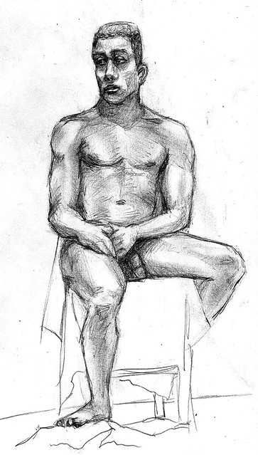
|
|
#
?
Jun 17, 2015 06:04
|
|
|
 Drawing monsters forever.
|
|
#
?
Jun 17, 2015 08:06
|
|
|
Pick posted:Drawing monsters forever. I hear ya  
|
|
#
?
Jun 18, 2015 00:05
|
|
|
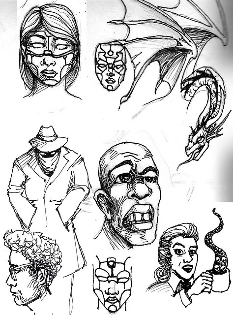
sigma 6 posted:CnC welcome. Sure. The front hand is nice, give the knuckles the correct curve (middle finger knuckle is the highest point) and smooth out the thumb area and it will be very nice. The other hand is all weird. The face is too flat, the eyes need to be deeper, the mouth needs to be higher, quick mask and move job on the face to show what im talkin abt:  I forgot the eyes, they arent focused on the creature. Did a cross-eyed thing with this head from an old sketch, wanted to do a panel from a comic but decided to test it with a simpler model 
|
|
#
?
Jun 18, 2015 01:44
|
|
|
I need to move on.
|
|
#
?
Jun 18, 2015 02:15
|
|
|
lovin that motion you got with the fur Pick. I wish my leg hair was that luscious!  having a lot of fun inking this. lovely chipped fingernail polished hand for scale.
|
|
#
?
Jun 18, 2015 05:33
|
|

|
loga mira posted:Sure. The front hand is nice, give the knuckles the correct curve (middle finger knuckle is the highest point) and smooth out the thumb area and it will be very nice. The other hand is all weird. The face is too flat, the eyes need to be deeper, the mouth needs to be higher, quick mask and move job on the face to show what im talkin abt: Thank you. This definitely helps. I just gotta really work on the face. I totally agree about the eyes. They have been a struggle. Painted the background and hood tonight in oil. First time using it. It is so... buttery. Daily sketch. 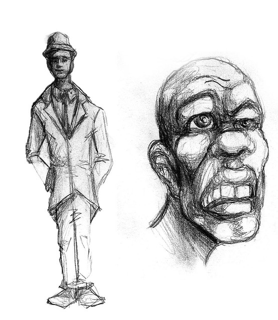
|
|
#
?
Jun 18, 2015 08:25
|
|
|
 yuck
|
|
#
?
Jun 19, 2015 22:11
|
|
|
Pug pug PUG You will note I'm trying the brown background thing.
|
|
#
?
Jun 20, 2015 02:09
|
|
|
  Fun commission I completed. Kale leaf, beet, orange. I really like the orange.
|
|
#
?
Jun 20, 2015 02:43
|
|

|
sigma 6 fucked around with this message at 04:42 on Jun 20, 2015 |
|
#
?
Jun 20, 2015 04:32
|
|
|
Cartyisme posted:
I am 100%behind this alternate color scheme thing you've got going. Don't ever stop!
|
|
#
?
Jun 20, 2015 06:56
|
|

|
Cartyisme posted:
I agree, these are great.
|
|
#
?
Jun 20, 2015 12:27
|
|
|
Some foolings on the train. They are brothers and sometimes they smash. 
|
|
#
?
Jun 20, 2015 13:50
|
|

|
the_lion posted:Year of Luigi
|
|
#
?
Jun 20, 2015 14:36
|
|
|
I got neeeeeew bruuuushes. 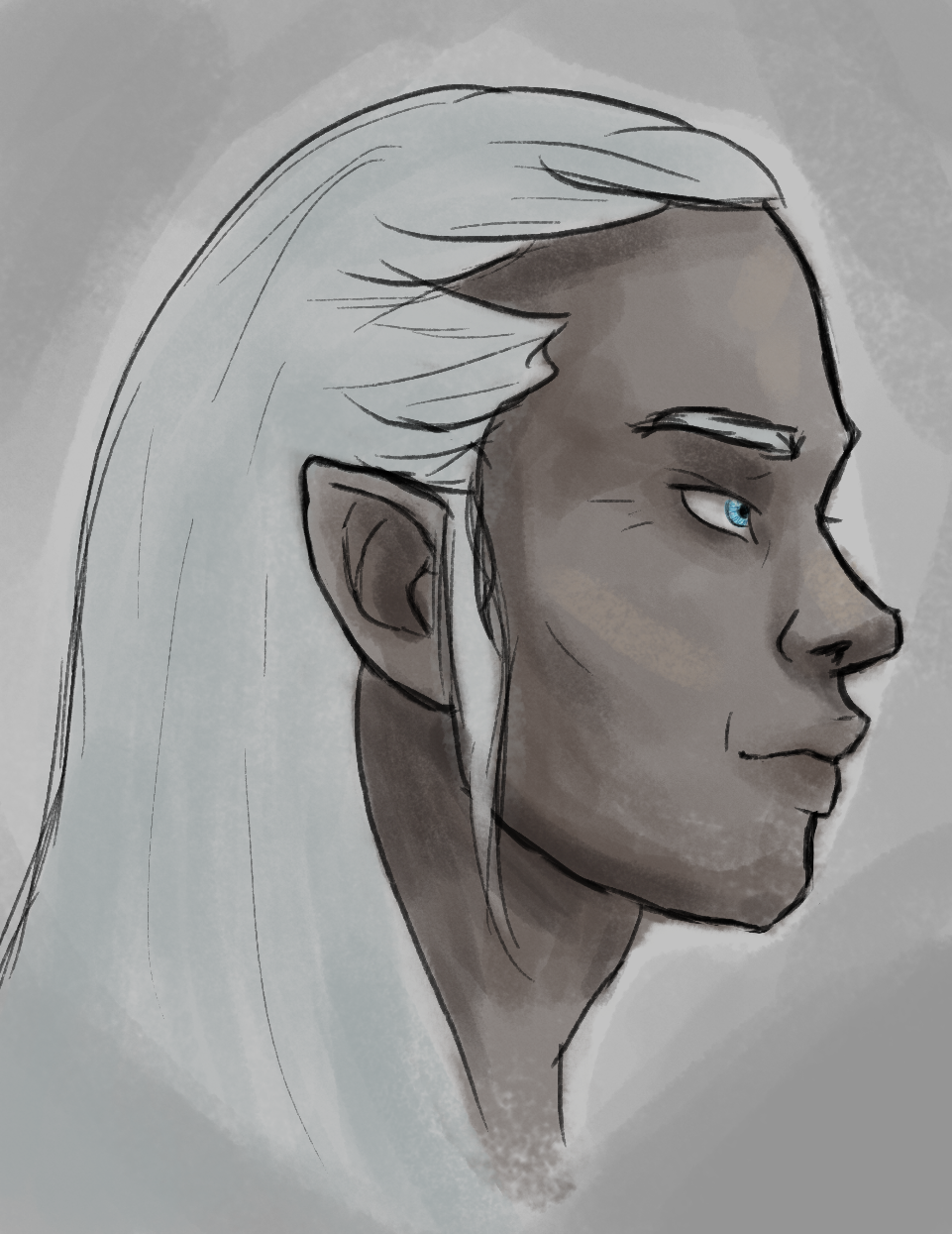    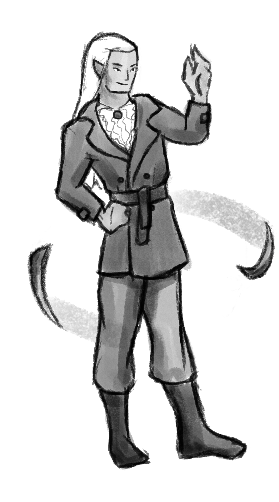 
|
|
#
?
Jun 20, 2015 15:10
|
|


|
neonnoodle posted:I like the style you're going for here, but I think this needs some serious reworking because the keys are popping all over the place. Map out the circular/elliptical arc that the character will make and do a really conservative cycle first. Fair call. I guess I better dig out the ol' Animation Survivial book I bought ages ago and read more of it / practise more.
|
|
#
?
Jun 20, 2015 16:11
|
|
|
Tiny update. Sorry for the crappy pic.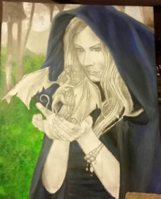 Raised the mouth and changed one eye slightly. What color should the dragon be? Hmmm.
|
|
#
?
Jun 23, 2015 11:01
|
|
|
I've been drawing one Pokemon per day, starting with Bulbasaur. Here are the last few days:    I also made this because I've got too much free time while I wait for a client to get back to me so I can start a big design project:  And a request from a friend: 
|
|
#
?
Jun 24, 2015 16:34
|
|

|
 It's wrong to feel so much rage and frustration when trying to draw something so adorable.
|
|
#
?
Jun 24, 2015 23:02
|
|
|
It's looking really good so far, keep going!
|
|
#
?
Jun 24, 2015 23:27
|
|
|
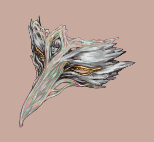 Something I did almost a year back. I had a fun time studying and painting the texture of antique silver and mother of pearl, though I don't think the mother of pearl came out right.
|
|
#
?
Jun 25, 2015 00:41
|
|
|
Doug doug DOUG.
|
|
#
?
Jun 26, 2015 23:21
|
|
|

|
| # ? Apr 23, 2024 22:08 |
|
|
Sharpest Crayon posted:Doug doug DOUG.
|
|
#
?
Jun 27, 2015 02:03
|
|