


|
wtfviz is a good spot for these. Some of my recent favorites:   Pakled posted:If I remember correctly, that was made as an example of how graphs can be deceptive. Nope, it was made in earnest, by Reuters.
|
 #
¿
Oct 7, 2015 17:27
#
¿
Oct 7, 2015 17:27
|
|


|

|
| # ¿ Apr 27, 2024 12:33 |
|
|
Another tumblr I like is http://glitch-chart.tumblr.com/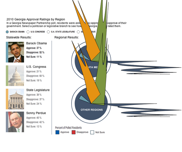
|
|
#
¿
Oct 7, 2015 19:38
|
|
|
Quad posted:Does anyone have a link to this big gender/sexual identity checklist I saw a while ago, it had over 200 different options and a Points System for how opressed you were? This one? 
|
|
#
¿
Oct 27, 2015 17:49
|
|
|
The major conference on information visualization wrapped up. I was able to show them some of NotJesus' parody graphs from the GOP Primary thread: http://forums.somethingawful.com/showthread.php?threadid=3680205&userid=109312 (well worth a look)   And now there is academic debate over how to even characterize how these charts are so bad. So congratulations, chart goons.
|
|
#
¿
Nov 5, 2015 02:41
|
|
|
Give me double y axes or give me death.
|
|
#
¿
Dec 4, 2015 17:59
|
|
|
Nachos
|
|
#
¿
Feb 12, 2016 19:10
|
|
|
What's wrong with Tableau?
|
|
#
¿
Feb 16, 2016 21:41
|
|
|
 wrap it up, non-gamers
|
|
#
¿
Mar 18, 2016 21:45
|
|
|
Stacked area charts have some problems, sure. But that example (minus the one missing label) is neither worse nor much better than any of the other stacked area charts I've seen, and the data seem interesting.
|
|
#
¿
Mar 24, 2016 05:13
|
|
|
Travis343 posted:Mods rename me Bored Youthism Someone Still Loves You Bored Youthism
|
|
#
¿
Mar 28, 2016 22:36
|
|
|
Platystemon posted:
Looks like a perfectly adequate graph of an important subject.
|
|
#
¿
Jun 28, 2016 05:27
|
|

|
The Cheshire Cat posted:What's the price per kg of antimatter? 
|
|
#
¿
Jun 30, 2016 01:43
|
|
|
I've been enjoying Mona Chalabi's data sketches.
|
|
#
¿
Jul 7, 2016 19:41
|
|
|
that's that good poo poo right there
|
|
#
¿
Aug 8, 2016 19:09
|
|

|
PittTheElder posted:Is the Repatriation question some sort of white supremacist dog whistle? Like are they seriously asking if people think politicians would really say what they mean, if only we could pack the blacks back to Africa? If your follow up question is "is race mixing a sin?" that's not a very high frequency dog whistle.
|
|
#
¿
Aug 17, 2016 00:19
|
|
|
Are there any other examples of treemaps in the wild (where "the wild" is "the news media or clickbait or infographics")? I know the wikipedia import/export graphs use treemaps, and there's the map of the market, and some disk space analysis software, but all of those applications are sort of for wonks anyway. I am trying to think of where the general public would see a fair number of hierarchical quantities where a bar chart wouldn't be a better option.
|
|
#
¿
Aug 28, 2016 16:19
|
|
|
 https://goatkcd.com/988/
|
|
#
¿
Dec 16, 2016 22:04
|
|
|
Condorcet paradoxes are avoided if all votes are cast as per normal, but are then fed into an enormous glowing and pulsating Voting Orb rather than counted.
|
|
#
¿
Jan 18, 2017 03:44
|
|
|
Also the per-capita rate would be vastly more informative (especially on the right, where the regions are not of equal population).
|
|
#
¿
Feb 2, 2017 17:43
|
|
|
You guys really dropped the ball here.
|
|
#
¿
Feb 10, 2017 13:58
|
|
|
https://twitter.com/YouGov/status/838750115796041728 they must have great calves from all that backpedaling
|
|
#
¿
Mar 6, 2017 23:37
|
|
|
Tiggum posted:How is it backpedalling? It's not a pie chart and they never said it was a pie chart. it's styled to look like a pie chart, and has a lot of the signifiers of it. it's not hard to assume that, like a lot of the bad charts itt, it was designed to look like a chart ("make it look statistic-y") by somebody who didn't care about getting the particular encodings of the genre of chart right. stuff like: 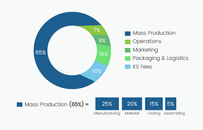 and 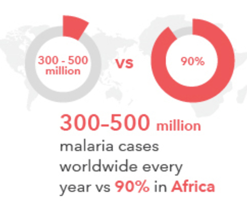 i mean, it's possible they intended it to be "just" a top down graphic of pizza with little call outs for the toppings, but even if so, they did sort of a lovely job of it. toppings aren't unique to each slice, for instance (olives, tomatoes, and pepperoni appear in different slices), some incredibly popular toppings didn't even make the cut to the main graphic (onions and chicken are both liked by over 50% of respondents, but aren't displayed, whereas olives and spinach are). it just carries no informational content, much like my posts.
|
|
#
¿
Mar 7, 2017 05:05
|
|
|
Carbon dioxide posted:Maybe a bit strangely formatted, but this chart seems quite clear to me? the wedges have the wrong centerpoint, so the size of the slice does not correspond to its value. c.f. "KS fees" and "Shipping & Logistics" which have the same value but have wedges of slightly different sizes.
|
|
#
¿
Mar 8, 2017 13:51
|
|
|
Powaqoatse posted:shut the gently caress up and never speak again, you freak. you weirdo. you piece of poo poo. gently caress you. non-black licorice is literally a toxic slurpee you sack of poo poo. gently caress! i like salmiakki as well, but i don't pretend that i am anything other than human detritus, to be swept away in the coming cleansing fires.
|
|
#
¿
Mar 18, 2017 10:19
|
|
|
Jose posted:Since my work involves charting software and i often link stuff posted itt on skype to people and i've been asked to write a blog for the company website about bad charts. Obviously a lot is obvious with that popular website infographic I posted being a great example of many ways to gently caress up a chart but was wondering what are some less obvious ways of loving them up so they're bad/meaningless/misrepresent the data Some less obvious mistakes (with academic papers showing that they do screw people up, when I can remember the right ones): 1) loving with the y-axis. http://www.cs.tufts.edu/comp/250VIS/papers/chi2015-deception.pdf It should start from 0, and should be linear, unless there is a very good reason for it to be so, for the reasons vyelkin said in the previous post (inflates effect size, or makes effect size really hard to suss out) 2) loving with the x-axis. If you've got time as the x-axis, it should also be linear, unless you've got a very good reason. Otherwise people are looking at the slope and saying "oh, things are slowing down and getting better," say, even if that's just an artifact of your showing data every year when you were previously showing it every decade. 3) loving with white space http://statweb.stanford.edu/~cgates/PERSI/papers/scatter82.pdf If you want to show that two variables are correlated, if you throw a lot of white space on either end of the charts (zooming out, in a way), it pushes the points together and makes them look more correlated than they actually are, and vice versa. 4) Failing to account for confounding variables and spurious correlations. https://imgs.xkcd.com/comics/heatmap.png Lots of pairs of variables may be correlated, but way fewer variables have a causal relationship. Showing charts with correlations makes people think they are causally linked, even if they should know better. http://www.tylervigen.com/spurious-correlations 5) Intentional unnecessary complexity A good example is the chart John Boehner's office released that was meant to show Obamacare. http://voices.washingtonpost.com/ezra-klein/2009/07/when_health-care_reform_stops.html Intentionally bad layout, way too many colors, and wordy labels all contribute to the idea "this is too complex for anybody to understand, so it's bad." c.f. the redesigned chart "Do not gently caress with graphic designers" https://www.flickr.com/photos/robertpalmer/3743826461 6) Failing to follow the conventions of a particular chart genre Often times, graphic designers will make "pseudo-charts" - stuff that looks like a chart, because chart = sciency = convincing. http://www.ask-force.org/web/Discourse/Tal-Blinded-with-Science-Trivial-2014.pdf However, this will mean that they sometimes do not follow the convention of the chart. I've posted a bunch of examples in this thread, but here's another: http://68.media.tumblr.com/62113c89bfde641aee65a611d33b7712/tumblr_on1cl2IxwY1sgh0voo1_1280.jpg It looks like a bar chart or meter chart, since it's a bunch of rectangles with numbers on them, somewhat aligned to a common axis. But it's not, it's just a bunch of rectangles with numbers on them. 7) Ensign Expendable posted:Bar graph where the bars are triangles and the data is the height so a small increase in height results in a large increase in area, which is irrelevant, but makes the data feel bigger. https://web.cs.wpi.edu/~ltharrison/files/skau2015evaluation.pdf In general, yeah, make sure you're not conflating two visual properties of the items in a chart. Charts with circles in them tend to be the worst offenders: are you encoding value as the radius, or the area? If it's radius, then know that a circle that has twice the radius is going to have more than twice the visual area. Some more that I thought of: 8) 3D charts are crap, don't make 3D charts. Even if you have 3D data, you still probably don't want to make 3D charts. People are not great at estimating the sizes of 3D objects and accounting for perspective and so on, and that's before you get to the problems of occlusion and perspective warping and whatnot. It's just almost never worth the cost. 9) Don't use the "rainbow" color map, where low values are bluish, and high values are reddish, and the other values are the ROYGBIV colors in the middle. https://classes.soe.ucsc.edu/cmps261/Fall15/papers/colormapHarmful.pdf We are way better at discriminating reds than blues, so it will make all your low values look closer together than your high values. We also separate colors into sort of discrete bins ("all the greens," and "all the reds") for instance, so you get these weird "bullseye" patterns even if your data is just increasing linearly. Tree Goat has a new favorite as of 15:42 on Mar 29, 2017 |
|
#
¿
Mar 29, 2017 15:29
|
|
|
speaking of which, the dataviz subreddit's april fools joke this year is to temporarily make it a shitposting subreddit, here are some highlights so far  to reiterate,
|
|
#
¿
Mar 31, 2017 22:00
|
|
|
google should know better 
|
|
#
¿
Apr 3, 2017 00:28
|
|
|
i love this so much
|
|
#
¿
Apr 26, 2017 07:21
|
|

|
i though the joke was that the ngram for "periodic" is itself periodic
|
|
#
¿
May 5, 2017 21:32
|
|
|

|
|
#
¿
May 17, 2017 21:59
|
|
|

|
|
#
¿
May 27, 2017 04:14
|
|
|

|
|
#
¿
May 30, 2017 01:40
|
|
|
Strudel Man posted:From a game mechanics perspective, I think a balanced diversity of choices is actually better than just "everyone's the same." for a lot of people, it may seem like you're a huge dumbass. but really, you are expanding the myriad tapestry of human experiences. wouldn't it be boring if everybody wasn't a huge dumbass?
|
|
#
¿
Jul 1, 2017 21:54
|
|
 IIRC, female characters got -1 strength and +1 constitution compared to male.
|
tired of all of these nerds in the 110 page forum thread about making fun of graphs. are we not all jocks, here?
|
|
#
¿
Jul 2, 2017 02:27
|
|
|
Titus Sardonicus posted:This is pro-click material it's v. good
|
|
#
¿
Jul 13, 2017 01:39
|
|
|
i am mad at how wrong this bird chart is
|
|
#
¿
Sep 5, 2017 23:22
|
|
|
Outrail posted:I was going to post a 'well actually!' rebuttal and tell you that well actually this one bird species is pretty cool but I can't think of any. like ourselves, each bird has the seeds of both good and evil within them 
|
|
#
¿
Sep 6, 2017 22:12
|
|
|
Tobermory posted:Equally weird is that the site treats overseas territories of France (like French Guiana and Mayotte) as being part of France, but does not treat overseas territories of the US (like Guam and American Samoa) as being part of the US. no that's pretty standard mayotte is a department, guam ain't a state
|
|
#
¿
Sep 12, 2017 17:49
|
|
|
https://www.youtube.com/watch?v=UTdhq3cbY00
|
|
#
¿
Sep 21, 2017 17:09
|
|
|

|
| # ¿ Apr 27, 2024 12:33 |
|
|
i think they meant to put both men on the same side of the beam but hosed up. at least then the message sort of is at least parseable and stupid ("ssm is 'unbalanced'") as opposed to unparseable and stupid ("ssm is bad because sometimes men don't weigh the same")
|
|
#
¿
Sep 21, 2017 17:30
|
|