


|

|
 #
¿
Sep 29, 2017 04:57
#
¿
Sep 29, 2017 04:57
|
|


|

|
| # ¿ Apr 25, 2024 21:30 |
|
|
i know everybody's tired of these so this is the last one, i promise
|
|
#
¿
Nov 20, 2017 13:52
|
|
|
|
|
#
¿
Nov 20, 2017 17:15
|
|
|
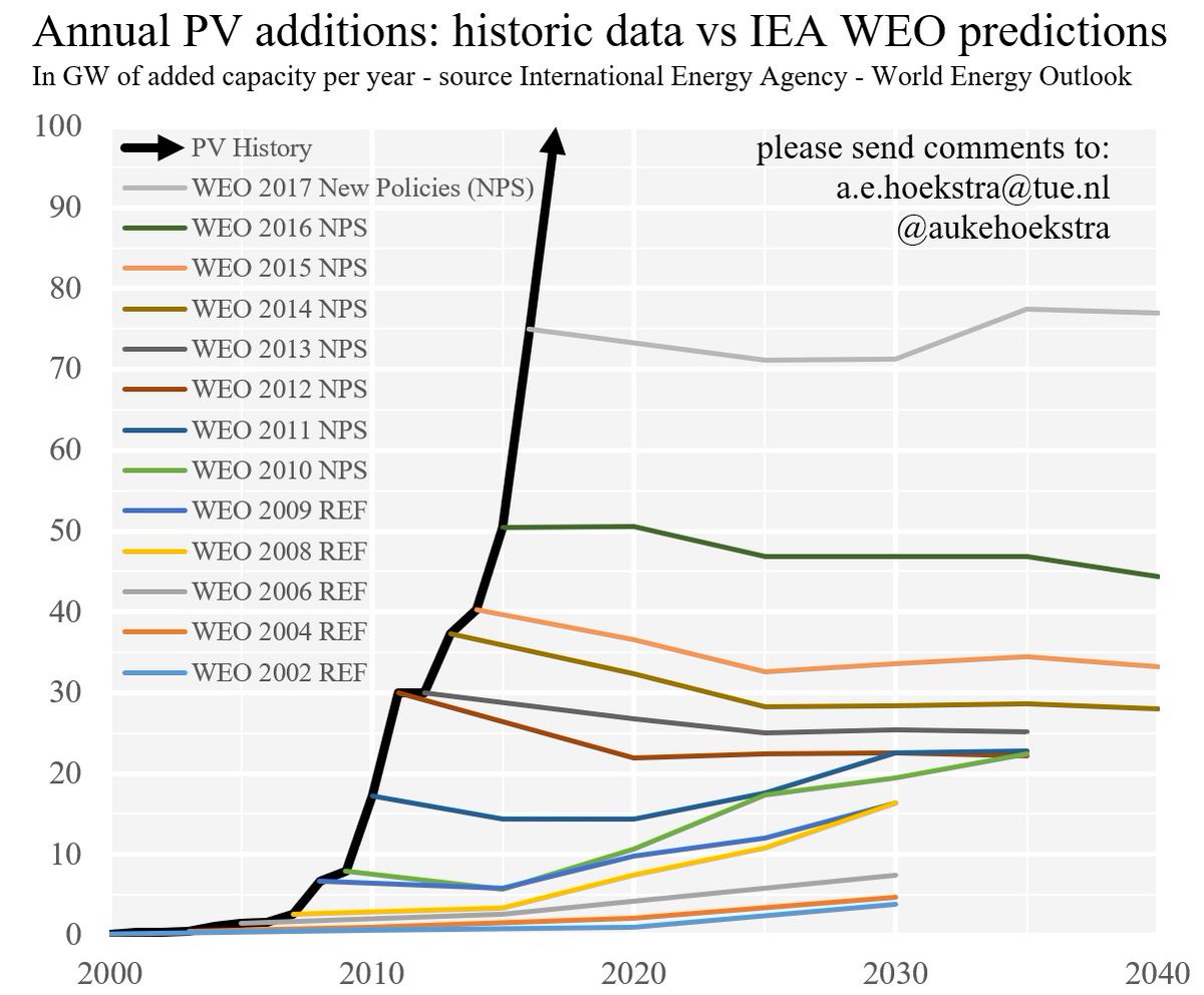
The Cheshire Cat posted:You have to admire their optimism. it�s just solar capacity added, so it�s the slightly less noble optimism https://steinbuch.wordpress.com/2017/06/12/photovoltaic-growth-reality-versus-projections-of-the-international-energy-agency/
|
|
#
¿
Nov 20, 2017 18:54
|
|
|

|
|
#
¿
Dec 1, 2017 06:07
|
|
|
steinrokkan posted:If your business can be upended by a flat fee of 35c per monthly subscription, you shouldn't expect your business to survive for very long. most patrons donate a buck or two a month (since if you donate more than a buck or two a month to a podcast or webcomic then imo you belong in jail for being a weirdo or sex pervert) and so the people who use patreon rely on volume of low donation subscribers. Doubling the amount of fees on these (in the case for $1/mo) hurts.
|
|
#
¿
Dec 7, 2017 16:39
|
|
|
Carbon dioxide posted:
i laughed at the drawing of the fat mouse
|
|
#
¿
Dec 9, 2017 18:06
|
|
|
frankenfreak posted:Someone make a authoratian/libertarian/left/right graph already! u got it chief 
|
|
#
¿
Dec 9, 2017 22:21
|
|
|
checks out 
|
|
#
¿
Jan 1, 2018 18:28
|
|

|
Irradiation posted:There is nothing wrong with that graph. Year is meant to be used ordinally, so it�s silly to give it a categorical color map (and a lovely not-color-blind-safe one at that), but I�d give it a 7/10. Also the trends seem to be mostly linear, so a table or bar chart with just the slope term would do a better job of conveying the rate at which the forecasting is getting better, if that�s the intent.
|
|
#
¿
Mar 10, 2018 00:13
|
|
|
cinci zoo sniper posted:Hotdog with egg whites and ketchup, my favourite.
|
|
#
¿
Mar 19, 2018 16:46
|
|
|
sankey? more like sucky
|
|
#
¿
Mar 27, 2018 20:36
|
|
|
alluvial? more like effluvial flow diagrams? more like flawed diagrams etc etc
|
|
#
¿
Mar 27, 2018 21:01
|
|
|
Powered Descent posted:A nice simple awful graph from the cursed images thread. I think it's okay. It's supposed to illustrate the great famine, and show that, at a time of growth for the continent, Ireland saw a huge decline from which it recovered only recently. The dual axes don't bother me because I don't think anybody would think that Ireland is bigger than Europe, and it makes the trends easier to compare.
|
|
#
¿
May 3, 2018 03:57
|
|
|
the whole thread is a roller coaster of bad graph emotions https://twitter.com/dynarski/status/996884468907610112 
|
|
#
¿
May 17, 2018 21:25
|
|
|
it was an april fools joke post
|
|
#
¿
May 28, 2018 23:33
|
|
|
DarkHorse posted:Loss edits gettin good
|
|
#
¿
Jul 20, 2018 00:53
|
|
|
Carbon dioxide posted:
I implemented that in D3 (under the assumption that there's a bezier transition from "normal" to "compressed" ticks) and it gets even more devious when stuff moves into and out of the region of focus e: example: 
Tree Goat has a new favorite as of 05:39 on Jul 24, 2018 |
|
#
¿
Jul 24, 2018 05:07
|
|
|
i like the part in blindsight where the vampire uses screaming human faces as high dimensional data visualization and it turns out in the references that the author was assuming that chernoff faces were the gold standard high tech technique for multidimensional data
|
|
#
¿
Sep 26, 2018 19:37
|
|
|
ishikabibble posted:Is yes. the variables are age-standardized incidence rate, proportion of incident cases, time trend in incidence, mean age at diagnosis, histological verification, mortality/incidence ratio, death certificate only cases and duration of cancer registration. they map to mouth curvature, hair length, # forehead wrinkles, nose height, ear height, eye height, eye vertical position, and mouth vertical position. the exact mapping is behind a paywall and i can't be assed to look it up. so the whole idea with chernoff faces is that we're good at summarizing/clustering faces rapidly (like, we're extremely good at finding the single frowning face in a sea of smiling faces, or determining if a crowd of people are generally happy or sad), so you come up with a mapping (the original paper used 13 or so dimensions including face shape and so on) and then you cluster the faces together or identify outliers (so dixville's "iowa is tripping balls" is a legitimate insight in this epidemiological dataset). here's an example from the nyt:  an unfortunate set of problems is that these suck so bad and that's not how face perception works really and you have to get really lucky with your encodings for you to reliably see anything important.
|
|
#
¿
Sep 27, 2018 12:44
|
|
|
The Cheshire Cat posted:Another problem is that facial expressions carry emotional meaning loaded into them, and if you map your variables badly, you might end up with say, Miyagi up there who's just so loving pleased with himself about getting lung cancer. right, for instance: (not my work, thankfully) 
|
|
#
¿
Sep 28, 2018 01:07
|
|
|
steinrokkan posted:Has there been any research on how logarithmic scales influence the perception of the average person, and on how they respond to normal vs logarithmic graphs? a little bit and the answer is mostly �people don�t interpret log scales correctly� especially in things like bar charts where people are comparing the heights directly rather than reading off the legend
|
|
#
¿
Sep 29, 2018 23:29
|
|
|
Mamkute posted:I'm the autism spectrum as an ideological position Count Roland posted:I suspect we all are, in this thread. 
|
|
#
¿
Oct 2, 2018 03:57
|
|
|
Blue Footed Booby posted:A huge portion of the math articles are like that because they're written by and for grad students, who have zero interest in making them accessible but extreme interest in making them rigorous and succinct. I wrote Way Too Many loving Words about this problem a few years ago: https://medium.com/@Birdbassador/wikipedia-the-internet-and-the-inequality-of-passion-1c4a690a26ee
|
|
#
¿
Oct 25, 2018 14:26
|
|
|
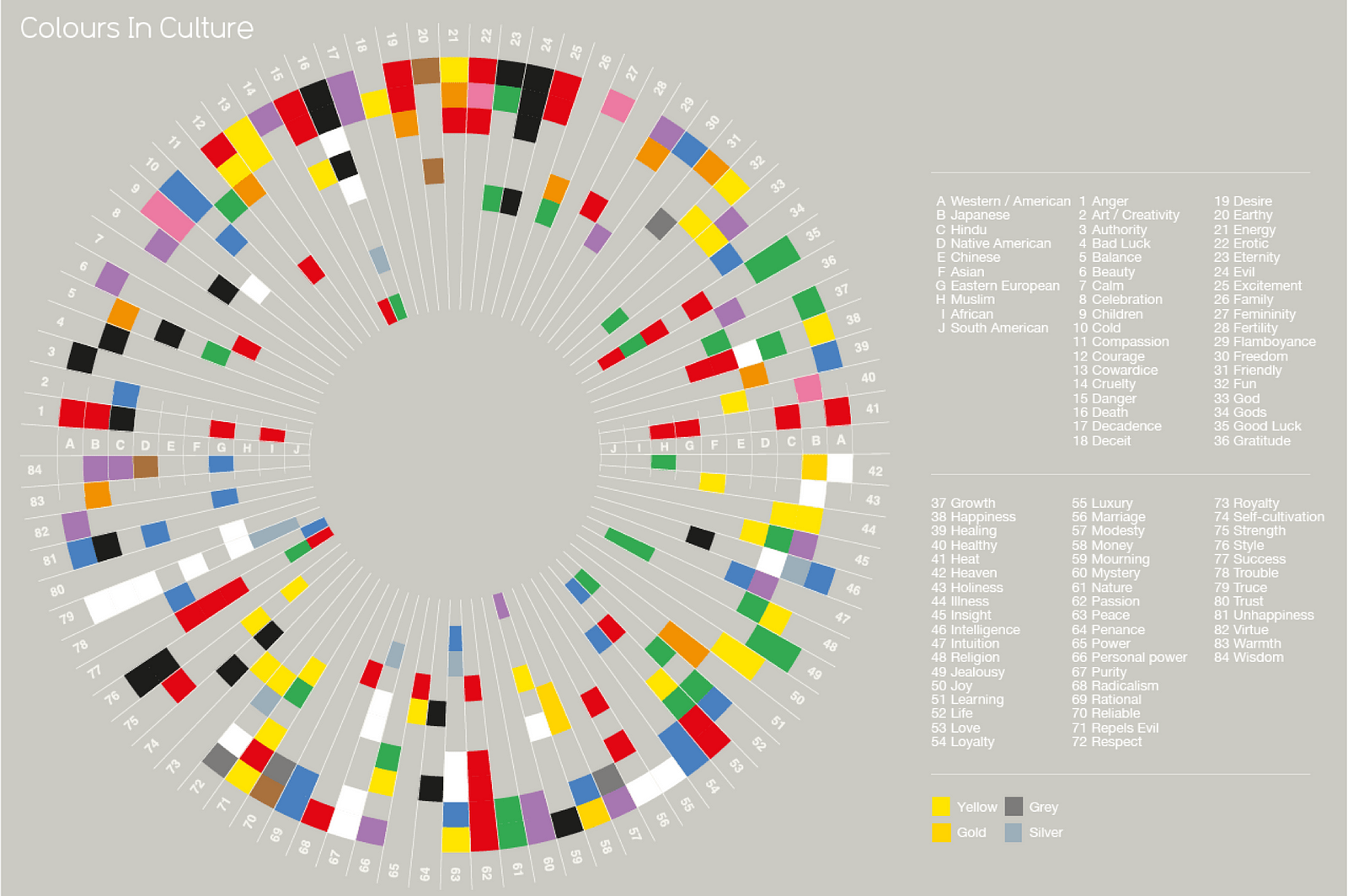
Kennel posted:I kind of like this (text is irrelevant). reminds me of w.e.b du bois's charts of african american demographics 
|
|
#
¿
Oct 29, 2018 13:08
|
|

|
the only way for a self-driving car to behave ethically is to do donuts and then jump off ramps and then crush cars with its big tires and then fire comes out of the exhaust and also the self driving car is a monster truck and all other vehicles are illegal
|
|
#
¿
Nov 7, 2018 22:33
|
|
|
Somfin posted:Yeah, it's the colour of the painting, mapped to the x and y axes by distance from the lower left corner horizontally and vertically. 
|
|
#
¿
Nov 8, 2018 21:44
|
|
|
that's one of the graphs that made stephen few sooooo mad at mccandless that he refused to do an ama on /r/dataisbeautiful because he thought that it was too close to mccandless' information is beautiful book and he didn't want to be perceived as supporting him in an way. he also wrote a blog post about how he was mad that somebody didn't use their platform at a university to denounce mccandless giving a talk there previously.
|
|
#
¿
Dec 5, 2018 20:40
|
|
|
Aleph Null posted:I just got a license for Tableau recently so let the games begin! have fun
|
|
#
¿
Dec 18, 2018 00:32
|
|
|
dedede is a king, dumbass
|
|
#
¿
Dec 20, 2018 05:53
|
|
|
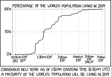
shouldn�t the x axis start at 5:00 EST
|
|
#
¿
Dec 31, 2018 22:14
|
|
|
I�m just counting the number of ticks from 1000 to 1330 EST and they don�t add up
|
|
#
¿
Dec 31, 2018 22:49
|
|
|
every other x axis label has a gray vertical line indicating its position in the main chart, including the 1000 EST tick (but at the incorrect location given the linear axis). i think it�s just mislabeled (as 1000 GMT instead of EST, say)
|
|
#
¿
Dec 31, 2018 23:20
|
|
|
Krankenstyle posted:Might still be problems with data collection. How do the subjects pick their preferences, do they know the age associated with the image etc he talks about more in his blog which he turned into a book "dataclysm" here's him talking about it for an hour https://www.youtube.com/watch?v=YX1gTVa1N78 tl;dr to the question of "how did they collect this kind of preference data" the answer was "extremely irresponsibly"
|
|
#
¿
Jan 9, 2019 21:09
|
|
|
i guess i should be more explicit that i'm not a big fan of this guy and the methods he uses (especially the way that he sort of sweeps all ethical concerns under the rug with a "gee ethics sure is a complex topic, also if we tried to address the racism and safety concerns in our platform in a way that impacted usability for straight white dude they'd just move somewhere else so our hands are tied")
|
|
#
¿
Jan 9, 2019 21:12
|
|
|
Aleph Null posted:My first thought was, "Jesus Christ, dudes are gross." his extremely unsatisfactory answer when asked about this was that they didn't have enough data about trans folks, but that gay men had "pretty much the same" preferences to straight men w/r/t age and attractiveness preferences. i think there is a chart somewhere on his blog
|
|
#
¿
Jan 10, 2019 18:16
|
|
|
https://twitter.com/aftertheboop/status/1085244367865085953
|
|
#
¿
Jan 15, 2019 21:11
|
|
|
TinTower posted:At least it wasn't Provo's old flag. my old man�s a provo // with a gradient and a gun
|
|
#
¿
Jan 26, 2019 01:13
|
|

|
https://twitter.com/brendankoerner/status/1105943375738478592
|
|
#
¿
Mar 19, 2019 21:20
|
|
|

|
| # ¿ Apr 25, 2024 21:30 |
|
|
do your patriotic duty and only eat tayto crisps
|
|
#
¿
Mar 25, 2019 16:49
|
|