

|
Hello goons! So I'm an aspiring animator who's currently practicing art related poo poo over the summer. As of late, I've been dabbling with designing characters that I've mostly drawn free hand for some time now. Basically, I want to make them more "structured," or "designed," if that makes sense. Problem is, I don't know jack poo poo about character design on a technical level  So I thought I'd come here for advice on what I've got  Here are some of the characters I've been designing, with the basic lines and some references for the shoe the dude on the right has.   And for shits and giggles, here are the two dudes with both the basic lines and references lines. As well as the reference lines alone. Keep in mind, I'm focusing on the actual design of the characters and not so much their actual heights compared to one another. The nerd guy is meant to be MUCH shorter than the dudebro, but I'm mainly focusing on anatomy and basic looks. That being said, there are some parts of these two that I'm not *huge* fans of. For example THE HANDS OH gently caress ME I DON'T KNOW WHY BUT I HATE WHAT I HAVE FOR HANDS  LIKE THIS WHAT IS THIS poo poo I HATE IT IT'S LIKE A BABY HAND JESUS CHRIST  This one I don't hate as much but I don't think it looks all that great. I'm obviously going for a sort of "Ren and Stimpy" like cartoony look but I think this hand (among other things) looks a bit lumpy.  And speaking of lumps, I'm not a big fan of the nerd's legs. They seem a bit "plump" to me.  Finally, I've had a dickens of a time trying to get the dudebro's shoes right. This isn't super bad IMO, but I do think it could use improvement somehow. Thankfully I'm taking a class about animation design in the fall, but seeing as I'm trying to practice this poo poo over the summer, any and all advice and critiques would help. At the risk of sounding like an edgy teen, I can take any and all criticism, no matter how harsh it may be, just as long as it's honest and constructive. So tell me what you think with 100% honesty and I'm all ears. PortalFreak fucked around with this message at 05:01 on Jun 30, 2017 |
 #
?
Jun 30, 2017 04:54
#
?
Jun 30, 2017 04:54
|
|

|

|
| # ? Apr 25, 2024 07:44 |
|
|
Bumping this thread shamelessly
|
|
#
?
Jun 30, 2017 19:22
|
|
|
My recommendation is the same as it is for all novice animators: do life drawing, a lot of it. Even if your aim is to do highly stylized characters, life drawing will give you a better looking end product both in terms of character design and in convincing movements. With regards to these specific sketches, you may want to give the nerd more jaw space, if you plan to animate him talking (his mouth is too cramped to move as it's presently sized). Alternatively you could give him a really tiny mouth. The hoodie guy is generic, but otherwise fine. You may find the shoe's exaggerated appearance difficult to maintain as it changes and deforms in his walk cycle.
|
|
#
?
Jul 1, 2017 19:23
|
|

|
Theokotos posted:My recommendation is the same as it is for all novice animators: do life drawing, a lot of it. Even if your aim is to do highly stylized characters, life drawing will give you a better looking end product both in terms of character design and in convincing movements. This is all really good, thanks! On a side note, I'm obviously keeping up with life drawing as well as designing characters, not to ignore your advice there, tho. Also, not to make this the only thing I take away from what you say, but I agree the hoodie guy's a little generic. Although I do plan to sort of go all out with poses and such. Like going off of model (not to the point where you couldn't recognize him ofc, just sort of on a similar level to what 'toons such as Ren and Stimpy did/do), make his movements and poses exaggerated when needed, etc. I do want to do that with other characters I'll design (i.e. make it part of my overall style), but I definitely think it'd add a LOT to the hoodie guy, and by extension it'd be needed if that makes sense. Besides, I could also make his body less rectangular as well
|
|
#
?
Jul 1, 2017 20:49
|
|
|
You may have already done this, but if you want to go off model, it's helpful to me to get a solid "skeleton" in place, so that when you exaggerate a gesture you have a baseline to return to. It'll also help you create rules for more oddly shaped characters like your nerd. I sketched in skeletons to demonstrate what I mean. The nerd's skull doesn't conform exactly to what you've drawn, but is a good guideline for where you would place his facial features throughout an animation. Outlining the joints, waistline, and spine allow for you to predict a more fluid movement path.
|
|
#
?
Jul 1, 2017 21:20
|
|
|
Also I just noticed-is the nerd wearing a hat, or is that nub his ear? If it's an ear the glasses arm should go over it not under it, if it's a hat, it should more obviously be a hat.
|
|
#
?
Jul 1, 2017 21:43
|
|
|
Theokotos posted:Also I just noticed-is the nerd wearing a hat, or is that nub his ear? If it's an ear the glasses arm should go over it not under it, if it's a hat, it should more obviously be a hat. It's his ear but that's intentional. Not to be butthurt about what you said obviously, but I just thought it'd be funny to have his ear like that. Funnily enough, I posted this pic on another site for advice and someone said the same thing
|
|
#
?
Jul 1, 2017 22:27
|
|
|
It can work with the glasses arm below the ear; the ear just has to be recognizable as an ear-in the current iteration it isn't, and next to the hoodie guy the shape strongly resembles his hat, so it's a bit confusing.
|
|
#
?
Jul 1, 2017 23:51
|
|
|
Theokotos posted:It can work with the glasses arm below the ear; the ear just has to be recognizable as an ear-in the current iteration it isn't, and next to the hoodie guy the shape strongly resembles his hat, so it's a bit confusing. Fair point. Upon reflection, actually I would usually put a sort of squiggle shape to show the inside of a cartoon ear (e.g., the "G" shape in the hoodie guy's ear), and I simply forgot to do that for the nerd's ear.
|
|
#
?
Jul 2, 2017 00:00
|
|
|
Yeah, if you match the design to the hoodie guy ear it'll be recognizable
|
|
#
?
Jul 2, 2017 00:12
|
|
|
Also, not to only focus on one thing and ignore everything else, but other than life drawing (again, not to ignore that bit of advice), what would you suggest for stuff like hands? I figure one way would obviously to practice real hands but also to stylize the studies, as seen here: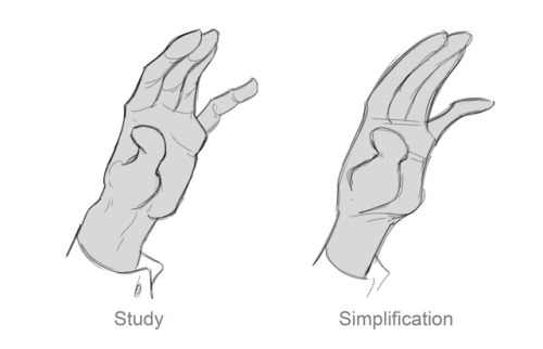 But I'm also curious as to what else I could do, I suppose.
|
|
#
?
Jul 2, 2017 01:42
|
|
|
Hands are actually my favorite thing to draw; the hands you're currently doing (the backwards hook) are reminiscent of a lot or recent kids cartoons, particularly on nickelodeon . If you want to learn how to articulate that shape I'd recommend looking jhonen Vasquez's art, as he favors that shape in his comics and cartoons, and uses it effectively. If you want to go the four fingered style I'd recommend Disney, warner bros (standard looking hands) and the simpsons (fat, rounded hands) as a broad example pool that's easily accessible. My personal favorite artist for hands is Jamie Hewlet, particularly back in the tank girl days. Wrt general hand anatomy, I do fairly stylized work, and utilize strong line work to suggest underlying bone and musculature. I've found it helpful to break the hand down into geometric parts, the same as any other body part. The palm is a shape of your choice (circle, square, rectangle, oval typically) the first joint/thumb knuckle comes off the side in a shape close to an Isosceles triangle, and the fingers are in a slight arch based on their length (middle being longest, then pointer, ring and pinky) I use my own hands as a reference, most often, so what I draw tends to reflect stylized/modified version of my own features (prominent knuckles, large palm, etc) I also pay close attention to other people's hands. Sorry for the wall of text, but I love hands. E: to more succinctly answer your question about hands, I think my answer is: look at how other people do hands, then combine the observations you have about other people's methods/styles with practice from anatomy studies and life drawings. Theokotos fucked around with this message at 22:55 on Jul 2, 2017 |
|
#
?
Jul 2, 2017 18:20
|
|
|
Theokotos posted:Hands are actually my favorite thing to draw; the hands you're currently doing (the backwards hook) are reminiscent of a lot or recent kids cartoons, particularly on nickelodeon . If you want to learn how to articulate that shape I'd recommend looking jhonen Vasquez's art, as he favors that shape in his comics and cartoons, and uses it effectively. This is honestly the most helpful wall of text I've ever read honestly. And I agree! Hands are really fun to draw.....Not to mention one of the hardest things to draw as well
|
|
#
?
Jul 2, 2017 22:52
|
|
|
haha, yeah, across cultures humans talk with their hands and varying degrees of gesticulation; animation is all about movement, so nailing down body language and hand gestures is pretty key. E: oh yeah, I forgot, this website is good for practice/ref photos, and you can tell it to feed you a bunch of body part specific images here: https://www.quickposes.com/en/gestures/random Theokotos fucked around with this message at 23:05 on Jul 2, 2017 |
|
#
?
Jul 2, 2017 22:58
|
|
|
For the long run, keep practicing drawing. Your lines indicate a lot of uncertainty on your part about how everything works and fits together, and that'll change as you get better at drawing. You should work on your gestures and lines of action especially. You mentioned John K, even in his super rough sketches, his lines are confident, he knows exactly the motion he's trying to convey and draws the line in one long fast stroke, which prevents the weird lumpiness you dislike about your nerd's legs. An example grabbed from his blog: In the short run: draw a turnaround for your characters, draw them doing different things, see how they work doing different actions. I have no idea how these characters will look from the front, and I suspect that you might not either. Figure it out now ") Also, what will the final style look like? Take one of these guys to how you envision the final product will look, rather than just a quick sketch. Also, what will the final style look like? Take one of these guys to how you envision the final product will look, rather than just a quick sketch.But most importantly keep drawing, lots, and asking people who are better than you for feedback.
|
|
#
?
Jul 3, 2017 19:36
|
|
|
  HOLY HELL AN UPDATE HOLY HELL AN UPDATE So I've been working on the design of the hoodie guy, based on the suggestion made by Theokotos, with some artistic liberties of course.  And here's the dude with just the main lines and the reference lines:   I think his pants/legs and shoes are a LOT better, plus he's more curved than he was in the pic of him in my OP. Having a dickens of a time trying to get the hands right (basically I'm trying to copy his hands from the first design), but other than that, I think he's shaping up rather well, all things considered. At any rate, I just decided to show this for kicks and giggles, as well as more potential advice (not that the advice I've gotten thus far is bad or anything).
|
|
#
?
Jul 8, 2017 00:49
|
|
|
Adding this since you were asking for advice on hands earlier and no one posted it (for shame!): https://line-of-action.com/practice-tools/hands-feet-practice/ That aside it's hard to give you much advice on your character designs with so little information. Who are these people? What's their function in the story? What kind emotion do you want them to elicit from your viewers? You see, the key to good character design IMO has less to do with technical proficiency (though that's still important) and more to do with clear communication and controlling the assumptions your viewers make when they look at your designs. So for example if you want to make a character appear suspicious you do things like make them lanky and give them small, squinty eyes. Of course, you can get much more subtle/abstract about it than that (line quality, posture, props, clothing, silhouette, color schemes, textures, etc), and you're free to subvert these assumptions later, but the important thing is that you know what you want to say and communicate it effectively. Master this, and you can accomplish quite a lot even with minimal technical skills. For an example of this in action I'd point to the goon-run webcomic It Hurts (occasionally NSFW): http://gobolatula.com/ithurts/  Now, if we're being brutally honest Gob's not the greatest artist on a purely technical level. The man breaks all the art rules all the time. Yet despite this his comics are still pretty fun to read. Why? Because Gob is secretly a pretty good writer and his art very effectively communicates what he needs it to. His character designs are generic, but they're competent *enough* to not get in the way and they tell you what you need to know to follow the story. Pasq is a child but not terribly extraordinary. He has big round eyes and a big head which communicate innocence and wears khakis and a polo shirt which shows that he's a touch uptight and socially awkward. He's pale, showing that he doesn't go outside much, and his expressions generally reveal him to not be the sharpest tool in the shed. In short, every element of the design, while crude, works towards what Gob is trying to do. My point is that I can't really give you terribly great advice since I don't know what exactly it is you want to do with these characters. The best advice I can give you at this point is to design with these things in mind while continuing to expand your technical skillset. Your nerd is actually not terrible on this front (He has personality and I get what you were going for) but your slacker was less successful. Who's he supposed to be exactly? Adding a slouch was a good decision (though your pose didn't factor in the character's pelvis. Always draw the figure under the clothes!) but I still don't know what you want me to feel about him. Is he supposed to be likeable or do you want the audience to think he's a goober? Is he smart or dumb? Young or old? His big head and backwards hat indicate youth but his thin hair and long features indicate someone older. A large part of the problem is his eyes. He kind of resembles Dr Doofensmirch but lacks the Dr's eyebrows, which makes him far less expressive. The eyes also don't quite match which is a tad offputting.:  As a learning exercise I'd also consider trying to redesign your characters as if you were planning to render them in 3D. Draw them from multiple angles and ask yourself how you'd turn them into action figures if you had to. Doing this will help you understand them as forms that take up space in their world rather than abstract symbols. Believe it or not most artists, even those who who do heavily abstracted work, are thinking largely in three dimensions. That's why Disney can make figurines of Phineas despite his bizarrely shaped head:   Some figure drawing lessons could also help. While, again, they're not essential to making enjoyable art they do provide a set of tools that will be very helpful in getting your ideas across. I'd recommend starting with proportions since they both let you fix your mistakes and help you exaggerate/caricature. And as always, finish a ton of work. That will improve your skills faster than anything else. Good luck! Hope that was useful. readingatwork fucked around with this message at 02:48 on Jul 9, 2017 |
|
#
?
Jul 9, 2017 02:45
|
|


|
readingatwork posted:Adding this since you were asking for advice on hands earlier and no one posted it (for shame!): Funnily enough, these characters' personalities have been established in my head, so I do have ideas as to who they "are," so to speak. I just never brought it up cus I was focusing on anatomy and the such I've used them in a couple of animations in the past tho, both of which were done without proper knowledge of anatomy, structure, etc. They don't look *********terrible********* , but there a LOT of anatomical errors (among other things, heh). That being said, their personalities do show in both projects https://www.youtube.com/watch?v=ZHxDgGFTv_0 https://www.youtube.com/watch?v=lG1HjztWUxQ So, as you'd imagine, the nerd is Albert, and Ian is the dudebro. Albert is supposed to be the brains (obviously) of the duo, but at the same time, I see him as a sort of socially awkward and nervous, yet kind-hearted guy overall. Ian, on the other hand, is the kinda guy you'd likely see at a frat house more than a college classroom, being the dudebro that he is. I want to make the chaotic over-the-top nature of stuff like the animation/poses/movements in general a staple in my style, but I definitely think that it would help with Ian A LOT as well. Not just because his design (as of now at least) isn't anything to write home about (thus making any and all "off model"-ness of him adding more to him), but also because I imagine him to be quite an outrageous personality/guy overall. Not trying to undermine what you said, of course. All the advice in the thread in general is great (I know I keep saying that, heh), but I just thought it'd be interesting to give a little insight about how I see my characters.
|
|
#
?
Jul 10, 2017 01:25
|
|
|
I think it's really cool that you've completed a couple of shorts already. Lots of people who want to study animation never even do that, and it shows a lot of effort on your part to take something like that and get it done, and post it out there for everyone to see. What I can see, based on the sketches you posted and those two shorts, are that there are 2 big things holding you back right now. The first is that you do not know how to draw. Fortunately, this is pretty easy to fix, just go out and draw a lot more for a very long time. A lot of your animation beats and gags are failing, not because you don't understand the timing or the medium but because your drawing skills aren't good enough to convey what you want. The gross-up close-up shot of the jock character at :46 in Chemical Conundrums, for example, loses a lot of impact because the drawing looks like it was done in MS Paint, when I'm sure what you are going for is a guache-textured super-detailed drawing like below:  Similarly, your character designs suffer a lot because there's a lot of inconsistencies in the "model sheet" drawings that I'm sure are not intentional - Albert's eyeglass lenses and Ian's eyes are two different sizes and point in different directions, your characters look like they're drawn with a mouse most of the time, lots of bumpy wobbly lines and a lack of smooth curves. This'll improve a lot on its own as you draw more, but right now it's the main thing that's detracting from your cartoons. The second thing, something that I hope you'll consider, is that your characters just aren't very interesting. You've created stereotypes rather than characters, and nothing either character does surprises me or makes me think there may be something unexpected lurking in them. "Generic" is almost always never a good end goal for a character design. I'm not saying that you need to hint at Albert's dark past or give Ian some dramatic backstory or whatever, but taking characters designed to be generic stereotypes and putting them in the most generic setting imaginable (Two different people are forced to be roommates!) is super boring and tells me you just started with the first idea that came into your head, rather than refining it and coming up with some hook to give the viewers something more unexpected.
|
|
#
?
Jul 10, 2017 20:29
|
|
|
gmc9987 posted:I think it's really cool that you've completed a couple of shorts already. Lots of people who want to study animation never even do that, and it shows a lot of effort on your part to take something like that and get it done, and post it out there for everyone to see. Late rear end reply, had RL stuff to deal with. One thing I should've noted: the two shorts are REALLY old. Conundrum's from 2013, when I barely had any artistic skill and before I got into college, and the second one was when I was in college and my artistic skills were "better," but not as """good""" as they are now. As of late, however (as well as in general) I have been keeping up with practicing drawing and art related stuff overall. As for Ian and Albert's personalities, I do agree. As of now they really are stereotypes. When I made those two shorts, I feel like I could've done a lot more with their characters, especially since I have a few ideas for what to do with them. Granted, it's not enough to make them fully fledged out, but it's something. With Albert, I see him as an intelligent kinda guy, obviously, but also the type of person that tries to be "safe" a lot of the times. This might play into the nerd stereotype a little bit, but I see Albert as a sort of altruist that constantly tries to be nice and polite all the time, despite his social awkwardness. Again, really pertains to the nerd stereotype, but the great Christian Weston Chandler once said, "I'm workin' on it!" As for Ian, I obviously made him into a dudebro kinda thing, yes. He's not the brightest lightbulb in the shack, and he likes to party and slack off in general. That being said, however, I see him as the kinda guy that thinks outside of the box in a lot of ways. He might see a trend or a popular belief that he's skeptical about and see it in a different, more rational way. I almost want to call him "rebellious," but he's not really "rebelling" anything or has any kind of agenda (that and it just sounds kinda cringey). He just sees how things are and says how he sees them, if that makes sense. He might be crude sometimes, but at the same time, he likely has a point not a lot of people think about. I intend Albert, on the other hand, to be sort of the opposite of Ian. I have this idea that they both got out of the same college early (Albert graduates early being the genius he is, while Ian gets kicked out for being the n'er do well he is), and end up moving into the same apartment room together. Yes I know this has been done to death, and it needs tweaking in a lot of places, but I like to imagine the dynamic between Ian and Albert being a good outlet of sorts for social commentary/not specifically social commentary (if that last one makes sense), because I see Ian and Albert's dynamic being something like "an outside thinker meets a normie." Obviously, I'm not saying this cus I'm butthurt about what you said or that I'm trying to be "NO gently caress YOU MY OC IS THE BEST," I just felt like sharing how I see my characters thus far and giving a little more insight.
|
|
#
?
Jul 12, 2017 23:35
|
|
|

|
| # ? Apr 25, 2024 07:44 |
|
|
Wrt developing unique character personalities: when I started actively working on character development I found those stupid personality quizzes posted on live journal etc were handy question sets that made me consider foundational human aspects of my characters. Even if it's never relevant for a second party to know your nerd character's favorite ice cream (or whatever), information like that informs narrative decisions you make about him. The little paragraphs you wrote about the characters is a start, but as another poster mentioned, it comes across as very generic; you're describing (stereo)types, not unique personalities. The physical dev of the characters is coming along tho-like I said, and I think someone else echoed, even if you're doing exaggerations and deformations, you must have a baseline to return to, and an understanding of where all the joints/internal anatomical structure is at any given point.
|
|
#
?
Jul 21, 2017 20:15
|
|