


|
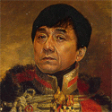
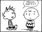
lofi posted:Uh, I think you'll find fire isn't very effective vs steel. Just hit it, ehm, twice? My entry is simply this:  oh drat, that picture sucks so bad but I wanted to snap it with the paint still wet.
|
 #
?
Jan 23, 2020 19:56
#
?
Jan 23, 2020 19:56
|
|


|

|
| # ? Apr 26, 2024 12:18 |
|
|
Am I on time for a change?
|
|
#
?
Jan 24, 2020 03:11
|
|

|
You are, I'm kinda worried for mine. found out that a glue I really like doesn't dry in the cold. also, that's really great
|
|
#
?
Jan 24, 2020 19:02
|
|


|
Just nail it on if glue won't work - 'bad' is far better than 'didn't enter'! 
|
|
#
?
Jan 24, 2020 20:02
|
|
|
138 posted:You are, I'm kinda worried for mine. found out that a glue I really like doesn't dry in the cold. also, that's really great I think adding a few clamps to the final piece would be totally on-theme
|
|
#
?
Jan 24, 2020 20:13
|
|

|
hey, yeah! drill in some braces!
|
|
#
?
Jan 24, 2020 21:40
|
|
|
I wish I had more time to make a proper hellraiser panda. edit:if glue fails things will just get wired into place in a really ugly way double edit : I think I need to buy some fishhooks. 138 fucked around with this message at 01:56 on Jan 25, 2020 |
|
#
?
Jan 25, 2020 01:22
|
|
|
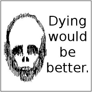
138 posted:I think I need to buy some fishhooks. I want to point out to everyone, this is how you play to the judge. 
|
|
#
?
Jan 25, 2020 02:13
|
|
|
Another one. This one in graphite vs. marker.
|
|
#
?
Jan 25, 2020 08:35
|
|
|
Sigma 6, which is your entry?
|
|
#
?
Jan 25, 2020 19:07
|
|
|
I think I will go with the second. Although I like them both to a degree.
|
|
#
?
Jan 25, 2020 19:30
|
|
|
Do we have another day for this or is the deadline midnight tonight?
|
|
#
?
Jan 26, 2020 04:10
|
|
|
I believe it�s tomorrow night at midnight.
|
|
#
?
Jan 26, 2020 04:13
|
|
|
cool, could use some time to take a new picture of my panda.
|
|
#
?
Jan 26, 2020 04:15
|
|
|
Deadline is 'when I get to my PC tomorrow'.
|
|
#
?
Jan 26, 2020 14:52
|
|
|
I'll try to get a better photo, but just in case I don't here's this: edit: changed my mind. I like the other picture better but this one is angrier. 138 fucked around with this message at 17:54 on Jan 26, 2020 |
|
#
?
Jan 26, 2020 17:43
|
|
|
gently caress this gerbil thing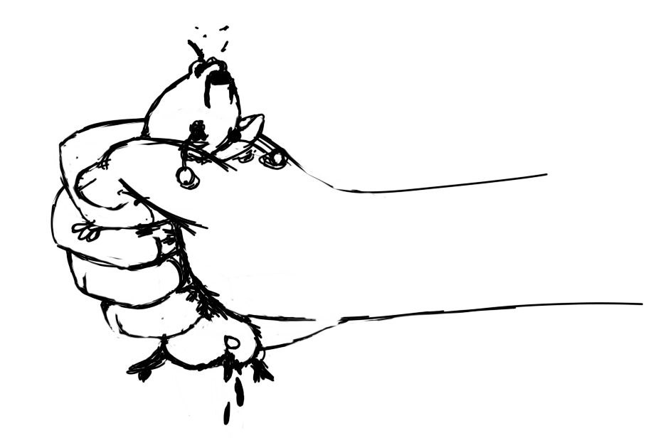
|
|
#
?
Jan 26, 2020 19:00
|
|


|
Upmarket Mango posted:gently caress this gerbil thing Take it easy now, Lenore. I am not saying anything about the panda (?) lest it haunt me.
|
|
#
?
Jan 26, 2020 19:37
|
|
|
Keetron posted:Take it easy now, Lenore. whoa, deep cut
|
|
#
?
Jan 26, 2020 19:39
|
|
|
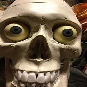
138 posted:I'll try to get a better photo, but just in case I don't here's this: What SCP number is this?
|
|
#
?
Jan 26, 2020 22:59
|
|
|
um, not sure but here's my final entry:
138 fucked around with this message at 03:53 on Jan 27, 2020 |
|
#
?
Jan 27, 2020 03:48
|
|
|
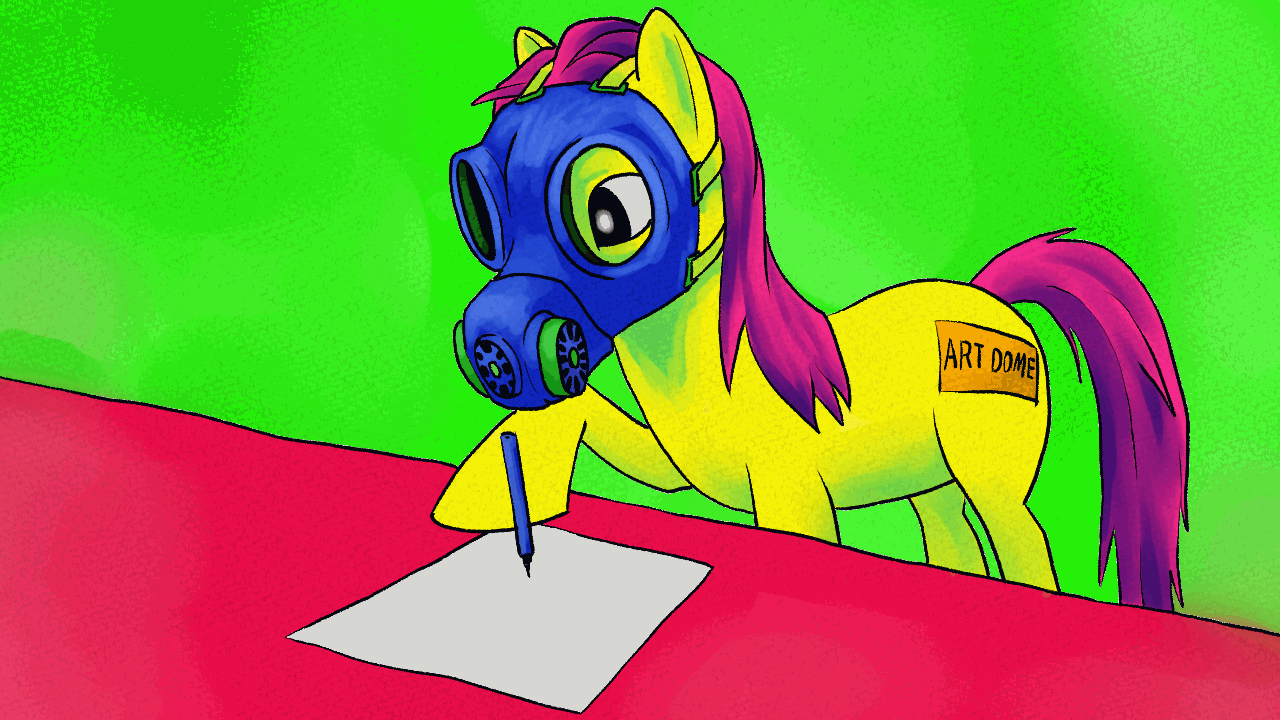
lofi posted:Next challenge is draw your ponysona  This still counts for the prompt because I took something adorable (me) and mixed it with something horrifying (My Little Pony). Also: JFC this turned out so much more disturbing than I intended.
|
|
#
?
Jan 27, 2020 04:18
|
|
|
|
|
#
?
Jan 27, 2020 10:11
|
|


|
Times up, artfans! The winner this time is 138 with their Five Nights at Fursona tribute! Congratulations! The winner this time is 138 with their Five Nights at Fursona tribute! Congratulations!I guess you're the loser too, now you have to live with that thing.  Loads of great stuff here, you all took really fun angles with this. I'll write up crits soon!
|
|
#
?
Jan 27, 2020 13:54
|
|
|
138 posted:um, not sure but here's my final entry: That makes way more (terrifying) sense when not at phone resolution...
|
|
#
?
Jan 27, 2020 14:53
|
|
|
Angrymog posted:
Wow, you got this one done superfast, and really set the bar high (low?) for the others! I should say before I write any more that I know veeery little about pokemans, so some of it might have flown over my head. I really like the idea here, you definitely hit the brief. I don't personally find most pokemon very cute, but that's just my taste, they're definitely a cute-thing, and the super-commercial vibe ties the concepts together nicely. I'm not so keen on your execution, though - your colours look pretty washed out compared to the fully saturated typeface, and the changes in ground level (particularly in the last evolution) are distracting. You've kept to a similar art style as pokemon which is good, but the difference in materials is really obvious and pulls your entry down. I'd look into burnishing and layering coloured pencils if you want to get more vibrant colours with them, I tend to avoid them for exactly this reason though. Your idea was brilliant, and if your follow-through had been a bit better, or if I was more of a pokemon fan, you might well have taken it. Fish Noise posted:HEY LOFI Yeah, OK, I should have stuck to my guns and done a straight ponysona challenge I reckon. Hindsight, etc. Those are some tasty colours, I'm a big fan of super-saturated colours, and it's nice to see a digital entry with some texture to it, I find digital can easily look very flat. The colours contrast well with the monochrome gibbering-skull-bit. The tentacle-reading-bit was superfast, so I had to take a good look in photoshop and...  Holy poo poo, that's my last AV!   That is sweeeeeet! Well, now I'm glad I brought your gif into photoshop, that's such a nice detail. That is sweeeeeet! Well, now I'm glad I brought your gif into photoshop, that's such a nice detail.I like the use of gif, and fast transitions like that are a nice way of making the animation jarring, uncomfortable. So why didn't you win? Well, the thing is... it's still cute! You've taken uber-cute and made it horror-cute! Your entry is really well-executed, it's gorgeous, but it just isn't that creepy. I wanted horror, not creepy-pasta. Keetron posted:My entry is simply this: Well, you said it. That photo does suck, and it spoils your entry. If you're going to do something like this, where the art is only going to be at it's best for a few seconds, set the photography up first. Having the blood be still wet and glistening was a good idea, but you've done your entry a lot of harm chasing it. Hell, even a quick GIMP cleanup would have helped. This is photoshop, but same principle:  All I did was cropped it and hit auto-colour, and it looks so much better. Why can I see your pencil lines? I should not be able to see your pencil lines. Buy a better eraser, and learn how to use it. I feel like you half-assed this one, your concept of making a cute anthropomorphisisation (  ) of your fear was a really good one, and I think you could have made a much better pic of it. Losing teeth is a really common fear, so it's #relatable as well. ) of your fear was a really good one, and I think you could have made a much better pic of it. Losing teeth is a really common fear, so it's #relatable as well.sigma 6 posted:Another one. This one in graphite vs. marker. Not just on time, but two entries, well done! ") I totally agree, mange-dogs are horrific, and definitely taking something cute and make it horrible! You've worked fairly loose here, which I think suits the horror-aspect of what you're going for - suggestion is always more horrible than seeing something in detail. Areas like the muzzle where you've suggested scales work really well, as does the patchy hair. Did you invent the lower neck and body? They have noticably less texture, and feel less convincing as a drawing - the collar looks like it's not quite sitting right either. I think your pic would have been much better if you'd cropped it more tightly, ended about where the collar is. I think you were right to go with your second entry. I prefer the first one as a picture (due to the sepia toning and nicer mark-making), but the second one sells the horror vibe much better. The first one still looks kinda cute, but the second one is a true abomination. I think you were a bit let down by your linework on the second pic, the outlines are very chicken-scratchy. It doesn't hurt this pic as much as it would others, because it maaaaaybe fits the theme, but it doesn't feel deliberate enough to work with the picture. I think you could have made your entry pop more by making the background toned, if it was a dark shade it would fit the horror theme, and make your pic look much more finished. Upmarket Mango posted:gently caress this gerbil thing Utterly unsubtle, crude and violent. I love it. A lot of weeks, you'd have had the win. Your rendering is perfect for the subject, harsh and 'hacked out' - I like how you've worked back into your black lines with white. The poo poo, the eyeballs popped out, they're so childish but they're right for this. It's going to sounds weird, but I like its elegance - you've had a simple idea, and done it well. I'd have liked to see maybe a touch more shading on the gerbil-butt to seperate it from the fingers (it looks a little like an extra finger atm), but you'd have to be so careful to avoid overworking this one. As with Sigma 6's entry above, I think a black background would work better. Especially with digital, you could make such a strong contrast that way, and make it look more finished and easier to read. I find too much white on a monochrome drawing makes it look unfinished. I don't have much to say on this one, really - that's no reflection on it's quality, just that it's such a simple idea. 138 posted:um, not sure but here's my final entry: Just for comparison:  What did you DO?! gently caress me, that thing is horrible. And that's exactly what I was after! I think you've used 3D really well, getting in the sort of texture that would be an absolute nightmare to think of and create in 2D. Your final photograph (by far the better one) makes great use of your surroundings and the perspective to make that horror look person-sized. It looks like a human-sized monster living in your garage, waiting to spring out and murder someone. You've got a very similar vibe to the mange-dog, that sort of patchy nastiness that hints at things rather than showing them all, and you've played to that by half-hiding it and keeping it in the shadows. A photo taken at night or in dimmer light might have worked even better, but with so much black on the model it might become unreadable. Maybe against a white background? Do you know Five Nights at Freddies? Very similar vibe. You use of crude techniques and parts works really well - horror is hardly ever clean and well-lit, it's grimey and half-broken, and you've hit that on the head. The eyes peering out from that broken snout help it read as an animal, otherwise it might be difficult to tell what it is. The teeth are just... teeth are horrid. Let's just get rid of teeth. Well done, A++, would hide from in a darkened amusement arcade again. readingatwork posted:
I... Umm... There's something wrong with your... I'm gonna say 'horse'? I love the way you've blended your chin into the horseneck, and the combination of realistic and weird gives it a nice grotesquery (that's a word, right?). The cutie mark (I hate that those things have a name and I know it) is a really nice touch, as is the way it's living in a cartoony cute world (backgrounds make illustrations better, people!). Did you do the background yourself or borrow it from a legit MLP thing? The slight outline on the... pony... makes me think it's borrowed. Not saying that as a negative, it makes a lot of sense to save time and add authenticity like that. I think my favourite bit is actually the leghoof, it's just so wrong and makes me think of a fly more than a horse. Actually, come to think of it, the whole thing is very The Fly. What doesn't work for me mostly is that the... equine... feels a bit disjointed from the background due to the different rendering styles. I think you could have improved it a lot by blending the two images slightly, maybe giving the nearby hills an outline, maybe some light texture close up. Or you could try knocking some of your lines back (having them be, say, a purple rather than black, disney-style). Maybe give it an apple, tie it together with a prop. Very nice use of hatching, you've made the form feel really 3D. Having to pick just one winner this week has been tough, so many great entries! Thanks*, everyone! So, 138, what's next? lofi fucked around with this message at 18:08 on Jan 27, 2020 |
|
#
?
Jan 27, 2020 18:06
|
|

|
Thanks for the critique! I�ll be sure to keep it in mind for next time. Everyone had great pieces. Can�t wait to see what�s next.
|
|
#
?
Jan 27, 2020 18:26
|
|
|
Thanks for the Crit! The background was done by me but I used screenshots of the show to try and mimic MLP�s color scheme and style. I could have just used a screenshot but I wanted to see what would be involved in making it for myself since color backgrounds aren�t my strongest skill. I think it actually came out a little too close to the source materialthough, so if I had to do it again I�d probably tweak several things to get a more original result. Good prompt Lofi! Now let us never speak It again.
|
|
#
?
Jan 27, 2020 19:07
|
|
|
lofi posted:Well, you said it. That photo does suck, and it spoils your entry. If you're going to do something like this, where the art is only going to be at it's best for a few seconds, set the photography up first. Having the blood be still wet and glistening was a good idea, but you've done your entry a lot of harm chasing it. Hell, even a quick GIMP cleanup would have helped. This is photoshop, but same principle: Good points, all of them. The erasing was done with the paint wet (I forgot to do it earlier) and the smear is a result from that. The whole piece is a "poo poo I doxxed myself and now I need to make something" exersize and you all deserve better. It wont happen again and I'll prep stuff better.
|
|
#
?
Jan 27, 2020 19:39
|
|
|
I don't think there's anyone who hasn't rushed something out to meet a commitment, don't worry about it. ") I was harsh because this is SA, but the point here is to have fun. I was harsh because this is SA, but the point here is to have fun.
|
|
#
?
Jan 27, 2020 19:57
|
|
|
lofi posted:Times up, artfans!
|
|
#
?
Jan 27, 2020 22:23
|
|
|
Thanks for the critique and the kind words all. The next theme is doing whatever you like in the style of german expressionism. Here's a great link if you aren't terribly familiar with it: https://www.moma.org/s/ge/curated_ge/styles/index.html As you can see, it's a pretty loose genre. Almost forgot important details. You have until February 9th to sign up and until the 16th to turn in. 138 fucked around with this message at 04:12 on Jan 28, 2020 |
|
#
?
Jan 28, 2020 04:02
|
|
|
Interesting choice! You�ll want to set a deadline to declare participation and a deadline for submission. I�d recommend Feb 9th and Feb 16th respectively but it�s up to you. E: Also I�ll participate. readingatwork fucked around with this message at 04:14 on Jan 28, 2020 |
|
#
?
Jan 28, 2020 04:11
|
|
|
Yes, I'm in
|
|
#
?
Jan 28, 2020 04:29
|
|
|
Cool, I'm in. I love Schiele's drawings, it'll be fun to mimic him.
|
|
#
?
Jan 28, 2020 10:03
|
|
|
My art history is pretty patchy. Does German expressionism include the dadaist, post-war grotesquery stuff, or is that it's own thing?
|
|
#
?
Jan 28, 2020 12:45
|
|

|
there wolf posted:My art history is pretty patchy. Does German expressionism include the dadaist, post-war grotesquery stuff, or is that it's own thing? Not dada, but definitely post-WW1 grotesquery, Grosz, Kirchner, Beckmann, Kokoschka, Dix, etc.
|
|
#
?
Jan 28, 2020 13:46
|
|
|
Mach ich ja
|
|
#
?
Jan 28, 2020 14:41
|
|
|
lofi posted:Not just on time, but two entries, well done! Thanks for the crit! I originally wanted to ink the second one like the first but ended up going with only graphite when the shading got out of hand. No point markering over too much graphite because it just gets too dark and too difficult to control values. Speaking of struggling with values... I ended up laser burning it but because the midtones weren't there I went back and inked it. Turned out better than the drawing I think and wish I had turned in this as a submission instead.  Oh - count me in for the next one!
|
|
#
?
Jan 30, 2020 16:31
|
|
|

|
| # ? Apr 26, 2024 12:18 |
|
|
I think that would make a lovely context-free gift for someone.
|
|
#
?
Jan 30, 2020 16:45
|
|