|
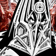
 Flag of the Ukrainian Free Territory.
|
 #
?
Jul 2, 2020 20:56
#
?
Jul 2, 2020 20:56
|
|

|

|
| # ? Apr 26, 2024 04:15 |
|
|
My Russian/Ukrainian is pretty lovely but, um, that top word means '(TO) DIE' I think? Not that the big gently caress-off skull didn't tip anyone off, probably
|
|
#
?
Jul 2, 2020 22:50
|
|
|
Death to anyone who threatens the freedom of working people, or something along those lines I think.
|
|
#
?
Jul 2, 2020 23:54
|
|


|
Guavanaut posted:Death to anyone who threatens the freedom of working people, or something along those lines I think. Yeah basically if my bad russian helps read ukrainian at all. Although honestly it works better as a design if there's just a big DEATH up top imo
|
|
#
?
Jul 3, 2020 00:00
|
|

|
 The flag of Wales, love it or hate it.  The flag of Lovely, a micronation declared as a stunt for the 2005 BBC series "How To Start Your Own Country."  Barbados. The former colonial flag featured Britannia holding Neptune's trident. The broken-off trident head therefore represents freedom from colonial rule.  The US state of Georgia, 2001-2003. The result of a compromise between the Democratic governor and Republican legislators who wanted to keep the confederate flag in some form.  Hamilton County, Ohio. Big energy. I think if the color scheme and proportions were cleaned up it could be pretty good.
|
|
#
?
Jul 3, 2020 02:15
|
|

|
QCIC posted:
Yeah, all that really needs is for the teal to be replaced with either yellow or blue
|
|
#
?
Jul 3, 2020 05:49
|
|


|
Barbelith posted:Coat of Arms chat! Holy poo poo lmao
|
|
#
?
Jul 3, 2020 13:45
|
|


|
Oh, I get it. BARB-ados. Should've been a bident. QCIC posted:
You can't say that story without saying what flag it led to today.  Oh whoops, mixed something up there. This one.  Which if you don't see something wrong with because that's not the racist flag that everybody knows about, well it turns out the confederacy was an absolute joke of a country, a pathetic farce. Not actually a sovereign state in any meaningful way, and the flag that they officially adopted was this.  Great idea, borrowing an actual american flag's iconography to have 13 stars for the 13 original colonies, only 6 of which actually consented to secession.
|
|
#
?
Jul 3, 2020 14:27
|
|

|
SlothfulCobra posted:Which if you don't see something wrong with because that's not the racist flag that everybody knows about, well it turns out the confederacy was an absolute joke of a country, a pathetic farce. Not actually a sovereign state in any meaningful way, and the flag that they officially adopted was this. It gets better. Solders complained that the first flag of the CSA looked too much like the flag of the USA and made things confusing on the battlefield, so in 1863 the CSA changed their flag to "The Stainless Banner"  However that looked too much like a white flag of surrender, so in 1865 the flag was changed again to "The Blood-Stained Banner"  It can't be a good sign when your prospective country changes flags 3 times in five years.
|
|
#
?
Jul 3, 2020 22:09
|
|

|
My God, go back to the original one. Those two look like someone copy-pasted an actual flag into MS Paint.
|
|
#
?
Jul 3, 2020 23:23
|
|


|
SlothfulCobra posted:Great idea, borrowing an actual american flag's iconography to have 13 stars for the 13 original colonies, only 6 of which actually consented to secession. That was basically The Point, a "we're the REAL Americans" thing, plus the Confederacy did admit 13 states.
|
|
#
?
Jul 4, 2020 02:14
|
|

|
QCIC posted:
I like this unironically. This looks like some 1920s Bauhaus art.
|
|
#
?
Jul 4, 2020 10:09
|
|

|
The town of H�rn�sand in northern Sweden has a coat of arms consisting of a beaver with a pike in its mouth. Nowadays looks like this  Original sigil when the town got city privileges in the 16th century 
|
|
#
?
Jul 9, 2020 05:35
|
|

|
Interesting they would put a beaver on their sigil when they had apparently never seen one before.
|
|
#
?
Jul 9, 2020 07:48
|
|


|
The pre-1924 flag of the sultanate of Kelantan was pretty neat even if it violated the no text on flags rule.
|
|
#
?
Jul 9, 2020 12:27
|
|

|
Calligraphy like that seems like it should be allowed on some flags. It's kind of messy, but cool. Just don't put it on anything anyone has to draw.
|
|
#
?
Jul 9, 2020 15:25
|
|

|
Also it's not like those "rules" are anything more than guidelines dreamed up by people because they thought they made sense. Flags are an art, and art breaks rules all the time.
|
|
#
?
Jul 9, 2020 15:54
|
|

|
Count Roland posted:Also it's not like those "rules" are anything more than guidelines dreamed up by people because they thought they made sense. Flags are an art, and art breaks rules all the time. True, but most art is lovely, ergo most flags are lovely, and to break the rules in an interesting fashion, you've got to know them first. Art brut is rarely more than merely interesting.
|
|
#
?
Jul 9, 2020 19:35
|
|
|

|
|
#
?
Jul 11, 2020 00:33
|
|

|
Indonesia/Malaysia looks like an alternative history Stany Zjednoczone Ameryki.
|
|
#
?
Jul 11, 2020 00:56
|
|
|
Vietnam/Philippines is sexy
|
|
#
?
Jul 11, 2020 03:39
|
|
|
Where does the Indonesian pentagon come from since it's not in Indonesia's actual flag design? I suppose it's to represent the pencasila but IRL this is represented by a coat of arms without any pentagon in it.
|
|
#
?
Jul 11, 2020 07:26
|
|
|
Edgar Allen Ho posted:Vietnam/Philippines is sexy A Communist Philippine flag would be super sexy as would a Communist (not connected to PRC) Philippines.
|
|
#
?
Jul 11, 2020 12:06
|
|

|
This is sweet.
|
|
#
?
Jul 11, 2020 12:20
|
|
|
Is this a series? If so, can you post the rest, I don't feel like trawling through miles of Instagram trash 
|
|
#
?
Jul 11, 2020 13:59
|
|
|
Pope Hilarius II posted:Is this a series? If so, can you post the rest, I don't feel like trawling through miles of Instagram trash Europe is just every conceivable tricoleur with a rainbow of union jacks.
|
|
#
?
Jul 11, 2020 14:40
|
|

|
  various combinations of union jacks, seals, and coats of arms on a navy blue or red background. sometimes, a boob.
|
|
#
?
Jul 11, 2020 16:04
|
|
|
Edgar Allen Ho posted:
California x Virginia: a bear, with boob. State motto, sic sempbear tyrannis
|
|
#
?
Jul 11, 2020 16:35
|
|


|

|
|
#
?
Jul 13, 2020 01:12
|
|
|
George says every American should have a vacuum cleaner in their basement. 
|
|
#
?
Jul 13, 2020 01:25
|
|


|
BonHair posted:Calligraphy like that seems like it should be allowed on some flags. It's kind of messy, but cool. Just don't put it on anything anyone has to draw. Arabic is a beautiful language when written down. I can't read it, I don't think I'd have an easy time learning because I can't even really handle cursive, but it sure looks nice. I hope none of these flags has something bad written on them, I wouldn't know.  Like I feel like this would be recognizable even at a great distance, as opposed to how latin alphabet characters tend to blur into little squares  A little accent to the main design, sure. Much better than Tunisia's earlier flag, although maybe not as distinctive.   Also very distinctive, as well as having a cool notable pattern to compliment it. I'm not really sure how this is supposed to be a whole word, but if it is, what an efficient as well as artistic language.  This is apparently "kufic script", which is an alternative arabic writing system that still looks plenty distinct. I like it, it looks like a skyline.  This has been brought up before, and I don't think the words are very readable from a distance, but it is a clever looking design. And all of those flags you can juxtapose next to this piece of trash.  Absolute garbage. All the distinct aesthetic qualities of arabic are missing, this looks like something you could type out with a latin alphabet keyboard, in lower case so it looks even shittier. Poorly written even, the characters are all lumpy. The sole part of the design that isn't just text is a white oval on black that is weirdly lumpy. What a terrible, terrible flag.
|
|
#
?
Jul 14, 2020 02:23
|
|
|
I remember we had a project in the kindergarten where I worked when we learned about different flags. One of my colleagues that's originally from the Philippines informed me that I had accidentally displayed their flag in a manner that indicated that their were at war.
|
|
#
?
Jul 14, 2020 10:59
|
|


|
Alhazred posted:I remember we had a project in the kindergarten where I worked when we learned about different flags. One of my colleagues that's originally from the Philippines informed me that I had accidentally displayed their flag in a manner that indicated that their were at war. Wikipedia confirms 
|
|
#
?
Jul 14, 2020 11:11
|
|
|
Yeah, I was real loving careful about how I displayed the various flags after that.
|
|
#
?
Jul 14, 2020 11:18
|
|
|
SlothfulCobra posted:Also very distinctive, as well as having a cool notable pattern to compliment it. I'm not really sure how this is supposed to be a whole word, but if it is, what an efficient as well as artistic language. Arabic and hebrew denote short vowels with what can be best described in latin as more like accents, so cat could be written as, say, �t, while cot could be čt. Also, the way semitic languages construct words means that you can often get the meaning while dropping the vowel marks entirely. This is usually done outside of stuff like the koran and torah where exact meaning is considered very important. That's why words and sentences can look so concise compared to latin.
|
|
#
?
Jul 14, 2020 18:28
|
|
|
SlothfulCobra posted:
I think this flag is trash on purpose, kind of like brutalist architecture is meant to convey to the individual that they mean nothing.
|
|
#
?
Jul 14, 2020 19:57
|
|
|
I love the City of Portland flag. The green represents the forest, yellow the agriculture and the blue lines represent the two major rivers (Columbia and Willamette) that run through the city. 
Tiger Crazy fucked around with this message at 20:14 on Jul 14, 2020 |
|
#
?
Jul 14, 2020 20:10
|
|

|

|
|
#
?
Jul 14, 2020 20:16
|
|


|
Tiger Crazy posted:I love the City of Portland flag. The green represents the forest, yellow the agriculture and the blue lines represent the two major rivers (Columbia and Willamette) that run through the city. There's something about that offset cross...
|
|
#
?
Jul 14, 2020 22:18
|
|
|

|
| # ? Apr 26, 2024 04:15 |
|
|
Edgar Allen Ho posted:Arabic and hebrew denote short vowels with what can be best described in latin as more like accents, so cat could be written as, say, �t, while cot could be čt. Also, the way semitic languages construct words means that you can often get the meaning while dropping the vowel marks entirely. This is usually done outside of stuff like the koran and torah where exact meaning is considered very important. That's why words and sentences can look so concise compared to latin. It's my understanding that the vowel marks were not originally part of the script (in either case), but later added in some situations to reduce ambiguity.
|
|
#
?
Jul 15, 2020 02:28
|
|