


|
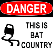
bowser posted:There's also a non silhouette version of that poster. I'm getting a real Occupy vibe from this whole thing.
|
 #
?
Mar 25, 2013 06:29
#
?
Mar 25, 2013 06:29
|
|


|

|
| # ? Apr 28, 2024 21:56 |
|
|
Beyond sane knolls posted:I'm getting a real Occupy vibe from this whole thing. Yeah, but instead of hippies making GBS threads on cop cars and raping women in tent cities after drug deals, it's got walls of hive-mind zombies ripping everything to shreds.
|
|
#
?
Mar 25, 2013 06:38
|
|
|
Gonz posted:Yeah, but instead of hippies making GBS threads on cop cars and raping women in tent cities after drug deals, it's got walls of hive-mind zombies ripping everything to shreds. Yeah good idea, you loving braying jackass, spin the movie posters thread into political territory. That's very much a recipe for success and one of the Seven Habits of Good Posters.
|
|
#
?
Mar 25, 2013 06:42
|
|

|
Marc Forster is very hit or miss when it comes to the execution of his film's concepts. The ant colony/tidal wave imagery is really interesting though, so here's hoping he pulls it off this time.
|
|
#
?
Mar 25, 2013 06:51
|
|
|
Bugblatter posted:Marc Forster is very hit or miss when it comes to the execution of his film's concepts. The ant colony/tidal wave imagery is really interesting though, so here's hoping he pulls it off this time. If you've read anything about it's production you'd know he was a poor choice. Sounds like a loving disaster.
|
|
#
?
Mar 25, 2013 07:16
|
|

|
Tewratomeh posted:I'm just wondering why they bothered basing it on or naming it after World War Z, since I don't recall that book mentioning anything about ant zombies. World War Z was pretty much just a straightforwards Romero rip-off except told in a more realistic documentary style.
|
|
#
?
Mar 25, 2013 07:27
|
|


|
When I read World War Z, I kind of imagined it as a Roland Emmerich film.
|
|
#
?
Mar 25, 2013 07:31
|
|


|
Beyond sane knolls posted:I'm getting a real Occupy vibe from this whole thing. Honestly, based on the trailer and A Buttery Pastry's description of the book, the zombies seem to be an avatar of mindless consumerism. That's not an especially new or controversial take on the genre though.
|
|
#
?
Mar 25, 2013 09:18
|
|


|
Band of Oldboys
|
|
#
?
Mar 25, 2013 09:21
|
|
|
Dissapointed Owl posted:Band of Oldboys This is the funniest boxart.
|
|
#
?
Mar 25, 2013 09:39
|
|

|
    
High Warlord Zog fucked around with this message at 09:48 on Mar 25, 2013 |
|
#
?
Mar 25, 2013 09:45
|
|


|
penismightier posted:Yeah good idea, you loving braying jackass, spin the movie posters thread into political territory. That's very much a recipe for success and one of the Seven Habits of Good Posters. You're right. I assure you it won't happen again in any Finer Arts threads.
|
|
#
?
Mar 25, 2013 09:59
|
|
|
These two are pretty funny.
|
|
#
?
Mar 25, 2013 10:02
|
|
|
The worst thing about that kind of bullshit is that every jackass who makes those thinks they're being totally cute and clever. No wait, the worst thing about those is that they look like poo poo.
|
|
#
?
Mar 25, 2013 10:02
|
|

|
Some guy on DeviantArt made this Episode VII poster in the style of Drew Struzan: Here's a larger version.
|
|
#
?
Mar 25, 2013 10:11
|
|
|
It's an admirable effort and a nice copy of his style, but man are the 3 main cast member's faces melty.
|
|
#
?
Mar 25, 2013 10:13
|
|
|
feedmyleg posted:It's an admirable effort and a nice copy of his style, but man are the 3 main cast member's faces melty. Perhaps they have been injured by Sith lightning between episode 6 and 7.
|
|
#
?
Mar 25, 2013 10:15
|
|
|
What the hell is this supposed to be? Cocaine getting snorted up a straw? I'm stumped.
|
|
#
?
Mar 25, 2013 10:21
|
|

|
Max22 posted:What the hell is this supposed to be? Cocaine getting snorted up a straw? I'm stumped. I still can't work it out either.
|
|
#
?
Mar 25, 2013 10:22
|
|

|
feedmyleg posted:It's an admirable effort and a nice copy of his style, but man are the 3 main cast member's faces melty. I think you have to blame nature for that one, not the artist. Mark Hamill is literally melting at this point. Honestly he made Fisher look way less melty than she actually does.
|
|
#
?
Mar 25, 2013 10:24
|
|


|
Carrie Fisher is going to have to get back on the coke horse if she wants to look presentable enough to appear in any of the next trilogy films. I saw her at the Comedy Central Roast of Roseanne last year, and.....good god. Good god.
|
|
#
?
Mar 25, 2013 10:27
|
|
|
Max22 posted:What the hell is this supposed to be? Cocaine getting snorted up a straw? I'm stumped. Heroin, but yeah I'm pretty sure that's exactly what this dumb loving thing is trying to depict.
|
|
#
?
Mar 25, 2013 10:27
|
|

|
Shanty posted:Heroin, but yeah I'm pretty sure that's exactly what this dumb loving thing is trying to depict. Of all the things that coukd have been on that poster, the final choice ended up being the worst. I don't even know how people are supposed to connect that image with the movie. It would have made more sense to depict a huge syringe stuck into a heart, instead.
|
|
#
?
Mar 25, 2013 10:29
|
|
|
TheJoker138 posted:I think you have to blame nature for that one, not the artist. Mark Hamill is literally melting at this point. Honestly he made Fisher look way less melty than she actually does. Yeah, I've gotta say, he made Carrie Fisher look a lot nicer than she does in real life at this point. I'm also not sure why he drew William H. Macy instead of Mark Hamill.
|
|
#
?
Mar 25, 2013 10:31
|
|


|
Noxville posted:These two are pretty funny. I thought so at first. Then I thought about how someone who hadn�t seen the films would view them. As amusing as they are as posters they suck. High Warlord Zog fucked around with this message at 10:57 on Mar 25, 2013 |
|
#
?
Mar 25, 2013 10:39
|
|
|
Max22 posted:What the hell is this supposed to be? Cocaine getting snorted up a straw? I'm stumped. It appears to be unused cover art for a New Order album drawn by a five year old.
|
|
#
?
Mar 25, 2013 10:47
|
|
|
It's nice Billy Dee Williams is on the poster at least.
|
|
#
?
Mar 25, 2013 10:56
|
|

|
Gonz posted:Of all the things that coukd have been on that poster, the final choice ended up being the worst. I'm actually kind of on the verge of admiring its trash aesthetic. Like they picked the ugliest scene in the movie with the most pop-culture baggage ever, condensed it to one repellent image and rendered it in the most garish, amateurish, "I just found paint.exe" style. If they had turned up the jpg artifacting a bit and maybe had the circle be obviously off with like a little yellow bleed at the edges, I would genuinely like it as a sort of internet-na�ve piece.
|
|
#
?
Mar 25, 2013 11:25
|
|
|
MikeJF posted:I always wanted to see a movie about a post-zombie society. And not the lovely fiefdom of Land of the Dead. A real resurrected day-to-day civilisation. If you're UK there's In The Flesh on BBC Three, that's about a medicated and rehabilitated zombie moving back in with his parents.
|
|
#
?
Mar 25, 2013 13:05
|
|

|
Was it Fido, with Billy Connolly as the kid's pet zombie?
|
|
#
?
Mar 25, 2013 13:32
|
|

|
I've probably seen Pulp Fiction 40 times and I swear to god I had no idea what this was after 10 minutes of looking at it. If its snorting heroine, why is heroine a triangle? The snorting of heroine is such a minor thing in this movie, I mean it leads to one of the more memorable scenes but it really has no impact on the plot of the film at all. I really hate these posters that take one minor thing from a movie and make a whole poster based on it just so people can see it and say "Oh, I get it! I remember that" and think they're clever. I think I've seen a poster for this movie that just had the Big Kahuna Burger logo on it or something. Gettin mad at posters here.
|
|
#
?
Mar 25, 2013 13:44
|
|

|
Don't be hatin' on the Big Kahuna Burger, at least it was a memorable part of the best scene in Pulp Fiction.
|
|
#
?
Mar 25, 2013 13:48
|
|

|
It's a straw, the triangle symbolizes a Five Dollar Milkshake! Okay yeah it's really obtuse I have no clue Also, no minimalist poster love (or hate) for Jackie Brown? I'll see if I can dig up anything.
|
|
#
?
Mar 25, 2013 14:16
|
|
|
Vegetable posted:Don't be hatin' on the Big Kahuna Burger, at least it was a memorable part of the best scene in Pulp Fiction. Yeah but it doesn't deserve a whole poster to represent the movie. It's a cool memorable thing but its totally inconsequential. I think the original poster for the movie is pretty much perfect in capturing the tone anyway. Just stick with what works.
|
|
#
?
Mar 25, 2013 14:20
|
|
|
Okay, it's Jackie Brown time! Ohhhhoho I get it because there is money and flying in this movie how clever  Ooohhhhhh I get that one, eeeeuuugh  Oh, shut up. Now for some better stuff:   
|
|
#
?
Mar 25, 2013 14:28
|
|
|
penismightier posted:....why? Well, suppose you bought the rights to Jurassic Park. You throw out everything but the dinosaurs, but you change them to just flying dinosaurs. In paying for the book rights but not using the book, no one else can make the movie about the T-Rex and the velociraptors terrorizing people in a genetic experiment theme park.
|
|
#
?
Mar 25, 2013 15:09
|
|
|
Nikaer Drekin posted:Okay, it's Jackie Brown time! Holy poo poo, this. Wanna have that poster.
|
|
#
?
Mar 25, 2013 15:18
|
|

|
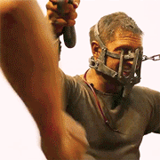
Two new posters for The Wolverine hit today... This one isn't very good...  But this one...oh good lord. 
|
|
#
?
Mar 25, 2013 15:28
|
|


|
^^  is that second one real? Wow. is that second one real? Wow.Gonz posted:Some guy on DeviantArt made this Episode VII poster in the style of Drew Struzan: 
|
|
#
?
Mar 25, 2013 15:30
|
|

|

|
| # ? Apr 28, 2024 21:56 |
|
|
Ahah... Hah... Haha... HahahahaHAHAHAHAHA! Oh... This is phenomenal. Please let this be real, the thought of seeing this on billboards is giving me a warm glow inside.
|
|
#
?
Mar 25, 2013 15:33
|
|