

|
I'd love to see a side-by-side comparison of the actual films vs. VSCO'd shots.
|
 #
?
Aug 7, 2013 00:16
#
?
Aug 7, 2013 00:16
|
|


|

|
| # ? Apr 28, 2024 14:30 |
|
|
It'll vary wildly depending on the camera 
|
|
#
?
Aug 7, 2013 00:19
|
|

|
I really really like the new VSCO. The black and whites look especially nice (which is funny because the selling point is the saturated colors). I played around with it on an old photo. RAW -> VSCO Preset -> Tweaked VSCO (pretty much just brought the orange saturation down and played with the curves a little, it's not as drastic as it looks) -> ~30 min Photoshop edit 
|
|
#
?
Aug 7, 2013 05:51
|
|


|
Why did you put that through VSCO at all? It looks like all your photoshop work was to make it look as much like the original as possible?
|
|
#
?
Aug 7, 2013 06:05
|
|

|
I like the look of the final one, but I agree - why bother putting it through VSCO when you could have done the same thing with very few tweaks from the beginning?
|
|
#
?
Aug 7, 2013 06:13
|
|

|
Because presets let me filter through a bunch of looks quickly to see what direction I want to go in. I thought it subtly brought out the color in the make up without doing a bunch of individual saturation tweaking but maybe not. I will find a more drastic example.
|
|
#
?
Aug 7, 2013 08:13
|
|
|
Okay, here are some straight RAW -> VSCO 04 filters with zero tweaking. I think they all would make great starting points (if they were good photos and not throwaway zoo pictures).   Again, if you're not already sold on VSCO, this probably isn't going to do it and what I find personally useful, the ability to zip through 20+ visual presets in a fraction of the time it would take to actually start editing in one direction and decide it's not working, is really hard to portray in a static image. Mainly I was just excited about the new VSCO and wanted an excuse to play around with it. I know a lot of people hate VSCO because "if you want the film look, shoot film" but I personally think it's neat and can lead to some great images if you use it like any other photo editing tool and not an Instagram filter for Lightroom. Plus it actually cost about what I feel it is worth with the new release sale and discount for owning another pack. I definitely wouldn't recommend paying full asking price for any of the VSCO packs. mr. mephistopheles fucked around with this message at 09:29 on Aug 7, 2013 |
|
#
?
Aug 7, 2013 09:26
|
|
|
I might say that if there was anything at all of a 'film look' there, but there seems to be nothing more than contrast increase and crushing black levels, which is kind of the opposite.
|
|
#
?
Aug 7, 2013 17:14
|
|
|
In all honesty almost any type of filer/preset can be done in vanilla photoshop, if you know what you're doing. However, just because that is true, that doesn't mean filters/presets are worthless. Being able to get an idea of what the results are before you do the work is a powerful and useful thing. Additionally, they save a lot of time and can provide consistent results. Personally, I hate doing black and white without something like nik.
|
|
#
?
Aug 7, 2013 18:57
|
|

|
I don't know if its just simple exposure and curves, but the bokeh looks... different to me in #2. Or maybe that's what happens to bokeh normally when hit with some adjustments, I dunno.
|
|
#
?
Aug 7, 2013 20:26
|
|

|
Miko posted:I don't know if its just simple exposure and curves, but the bokeh looks... different to me in #2. Or maybe that's what happens to bokeh normally when hit with some adjustments, I dunno. It is, that's just the result of compressed tones being compressed more.
|
|
#
?
Aug 7, 2013 20:28
|
|
|
I took this really neat shot of a gigantic pile of firewood here. I really like the tonality, but wasn't sure what mood to convey in post. Do you guys have any suggestions? I'm not usually this abstract and I'm out of my comfort zone. Original:  What I decided to do with it: 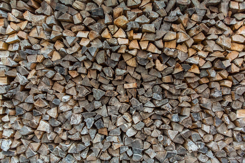 I warmed it up and tried to bring out as much detail as I could. I was thinking of emulating film but couldn't really figure out how without making it look cheap. I also think I was too close when I took the shot as you can see the perspective change as it gets away from center. I was going for a very square on view. rcman50166 fucked around with this message at 02:59 on Aug 8, 2013 |
|
#
?
Aug 8, 2013 02:52
|
|
|
rcman50166 posted:I took this really neat shot of a gigantic pile of firewood here. I really like the tonality, but wasn't sure what mood to convey in post. Do you guys have any suggestions? I'm not usually this abstract and I'm out of my comfort zone. I'd personally try different crops - like a square one. It would get rid of some of distortion away from the center, and square formats work well with patterns like that.
|
|
#
?
Aug 8, 2013 03:06
|
|


|
I think appreciating texture shots like that is all about how you use them. I like them in a collection of textures, for smartphone wallpaper, or really any background. However, I find it hard to appreciate them by themselves.
|
|
#
?
Aug 8, 2013 15:32
|
|

|
Is it kosher to post other people's work in here to ask tips on replicating their processing? I don't mean obvious composites, or anything, but just general toning. I'm sure there are filter presets that would do what I'm looking at right-off, but I'm in Photoshop CS6 at work, so it's a little more fiddly than what it seems like Lightroom is.
|
|
#
?
Aug 8, 2013 18:56
|
|


|
I know people here aren't too huge on textures, but I've seen some love for Brooke Shaden before, so here are some textures from her: http://shadenproductions.com/blog/2013/08/10/les-mis-texture-pack/
|
|
#
?
Aug 10, 2013 16:54
|
|
|
I'm huge on textures, so thanks for that!
|
|
#
?
Aug 12, 2013 17:57
|
|

|
Question guys. I originally had most my photos stored on iPhoto. I want to have Lightroom as my only photo library, so I imported the photos straight from iPhoto to Lightroom. My question: Does Lightroom duplicate my iPhoto imports to its own Lightroom library, making it completely independent from iPhoto and thus safe for delete everything in in my iPhoto folders?
|
|
#
?
Aug 20, 2013 21:49
|
|

|
Ars Moriendi posted:Question guys. I originally had most my photos stored on iPhoto. I want to have Lightroom as my only photo library, so I imported the photos straight from iPhoto to Lightroom. It depends on how you set it up when you imported. Did you copy the files or just link LR to where the iphotos were stored? I'd go into finder and try to locate the files and compare sizes. I think iphoto might have all your photos stored in a single file, whereas LR will put them in folders in a directory. Make sure you have a time machine backup before you delete anything. I've hosed myself before long ago when I switched from LR to Aperture and deleted a bunch of stuff I thought I imported.
|
|
#
?
Aug 20, 2013 23:26
|
|
|
Ars Moriendi posted:Question guys. I originally had most my photos stored on iPhoto. I want to have Lightroom as my only photo library, so I imported the photos straight from iPhoto to Lightroom.
|
|
#
?
Aug 21, 2013 02:38
|
|

|
dukeku posted:I'd love to see a side-by-side comparison of the actual films vs. VSCO'd shots. I did just that, to satisfy my curiosity. Provia 100F vs RX1 with VSCO filter for Provia 100F.  Test Test by alkanphel, on Flickr
|
|
#
?
Aug 25, 2013 03:27
|
|

|
alkanphel posted:I did just that, to satisfy my curiosity. drat, what's with that weird outline on the chairs and the bike frame? Was it like that before applying VSCO? Also, are you using the Sony-specific set of filters?
|
|
#
?
Aug 25, 2013 06:35
|
|


|
404notfound posted:drat, what's with that weird outline on the chairs and the bike frame? Was it like that before applying VSCO? Also, are you using the Sony-specific set of filters? Ok I investigated and it seems to be the result of some overly aggressive CA removal which was removing the red edges. Here's the version without that CA removal:
|
|
#
?
Aug 25, 2013 09:51
|
|
|
Not bad. RX1 looks a bit too saturated and the green foliage looks a bit more blue with Provia? Looking at this through wacky f.lux colors so I might be off a bit.
|
|
#
?
Aug 26, 2013 10:02
|
|

|
East Lake posted:Not bad. RX1 looks a bit too saturated and the green foliage looks a bit more blue with Provia? Looking at this through wacky f.lux colors so I might be off a bit. Sort of, the VSCO one makes the colours darker and more saturated, the foliage and the shadows are more warmer.
|
|
#
?
Aug 26, 2013 13:02
|
|
|
So, I was going through some pictures I took on a field trip to California a couple years ago, and I found one that I liked the composition on, but I hopelessly burned out the sky on the exposure (thanks compact camera!)  563 - Original by venusian-weasel, on Flickr So, I figured maybe replacing the sky using another image from the same day might have worked:  563 - Composite by venusian-weasel, on Flickr Anyone have any suggestions or comments?
|
|
#
?
Aug 31, 2013 19:05
|
|
|
This is a pretty interesting article on post processing in the darkroom: http://theliteratelens.com/2012/02/17/magnum-and-the-dying-art-of-darkroom-printing/
|
|
#
?
Sep 12, 2013 00:50
|
|
|
What's the easiest way to get a totally grey sky to not being totally grey? Working with CS6 and I've tried messing with the curves and adjusting the hue/saturation, but the clouds are totally grey and totally in the entire sky of my picture. I'm not expecting to get blue skies or anything, but having some kind of color or at least texture coming through would make this a whole lot more pleasant. This is what I'm working with. On an unrelated note, is there an easy way to save a photo at a different size than what I'm working with instead of having to change the image size, save the file, and then change it back?
|
|
#
?
Sep 17, 2013 00:24
|
|
|
yoohoo posted:What's the easiest way to get a totally grey sky to not being totally grey? Working with CS6 and I've tried messing with the curves and adjusting the hue/saturation, but the clouds are totally grey and totally in the entire sky of my picture. I'm not expecting to get blue skies or anything, but having some kind of color or at least texture coming through would make this a whole lot more pleasant. This is what I'm working with. Is the sky blown out? If not... sometimes totally grey skies are just totally grey and there's not much there to work with. Otherwise, if you have another sky to substitute (with somewhat similar lighting direction/temp/etc) that might work.
|
|
#
?
Sep 17, 2013 00:26
|
|

|
dedian posted:Is the sky blown out? If not... sometimes totally grey skies are just totally grey and there's not much there to work with. Otherwise, if you have another sky to substitute (with somewhat similar lighting direction/temp/etc) that might work. The left side may be slightly blown out but that would be the only part really; it's a stitched panorama. Although the sun was behind me for most of it and slightly left, so maybe the cloud conditions reflected the sun and caused it to be blown out? I can look around for other decent sky pics, any tips how I'd do that?
|
|
#
?
Sep 17, 2013 00:56
|
|
|
You'll probably have a hard time finding a pan-sized sky to substitute. For a normal-sized picture, I prefer to look for better-exposures of the sky that are in pictures from the same day. Then, you make a layer for the foreground and cut out the blown out sky, then paste in your new sky behind the foreground layer. Then you adjust the brightnesses of the new sky and the foreground until they look like they were a single shot. My post just up the page will be in the ballpark of what you'll want.
|
|
#
?
Sep 17, 2013 06:17
|
|
|
Did you try dropping the blue luminance in LR?
|
|
#
?
Sep 17, 2013 12:34
|
|
|
Anyone has an idea how to reduce or eliminate stress marks from a scanned negative. What I have is a roll of this:  stress marks by Stingray of Doom, on Flickr and I need to make those streaks of while look less distracting if I cant get rid of them altogether. Any ideas?
|
|
#
?
Sep 20, 2013 01:24
|
|
|
Putrid Grin posted:Anyone has an idea how to reduce or eliminate stress marks from a scanned negative. That's bromide drag. Do a presoak and do more agitation.
|
|
#
?
Sep 20, 2013 01:30
|
|

|
MrBlandAverage posted:That's bromide drag. Do a presoak and do more agitation. I meant how to fix it in post. While it certainly looks like bromide drag, I develop two rolls per tank, and the other roll came out fine. While the problem roll was rewound in wrong direction and then some significant force was applied to it when it got "stuck". I might have been quite drunk at that point in time. I've seen it happen before when I turned that crank backwards, so I am almost positive thats the case. But I could be wrong, as always ") The deed is done, and I need to find how to fix it. Putrid Grin fucked around with this message at 02:03 on Sep 20, 2013 |
|
#
?
Sep 20, 2013 01:59
|
|
|
Putrid Grin posted:I meant how to fix it in post. Scan and post the whole deal including sprocket holes and embrace it. Next time do what MrBlandAverage said and don't get it.
|
|
#
?
Sep 20, 2013 04:16
|
|

|
No those are stress lines, I've had that happen too on two occasions when I rewound the film in my Bessa too far. Never figured out a simple way to to clean it up though, unless you want to spend a lot of time in photoshop or something.  kg31513003.jpg by MrDespair, on Flickr Stress marks tend to have two lines coming off of each corner of the sprocket, bromide drag has solid lines coming from the sprockets. This is bromide drag, for comparison.  bromide drag ? by paapoopa, on Flickr
|
|
#
?
Sep 20, 2013 07:13
|
|


|
Putrid Grin posted:
I like them, but what the gently caress do I know?
|
|
#
?
Sep 20, 2013 20:37
|
|
|
Is there a good equivalent to Virtual Photographer on the Mac? Even better if it's Retina optimized so I don't have to stare at pixelated UI. I just switched over from Windows and was disappointed to find out that Optikverve never ported it; beyond that, if anyone has any "must have" Mac plugins feel free to recommend me.
|
|
#
?
Sep 22, 2013 02:26
|
|

|

|
| # ? Apr 28, 2024 14:30 |
|
|
DxO FilmPack 3 Film Emulation Software is Free Until October 31st
|
|
#
?
Sep 22, 2013 09:54
|
|
