|
For people who were talking about rebooting the stream thread I did it. Going to update it tomorrow with more detailed information but it serves is purpose for now.
|
 #
?
Jan 20, 2014 15:39
#
?
Jan 20, 2014 15:39
|
|


|

|
| # ? May 10, 2024 20:46 |
|
|
OneDeadman posted:If you haven't checked it out already, James315's BF1942 is an excellent example of showing off BF Multiplayer. Yep, I watched that when it was ongoing. I don't plan on making 70+ videos, however. Depending on my schedule it would be something like one campaign video a week along with two multiplayer videos. At most I would keep the multiplayer videos going after the single player was over if people were enjoying them.
|
|
#
?
Jan 20, 2014 15:56
|
|


|
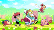
So it's no secret that I'm planning on doing a Ratchet and Clank: Into the Nexus LP once the three-month rule has passed. I'm trying to decide what I want to do with the youtube preview images, and I've done this number here: I just wanted people's quick opinions on it before I commit to making every preview image like this. With Lollipop Chainsaw I liked what I did with the preview images. This one I'm not so sure.
|
|
#
?
Jan 21, 2014 14:32
|
|
|
That picture makes it look to me like his nose is his mouth, especially when it's thumbnailed.
|
|
#
?
Jan 21, 2014 14:37
|
|


|
You might want to shy away from pink outlines on pink backgrounds. It's kind of hard to read right now and as a thumbnail it's almost unreadable. edit: Also I am colorblind because that's definitely purple.
|
|
#
?
Jan 21, 2014 14:39
|
|
|
You might also want to make the text readable (the important parts, at least) even at a small thumbnail size.
|
|
#
?
Jan 21, 2014 14:41
|
|
|
tiistai posted:You might also want to make the text readable (the important parts, at least) even at a small thumbnail size. How? Make it bigger or make the border a different color? I've already worked on the border color (made it black instead of the same purple color as the background), and did sort of an alternate thing which Jordan Kai suggested. I'll show the two new versions below, but if it's a size issue, I could always make it bigger.  With scanlines over the text, as per Jordan Kai's suggestion.  Without.
|
|
#
?
Jan 21, 2014 14:46
|
|
|
Look at the thumbnails on this page, can you read any of them? I know I can't. Make the text bigger, maybe truncate the title to "R&C: Into the Nexus"
|
|
#
?
Jan 21, 2014 15:48
|
|

|
It's just really ugly and I'm not sure why you'd want to mangle a perfectly good picture like that.
|
|
#
?
Jan 21, 2014 15:49
|
|
|
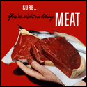
kalonZombie posted:How? Make it bigger or make the border a different color? I've already worked on the border color (made it black instead of the same purple color as the background), and did sort of an alternate thing which Jordan Kai suggested. I'll show the two new versions below, but if it's a size issue, I could always make it bigger. On the front page youtube thumbnails are 320x180 resized to 175x98 and on the side bar when watching a video they're 120x90. Right now from the SA thumbnail they're 174x99 and I can't read poo poo. Here, I rigged this up in 5 minutes to give you a good idea of how to keep things visual: 1280x720:  175x98:  edit: Annnd I just realized that SA and youtube scale down by the same factor so the SA thumbnail is identical to the 175x98 image, but whhaaaatttevs. MEAT! fucked around with this message at 16:08 on Jan 21, 2014 |
|
#
?
Jan 21, 2014 16:00
|
|
|
kalonZombie posted:So it's no secret that I'm planning on doing a Ratchet and Clank: Into the Nexus LP once the three-month rule has passed. I'm trying to decide what I want to do with the youtube preview images, and I've done this number here: It looks hideous. Especially the purple/pink outline against a purple/pink background.
|
|
#
?
Jan 21, 2014 16:04
|
|
|
unfair posted:It's just really ugly and I'm not sure why you'd want to mangle a perfectly good picture like that. Stabbey_the_Clown posted:It looks hideous. Especially the purple/pink outline against a purple/pink background. See, THIS is more what I was worried about. I wasn't too keen on it myself, to be honest, and this just cinches it.  Bigger text, no filters, no recoloring.
|
|
#
?
Jan 21, 2014 16:13
|
|
|
kalonZombie posted:See, THIS is more what I was worried about. I wasn't too keen on it myself, to be honest, and this just cinches it. That's a lot better visually - just double the size of the text (and cut out unnecessary words). Generally you usually want to use a blockier font for thumbnails too, but that might work once it's twice the current size. E: the one thing I find helpful with images is to bump the contrast (and brightness if necessary) slightly to really make them pop.
|
|
#
?
Jan 21, 2014 17:13
|
|
|
kalonZombie posted:How? Make it bigger or make the border a different color? Bigger, of course. See what MEAT! did. That newer version you just made is better, but from that thumbnail I couldn't tell if that number were 1, 7 or 4 without squinting really hard.
|
|
#
?
Jan 21, 2014 17:23
|
|
|
kalonZombie posted:See, THIS is more what I was worried about. I wasn't too keen on it myself, to be honest, and this just cinches it. That looks much better than a pure purple recoloring over it. Maybe you could put the text as purple if you really want? Otherwise, it looks better than the last.
|
|
#
?
Jan 21, 2014 19:33
|
|
|
Something I should have mentioned is that it's more for Polsy than the sidebar stuff, which is why I made the text "small". It'll appear in it's native resolution for the Polsy preview. I couldn't really give a rat's rear end about the YT sidebar, since I'm not nearly popular enough, nor care to be popular enough, for the sidebar to show my videos.
|
|
#
?
Jan 21, 2014 21:19
|
|
|
kalonZombie posted:Something I should have mentioned is that it's more for Polsy than the sidebar stuff, which is why I made the text "small". It'll appear in it's native resolution for the Polsy preview. I couldn't really give a rat's rear end about the YT sidebar, since I'm not nearly popular enough, nor care to be popular enough, for the sidebar to show my videos. Well geez, you could have said so. If it's not to attract randos from youtube and it's just a placeholder image for polsy, put whatever you want. I don't think anyone following your thread will really give a rat's rear end.
|
|
#
?
Jan 21, 2014 23:48
|
|
|
kalonZombie posted:Something I should have mentioned is that it's more for Polsy than the sidebar stuff, which is why I made the text "small". It'll appear in it's native resolution for the Polsy preview. I couldn't really give a rat's rear end about the YT sidebar, since I'm not nearly popular enough, nor care to be popular enough, for the sidebar to show my videos. If it's just for polsy (or any embed) there's really no reason to have a unique title screen for each video. Everyone watching it will have followed a link from your thread so they'll know what video they're watching. Save yourself some time and just download a desktop wallpaper from the internet somewhere, resize it to the same as your video, and use that for everything.
|
|
#
?
Jan 22, 2014 00:12
|
|
|
I posted this a super long time ago and didn't get too much feedback on it. I've since touched it up a tad - video included - and will probably post the thread tonight unless there are any other major problems that stand out.InterrupterJones posted:Let's Play Army Men: Sarge's Heroes (sub)series
|
|
#
?
Jan 22, 2014 02:21
|
|

|
Alright super rough test post For Final Fantasy 8. I don't have the first update done yet but I want to get some feed back on what I have so far. OP part 1 OP part 2 These will be the first and second post respectively. Mostly I'm looking for feedback on writing. I need some help figuring out how to make them better. I'm not an English major, so any help you can give for grammar/style would be greatly appreciated. Also, ideas on how to beef them up. Secondly, are the images okay? Are they too big? The pictures next to the names are the character portraits I'm going to use throughout the LP. Right now, they're 120x120, but I can easily change it if needs be. Also, at the bottom is a placeholder for a Bestiary and GF gallery. Those will have their own separate pages. Lastly, I'd like some advice on the screenshot size, what's a good size to use? I've got some samples here: This one is 640x480  And this one is 800x600  Which one is a better size? I personally like the larger one more. Sorry, I'm asking so many questions. This is my first LP, and I really want to make sure I get everything squared away before I start.  P.S. What would a good thread title be? I'm awful at coming up with this kind of stuff. P.P.S. I got the steam version so I could use the higher res texture, but it was a big mistake. If you're thinking about getting the steam version, don't. They completely butchered the music. 
|
|
#
?
Jan 22, 2014 02:56
|
|

|
Is the bigger one resized from the smaller one? Cause the text in that one is really really bad.
|
|
#
?
Jan 22, 2014 03:01
|
|

|
What resolution are you playing at? Your screenshots should be the same as your playing size (so if you're playing at 640x480, screenshots should be the same). Also I realize it's a 3D game, so JPGs are probably better than PNGs here, but do you think you could dial down the compression a bit? The blurriness kind of hurts to look at. Oh, and are those black bars part of the game? Because if not you could probably crop them and save a few kb.
|
|
#
?
Jan 22, 2014 03:03
|
|

|
judgementbringer posted:Secondly, are the images okay? Are they too big? The pictures next to the names are the character portraits I'm going to use throughout the LP. Right now, they're 120x120, but I can easily change it if needs be. Since there aren't any changing expressions or anything, 120x120 is way too big. I'd say get somewhere below 75x75. Also, while Seifer's looks okay, Quistis and Squall's portaits look really squashed.
|
|
#
?
Jan 22, 2014 03:08
|
|

|
judgementbringer posted:This one is 640x480 I'd say 640x480 but hell if I remember what FF8's native resolution is. quote:P.S. What would a good thread title be? I'm awful at coming up with this kind of stuff. I won't let Final Fantasy 8 be referred to in the past tense!
|
|
#
?
Jan 22, 2014 03:09
|
|

|
120x120 is way too big for portraits, and the scaling is all messed up.  On the left is the image you use for Squall. On the right is the source image cropped to the same size. Make sure you're constraining proportions whenever you resize something. For your main screenshots, the smaller size looks much better, but I would crop off the black bars. I highly recommend using Irfanview; it will make batch cropping/resizing/etc. a breeze. The best advice for improving your writing is to read. Go to the archive or check out some popular threads to see how they handle OPs. Definitely put together a test update, though, so we can give you more thorough advice. As a suggestion, don't just make a sample first update; choose a section a few hours in to show how a "typical" update will look. Incidentally, this will probably demonstrate how hard it is to make a good LP; it might be a good idea to cut your teeth on something smaller before you tackle a huge RPG like FF8. Quovak fucked around with this message at 03:16 on Jan 22, 2014 |
|
#
?
Jan 22, 2014 03:14
|
|
|
Orange Fluffy Sheep posted:I'd say 640x480 but hell if I remember what FF8's native resolution is. I think it's probably 512x448, so 640x480 is usually the closest "standard" size. Don't quote me though, Square does some weird poo poo sometimes (apparently some of the FFX-2 FMVs play at something like 300x800?).
|
|
#
?
Jan 22, 2014 03:20
|
|
|
BrainWeasel posted:I think it's probably 512x448, so 640x480 is usually the closest "standard" size. Don't quote me though, Square does some weird poo poo sometimes (apparently some of the FFX-2 FMVs play at something like 300x800?). I don't know for certain, either, but it seemed to look okay when I recorded at 640 x 480 many moons ago.
|
|
#
?
Jan 22, 2014 03:51
|
|

|
judgementbringer posted:
... - Let's Play Final Fantasy 8 or ......... - Let's Play Final Fantasy 8 or ...Whatever - Let's Play Final Fantasy 8
|
|
#
?
Jan 22, 2014 04:18
|
|


|
Everyone hates Selphie, Let's Play Final Fantasy 8.
|
|
#
?
Jan 22, 2014 04:21
|
|
|
Let's All Sing the Train Song in Final Fantasy 8
|
|
#
?
Jan 22, 2014 04:23
|
|
|
David D. Davidson posted:Everyone hates Selphie, Let's Play Final Fantasy 8. Aw, I kinda liked Selphie. I'd probably go with "...Whatever." though.
|
|
#
?
Jan 22, 2014 04:23
|
|
|
Quovak posted:120x120 is way too big for portraits, and the scaling is all messed up. Yeah, I know the scaling is all messed up. I was trying to make all the portraits the same size for consistency, but the source images were all different sizes, so it ended up squishing a few. I guess I won't worry about making them the same size then. For reference these are the images at the correct proportions.    As you can see they're all different sizes. And here are the actual source images those came from.    And these are just the three I put in, since they're the ones we'd meet in the first update. Other artwork was even more varied. I had a hell of time cropping Edea's to look decent because of her crazy headdress. Hmm, maybe I should just start with something simple though. All of my other ideas would be VLPs though, so that doesn't really help me develop the skillset needed for a good SSLP, but whatever. Blind Sally posted:... - Let's Play Final Fantasy 8 Lol, yeah. Squall really isn't the most quotable character in videogames. judgementbringer fucked around with this message at 04:27 on Jan 22, 2014 |
|
#
?
Jan 22, 2014 04:23
|
|
|
judgementbringer posted:P.S. What would a good thread title be? I'm awful at coming up with this kind of stuff. The Only Winning Move is Not to Play Final Fantasy 8.
|
|
#
?
Jan 22, 2014 04:26
|
|

|
judgementbringer posted:And here are the actual source images those came from. You should be able to crop those in a program like, say Irfanview, so that they are all about the same.
|
|
#
?
Jan 22, 2014 04:26
|
|
|
judgementbringer posted:As you can see they're all different sizes. Just the use the ones from the status screen? Those all come from that same artwork. You're making this way more complicated than it needs to be.
|
|
#
?
Jan 22, 2014 04:28
|
|

|
judgementbringer posted:P.S. What would a good thread title be? I'm awful at coming up with this kind of stuff. "If I junction Haste maybe I can finish Let's Play FF VIII"
|
|
#
?
Jan 22, 2014 04:34
|
|

|
judgementbringer posted:Yeah, I know the scaling is all messed up. I was trying to make all the portraits the same size for consistency, but the source images were all different sizes, so it ended up squishing a few.  FF8 has tons of text, so you want the portraits to be really small. Otherwise, updates will fill way more space than they need to. FF8 has tons of text, so you want the portraits to be really small. Otherwise, updates will fill way more space than they need to. And most of that space will be empty, since text aligns to the bottom of an image. You don't need to see high detail pictures each time someone speaks. All a portrait needs to do is be recognizable and clear. And most of that space will be empty, since text aligns to the bottom of an image. You don't need to see high detail pictures each time someone speaks. All a portrait needs to do is be recognizable and clear. Don't worry about consistency so much. As long as the pictures are the same size and the scale's somewhat close, it isn't distracting at all. Don't worry about consistency so much. As long as the pictures are the same size and the scale's somewhat close, it isn't distracting at all.
|
|
#
?
Jan 22, 2014 05:00
|
|
|
Okay, do these look better? Sorry if this stuff takes me awhile. I've never done a lot of this stuff before.     I put them all to 75x75. Or should they be even smaller?     These are 40x40.
|
|
#
?
Jan 22, 2014 05:19
|
|
|
I'd just use Quovak's there. No clue what size they are, but I can tell at a glance what characters they are and since FF8 is a -wordy- drat game, they're not going to make the updates filled with blank space.
|
|
#
?
Jan 22, 2014 05:23
|
|
|

|
| # ? May 10, 2024 20:46 |
|
|
I keep my portraits at 75x75. Since the background is just whitespace, you can easily remove it and make the image a transparent png:
|
|
#
?
Jan 22, 2014 05:32
|
|