


|
How do you guys work on color balancing? I find that the more I work with a portrait, the further away I get from accurate colors. The concentration required to keep skin tones real while balancing the rest of the photo is the stuff of artists, which I am not. Do you wing it and have a natural feel for color accuracy? Do you heavily rely on the histogram? A color reference card (which I'm heavily considering at this point because these portraits are driving me mad)?
|
 #
¿
Nov 12, 2015 15:50
#
¿
Nov 12, 2015 15:50
|
|

|

|
| # ¿ Apr 29, 2024 01:16 |
|
|
BANME.sh posted:If you don't have a grey card, set your white balance to match the setting. Maybe post an example where you're having trouble. Not trying to sound arrogant but I've never had an issue with color balance unless I was shooting in really horrible lighting like a mix of daylight/tungsten or under fluorescents. In that case, use a flash and kill off any ambient light. Sorry, should have specified this is in post production. I never had issues with white balancing on the camera when I shot in jpgs. Now that I'm shooting in raw I'm loving up colors on just about everything. I quickly lose reference on what is "normal" and half an hour later end up with some lovely abomination of a picture. On top of that, I just did my first portrait session with indoor and outdoor shots and cannot for the life of me make them look like a human being was sitting in front of the camera. I must have started over 3 times on each picture to get a different kind of "wrong" every time. Next time I'm having my subject hold a color reference card next to their face for every location I shoot in. This portrait may say version 8 but that's #8 in this iteration, which is about the 4th iteration overall. I'm going blind. I don't know if these are real colors or not anymore. 
|
|
#
¿
Nov 12, 2015 22:04
|
|
|
Taps posted:Picked up photography after like 6 years off... teaching myself strobes and studio stuff. Wonder if anyones got any advice or anything they see horribly wrong with these My first impression of this one was really good. I liked the composition, elements, and colors. Then I saw the backfill flash and I don't think it fits at all. The light back there is too white and too low. Maybe Photoshop the highlights to a gold or incandescent hue to blend it in a bit? Edit: Also I might suggest shooting at a higher f stop for multiple subjects like your second shot. The guy sitting 6 inches back from the woman is out of focus. Using f/8 or f/9 should help a ton. Judge Schnoopy fucked around with this message at 22:26 on Nov 25, 2015 |
|
#
¿
Nov 25, 2015 05:05
|
|
|
Starting the holiday shots already
|
|
#
¿
Nov 25, 2015 22:28
|
|
|
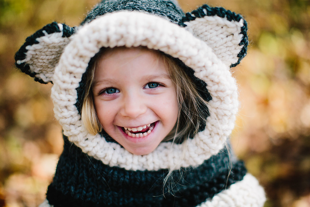
dakana posted:Been photographing a lot of kids & families this fall What kind of processing do you do for the eyes? This shot has some great colors, and anybody that can hit that kind of depth of field on a moving kid is always impressive
|
|
#
¿
Nov 27, 2015 14:34
|
|
|
Did some family pictures for a friend. If there's anything about this portrait particularly heinous let me know. I just started portraits and I'm trying to move from amateur to intermediate.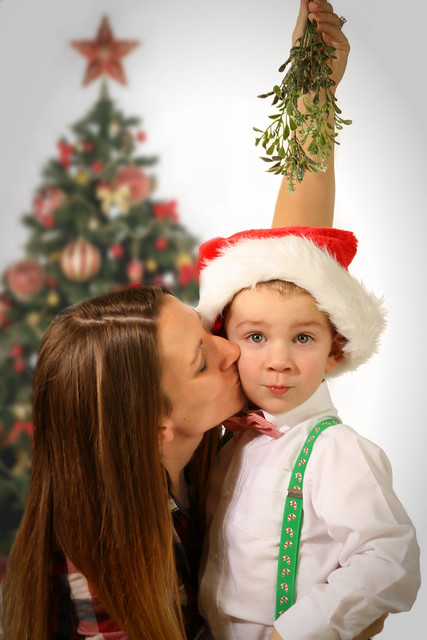
|
|
#
¿
Nov 27, 2015 22:49
|
|
|
Mido posted:is that tree photoshopped in?  it looked way better than empty gray space and I didn't bring a lit decorated tree with me to the shoot. It made the client happy. it looked way better than empty gray space and I didn't bring a lit decorated tree with me to the shoot. It made the client happy.
|
|
#
¿
Nov 28, 2015 02:34
|
|

|
Dren posted:She's kissing the kid with her head tilted, from below, and with eyes apparently closed. Not only is that more romantic than playful, neither her face not her profile are visible and the part in her hair is featured largely which is not really desirable. Thanks for the feedback on this. You've convinced me that my main focus for now should be on studying posing. Any recommendations on a good book or website that gives more than "Don't make these 10 stupid posing mistakes"?
|
|
#
¿
Nov 30, 2015 17:27
|
|
|
Pukestain Pal posted:I like it. The crop feels awkward to me for some reason, but I dig it. I was going to say the same, the grid of thirds don't intersect anything important. It almost gives the feeling that the guy moved forward during / immediately before the shot. Which isn't to say it's bad, it adds animosity which fairly fits the lighting and mood. Gives it a touch of uncomfortable over class.
|
|
#
¿
Dec 16, 2015 23:21
|
|
|
hi liter posted:
Nice. Hot shoe mounted flash hanging to the right since the camera is vertical? I tend to turn my camera the other way so I'm hanging it from my trigger hand, but then compose my shot to the left out of non-flash habit. I'm getting a lot of unbalanced pictures.
|
|
#
¿
Dec 31, 2015 21:15
|
|

|
red19fire posted:Rim lights don't need to be crazy bright to be effective. You can get away with -1.5 off the key light, my first impression of the first picture is that it looked like poor job cutting the subject off a white background and dropped him onto a gray background, especially in the thumbnail. Then I realized it was a super bright rim light. I had the same impression. And I think the second shot could use the side lights a bit more towards the front, or at least one of them. Even lights on both sides kind of leaves the face blank and uninteresting. The outdoor shots are OK but I think some need a longer lens. The wide angle and distance starts losing the subject.
|
|
#
¿
Feb 1, 2016 04:36
|
|
|
Helen Highwater posted:No it was all handheld as I was scrambling around on my knees getting angles while she posed. There wasn't a lot of time for the shoot so I set the lights up and we just ran through some locations in my apartment. To get anything like you had at 1/15 is pretty amazing. If I have to drop below 1/60 I deem the lighting unacceptable and won't shoot until it's fixed, because I know 1/40 will soften up over half my shots and I'll be pissed in post.
|
|
#
¿
Feb 17, 2016 14:43
|
|
|
What's the trick for getting the sun to glow like that? I see it in a lot of portraits but I'm never able to replicate it. Perfect shot or Photoshop editing? E; I think I hit one of my best portraits here. Lighting, pose, depth of field seem to come together. Please point out any glaring mistakes so I can continue to learn. 
Judge Schnoopy fucked around with this message at 02:45 on Feb 21, 2016 |
|
#
¿
Feb 20, 2016 06:37
|
|
|
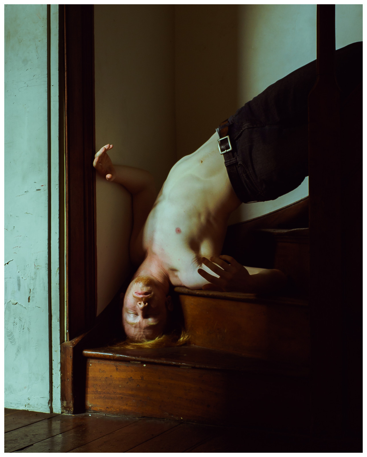
XTimmy posted:So I'm currently working on the overall look of a shoot I want to do. Here's a couple of images as a bit of proof of concept/standalone work. I dislike the right side being crushed to black. The lower right corner is unimportant so that's fine but the banister being reduced to a black shadow takes some depth away. I also understand the green tint and why it's there but I'm a sucker for natural wood. I think you can get some good contrast out of the cherry wood grain, his red face from being upside down, and still keep the muted effect without going green. I like the composition, subject, and idea!
|
|
#
¿
Mar 8, 2016 03:43
|
|

|
red19fire posted:For thread content: It's unfortunate because everything else looks good, except the middle shadow on the first one makes her look extremely cross eyed. For the second one, I like everything except the florescents on the ceiling. To me I think it would make a cleaner concept to wipe them off the picture since it's all black up there anyway.
|
|
#
¿
Apr 24, 2016 17:49
|
|


|
Marman1209 posted:
What does it do to photos? I haven't looked into how photos change when I upload them but now I'm really interested
|
|
#
¿
Apr 25, 2016 18:08
|
|

|
maxmars posted:No, not really. Otherwise I wouldn't have asked for that make up or set the lights the way I did. I'll start by saying I really dig the tone of the photo, the pose, the setting, and composition. That said, I'd like to question the decision to yellow the face so much. Her arms look fine so it's not that the color balance on the photo is off, but it's unsettling that her face doesn't match the skin tone on her arms. It looks a bit too try-hard for a weird concept that detracts from everything else you've got going on.
|
|
#
¿
Apr 26, 2016 16:11
|
|
|
TheAngryDrunk posted:
This looks great, but it looks like your on a building and the grass patch is meant for dog poop and I'm really worried about what she's laying on. thetzar posted:
on fire with this series, I love it
|
|
#
¿
May 6, 2016 23:34
|
|

|
Uninteresting expression from the model, front lighting is weak, choice of wardrobe doesn't tell a story, I'll give this a C-. (kidding, congrats, you'll be getting a lot more use out of that camera)
|
|
#
¿
May 9, 2016 20:00
|
|
|
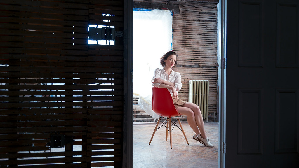
thetzar posted:
OK I feel like I'm obligated to make some sort of criticism here because I'm waayyyy too jealous of the shots you're getting. That chair doesn't look like it fits the scene and kind of breaks immersion to the rundown location. But seriously that's the best I can come up with because I'm enamored right now. The sheer attitude you're portraying is off the charts.
|
|
#
¿
May 12, 2016 15:19
|
|

|

|
| # ¿ Apr 29, 2024 01:16 |
|
|
Pretty generic maternity shoot, but I'm new to this so I didn't want to get out of my comfort zone (being what I had looked up online for maternity photos).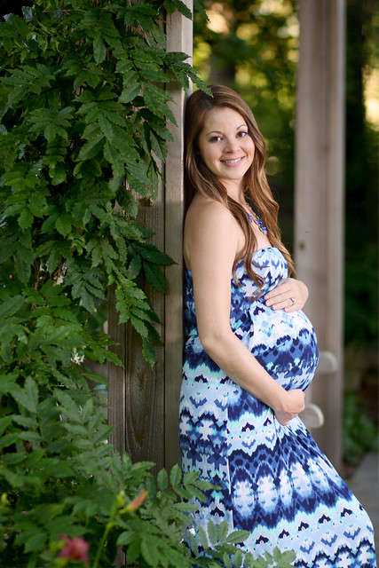
Judge Schnoopy fucked around with this message at 19:06 on Jun 20, 2016 |
|
#
¿
Jun 20, 2016 19:04
|
|