|
did a new one and tweaked the animation on the first a little 
|
 #
?
Apr 2, 2013 17:54
#
?
Apr 2, 2013 17:54
|
|


|

|
| # ? Apr 27, 2024 21:12 |
|
|
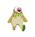
Hellbeard posted:Made this for a goon's avatar but he didn't want it (I'm making him a different one now). He's a fool! This is great.
|
|
#
?
Apr 2, 2013 19:35
|
|

|
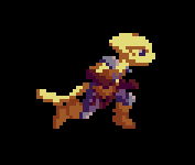
Triangle posted:did a new one and tweaked the animation on the first a little This new one looks nice BUT I can clearly see that you shifted the whole thing to the right on one frame. It looks almost like tearing when you disable v-sync on a modern game. Same thing on her head which is shifted to the left. Watch for this and you see the head and the lower mass just tearing back and forth. angel opportunity fucked around with this message at 21:40 on Apr 2, 2013 |
|
#
?
Apr 2, 2013 19:52
|
|

|
Sub-Actuality posted:He's a fool! This is great. Thanks! Not everyone appreciates the same things. V  V VWhat's cool about pixel-art avatars is because of the low color count you can cram in a lot of frames and have variety.
|
|
#
?
Apr 2, 2013 21:30
|
|
|
dads_work_files posted:I really love how this is animated. How did you manage to make it so smooth in such a limited space? Thanks! It's 14 frames of animation, which was how I made it looks as smooth as possible. Small tweaks like having the character compress one pixel as it lands, as well as the head panning helps it look more lifelike. There's actually a problem with the animation where Gimp seems to have stopped exporting gifs with variable timing for some inexplicable reason. Every frame you see is at 100ms, but the timings should be varied to make it look much better. I've never had this problem before. Anyone know how to rectify it? Love it!
|
|
#
?
Apr 2, 2013 23:38
|
|


|
Triangle posted:did a new one and tweaked the animation on the first a little Looks great, but it might make the "tearing" effect systran mentioned less obvious if you cleaned up some of the edges that look a bit off? Like the bit on her sleeves where there's a one-pixel outward pucker, or the top of her boot where part of it seems to bulge outward. It's a little ripply right now. I think it'd benefit from a little more movement as well, maybe in the feet, sleeves or skirt.
|
|
#
?
Apr 3, 2013 01:29
|
|

|
Those sprites are great, but like others have said tearing effect looks more like an accident. Moving the parts 1px to the side to make it look like she's rotating a little is a good idea in theory, but you have it occurring in straight horizontal strips across all her body parts which makes it look more like a display error. I think the effect on her hat/head will look fine if you put the tearing effect on her hat and head in different places (maybe just around her nose on her head, and keep the hat where it is now), and the same thing for her arms/hips - if I were you I'd have her arms only move at the shoulder, since then it looks like her arms are remaining as rigid as possible against the broom. Also the tip of the broom handle looks kind of floppy. Once you see it, you won't be able to unsee it.
|
|
#
?
Apr 3, 2013 03:58
|
|
|
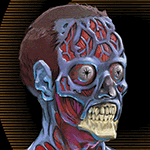
Wow, there's so much talent in this thread it makes me feel insecure! Anyway, here's what I've been doing lately. I apologise for the image dump. I'm also a fan of blowing up low-res work, so everything is thumbed for your benefit.  A personal logo design.  A pixel-version of a design of mine.  Trying to go with higher resolutions. Not really that great. Then I did these 5 things that a lot of people seemed to like.      and lately it's just been monster stuff. Nothing remarkable.  
|
|
#
?
Apr 3, 2013 20:04
|
|

|
 I got that stupid frame timing issue resolved. So much peppier now.
|
|
#
?
Apr 5, 2013 16:21
|
|
Scut posted:
The headturn is a neat effect, but I think it's out of place in this cycle. Try slowing this thing down and looking for problems. I think it's that the head is paused then jerks back before it turns in the other direction. I think you should either make it so the head doesn't rotate on the run cycle or put the pause in motion when he's looking to his left/right (away/towards the camera).
|
|
|
#
?
Apr 5, 2013 16:47
|
|
|
You're right. I'll attempt a tweak or two. I think it's a pause that I really want to keep in the rest of the body's motion but the head needs to rotate less during that phase.
|
|
#
?
Apr 6, 2013 00:49
|
|
|
Yeah, the head has a very linear back and forth motion -- it's constantly rotating at the same speed. The rest of the body has more of a sine wave thing going on where it speeds up the middle and slows down when it hits the extremes. If you apply the same rate of motion to the head turning I think it'll look much better.
|
|
#
?
Apr 6, 2013 02:30
|
|

|
Update! I replaced a bunch of the head rotations to make it looks more natural.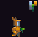
|
|
#
?
Apr 8, 2013 21:04
|
|
|
Scut posted:Update! I replaced a bunch of the head rotations to make it looks more natural. Looks great! I like the timing and palette of *whatever that is. * a bear hat wearing wild gun man, I'm pretty sure.
|
|
#
?
Apr 8, 2013 21:31
|
|
|
Scut posted:Update! I replaced a bunch of the head rotations to make it looks more natural. This looks much better! I really love this kind of stuff, pixel art with really smooth animation looks so good.
|
|
#
?
Apr 8, 2013 22:08
|
|
|
Scut posted:Update! I replaced a bunch of the head rotations to make it looks more natural. Awesome. But that's a lot of colors in the palette for a sprite that small. I'm sure you could reduce it.
|
|
#
?
Apr 9, 2013 00:58
|
|

|
You are correct, but the palette is taken from a larger project so I felt I could be a little less tight.
|
|
#
?
Apr 9, 2013 01:16
|
|
|
Oh man. I love me some pixel art. I don't do it nearly as often as I wish I did. A few months ago I tried my hand at a pixel room. It was based off of the design and sketch of a friend so I didn't actually have to do much thinking in the way of layout/colours. I think it's probably easy to spot the areas where I was tossing my hands up over isometric art and decided to just fake it or risk not doing it at all. By the time I was done I'd already spotted a few things I could have improved on in the first objects I did, like making the edges actually have dimension.  
|
|
#
?
Apr 9, 2013 06:55
|
|
|
It's very cute, I love it 
|
|
#
?
Apr 9, 2013 06:59
|
|

|
Arbor posted:Oh man. I love me some pixel art. I don't do it nearly as often as I wish I did. Reminds me of Mega Man Battle Network. Very nice.
|
|
#
?
Apr 9, 2013 09:35
|
|
|
Shinku ABOOKEN posted:Reminds me of Mega Man Battle Network. Very nice. Was thinking the same thing. I don't care for them in more traditional forms of media, but I love pixel-art landscapes and rooms and such.
|
|
#
?
Apr 9, 2013 20:11
|
|

|
Arbor posted:Oh man. I love me some pixel art. I don't do it nearly as often as I wish I did. I have a big soft spot for Pokemon and for little isometric scenes so I love this. You could probably play up the contrast between shadows and midtones in this but I honestly kind of like it as it is, it's very soft-looking.
|
|
#
?
Apr 10, 2013 03:36
|
|
|
Wow, this is pretty much the exact visual style I envisioned for a project of my own, which is, unfortunately, sort of in limbo at the moment. Kind of a cross between Ultima VII and Mother 3. I only did a couple basic mock-ups just to get a sense of scale, and had my little 8-directional Mother 3 rip-offy guy running around on a blank canvas in an HTML5 game. But then other stuff got in the way. If I were actually ready to move forward with it, and had the know-how, I'd be trying to recruit you!  You want to see some gorgeous room art to aspire to, though, check out Final Fantasy Tactics Advance:  The game levels are made up of repeated tiles, but, I think they make, like, second-passes over all the floorboards and stuff when it's all stitched together, for the lighting. I've studied this and various other maps from the game pretty hard. Every space looks unique and pretty. RedRupee posted:
Zackarotto fucked around with this message at 19:13 on Apr 10, 2013 |
|
#
?
Apr 10, 2013 19:04
|
|

|
I really like your proportions between height levels vs tile area. Have you got more mockups from this project you want to share? Looks like a cool grid for doing a group piece.
|
|
#
?
Apr 10, 2013 20:19
|
|
|
Scut posted:I really like your proportions between height levels vs tile area. Have you got more mockups from this project you want to share? Looks like a cool grid for doing a group piece. Thank you. Most of the work has been on the design document. In terms of the art, I worked out a few specifications for tile dimensions, slopes, portraits, how many tiles I'd have to stack to leave room for a door that the tallest characters could walk through... that sort of thing. I'm working with a couple other people, so I wanted to put together some numbers they could work from (although it looks like I'm on my own with the art for now). Here's something at 1x size--you're welcome to use or modify my tiles / measurements for anything.  edit: Ah, wait, here's something that's been fixed up a little more, tiled to the size of the game window's resolution as I envision it (320 x 180):   edit 2: Fixed the slopes up a little in the image provided. There's also a little running demo with fake, Escher-esque, 3D (you can drag tiles around with the mouse to try recreating some Escher works if you want), but there's a bug where it appears to not be drawing the tiles at pixel-perfect coordinates, so some tiles appear distorted. Well, I'm not planning to make the real game in HTML5, so, whatever. Anyway, it's here: http://ownicon.com/inordinatehopes/ Zackarotto fucked around with this message at 13:28 on Apr 13, 2013 |
|
#
?
Apr 10, 2013 21:18
|
|
|
Zvezda posted:Oh man some lovely lovely things in this thread. My hats off to you, these are nice! They would fit in very nicely in games like Gnomoria or Starbound. If you are looking to get in the games industry, video game Kickstarters are always interested in graphic artists, specially those with your style.
|
|
#
?
Apr 19, 2013 07:58
|
|


|
Pixelart thread! I need your help! I need to come up with a harmonized, video-gamey palette (8-16 colors and shades?) for something involving this character in the town below, around sunset: 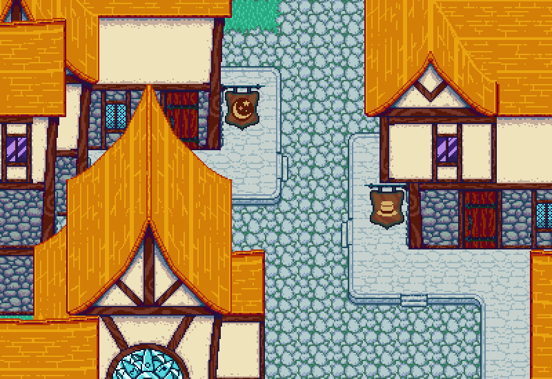 But as evident in the above image, I am bad at creating limited palettes for spritework. I was collaborating with a couple artists on the above, but with no common palette the end result ended up with tons of colors. When I do try to choose a palette beforehand, I find I can easily spend months obsessing over what colors to use and how many lightness steps to divide them into and all that. Would anyone here with experience choosing palettes for retro games be willing to throw me some ideas, or examples of existing, sunset-like palettes close to what I'm looking for? I'm a huge fan of the simple, almost iconic many old games use but have no idea where to start in choosing my own. Kazerad fucked around with this message at 06:54 on Apr 20, 2013 |
|
#
?
Apr 20, 2013 01:29
|
|
|
Kazerad posted:palettes I'd have a look at editing less garish palettes from old systems towards the colours you'd like (so, more like C64 than EGA). Right now I'd say everything is too saturated. You probably want 3 or 4 near greys, and it's best to stay away from "pure" hues. And of course there's always Dawnbringer's palette:  Also I'd like to share Elk's newest piece  
|
|
#
?
Apr 21, 2013 14:47
|
|

|
Exclamation Marx posted:Also I'd like to share Elk's newest piece Reading this thread has gotten me interested in learning how to do pixel art but, eh, I think I'll take up glass blowing or something instead.
|
|
#
?
Apr 22, 2013 01:05
|
|

|
Pixel art is pretty hard considering there is alot of rules. But boy is the payoff feels awesome. And not literally a "pay". More so of the satisfaction you finally finished that goddamn thing.
|
|
#
?
Apr 22, 2013 01:20
|
|
|
Kazerad posted:Would anyone here with experience choosing palettes for retro games be willing to throw me some ideas, or examples of existing, sunset-like palettes close to what I'm looking for? I'm a huge fan of the simple, almost iconic many old games use but have no idea where to start in choosing my own. I am by no means an expert, but I thought I'd give it a go and I came up with this:  It's 15 colours in total, mostly reds and purples since it's supposed to be sunset, with a little green to contrast. Here's an example of what it might look like in your scene:  Bear in mind I was a little bit overzealous with the fill bucket and for some reason photoshop says there are supposed to be 26 colours in the image (I've looked and I haven't found these extra 11 colours) so it's probably worth playing around with them a bit more, see what works.
|
|
#
?
Apr 22, 2013 16:51
|
|

|
Very nice town. Gives me a vibe of a GBA RPG with a reduced palette. I have a question for graphics/videogame buffs. Hardware-wise, would a map drawn in pixels be more taxing than one rendered in polygons (our "3D")?
|
|
#
?
Apr 23, 2013 06:10
|
|
|
Exclamation Marx posted:I'd have a look at editing less garish palettes from old systems towards the colours you'd like (so, more like C64 than EGA). Right now I'd say everything is too saturated. You probably want 3 or 4 near greys, and it's best to stay away from "pure" hues. Disproportionation posted:I am by no means an expert, but I thought I'd give it a go and I came up with this: Thanks guys! I did some work with Disproportionation's, namely changing the green ramp into a yellow-to-green one based off the yellow from the C64 palette, and I'm kind of liking the result. I did a quick doodle a couple minutes ago to get an idea of how to make the different browns/blues/oranges for the characters, here was how it turned out: 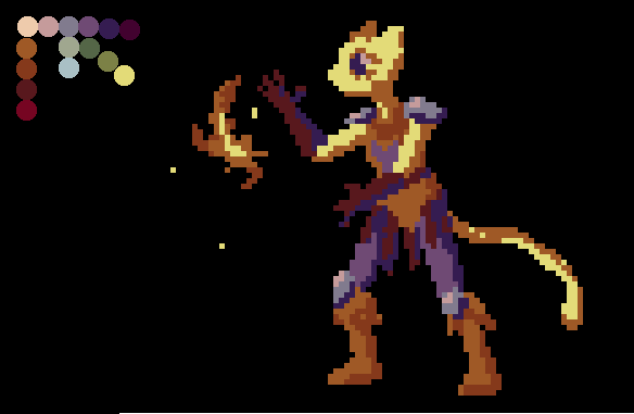
|
|
#
?
Apr 23, 2013 09:39
|
|
|
Lot of great work in here. That piece by Elk is phenomenal. Here's a couple pieces for a game I'm working on. I think I finally got a palette I like, and the character sticks out enough of the environment. Will say that animations are the devil, though.  
|
|
#
?
Apr 23, 2013 13:46
|
|
|
That looks really, really nice. Good work.
|
|
#
?
Apr 23, 2013 14:16
|
|

|
Figured I'd try making a platformer and was reminded how much I dislike programming. Oh well, here's an early test for the main character. I'll spice it up eventually after I've learned how to make freaking gravity with numbers and letters:
|
|
#
?
Apr 23, 2013 16:50
|
|
|
Is he limping? It looks like his head drops more on one of the steps.
|
|
|
#
?
Apr 23, 2013 19:04
|
|
|
 I WILL RACE YOU, FISHMAN.
|
|
#
?
Apr 23, 2013 19:52
|
|
|
It's hard to read the back boot. Do you think you could darken it like you did the pants? Or are the pants dark because of a shadow from the tail?
|
|
|
#
?
Apr 23, 2013 20:29
|
|
|
|
| # ? Apr 27, 2024 21:12 |
|
|
I posted this in the DIY forum, but this may be more appropriate: I have some pixel art that I want to print and attach to a 20x30 inch posterboard. The piece is 120 by 80 pixels, so it's perfectly proportional to the size of the board. I need to do this by friday, so I'm a bit limited on time. Could I get a print this size at an Office Depot or staples or something? What do I need to do to ensure that it's printed at exactly 20 by 30 inches? I was thinking of rasterbating it as a last resort, but I figure it would be a good idea to ask experts.
|
|
#
?
Apr 24, 2013 01:55
|
|