


|
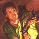
HiriseSoftware posted:I've been following your game and I think you made the right decision. I've never played Mega Man Battle Network, and this kind of frantic action that you've illustrated looks like a lot of fun. I think I wouldn't have the patience for a turn-based strategy game, especially on mobile. Cheers! Whole thing started when I was binging through MMBN LP's and getting annoyed with the constant pausing-to-go-to-inventory. It's a really cool series and it looks super polished but I felt like I was looking at the word PAUSED more than anything else. Also I got that fucker in the game and it's a lot of fun, doing a bomb dropping variant now.
|
 #
?
Feb 4, 2014 11:17
#
?
Feb 4, 2014 11:17
|
|


|

|
| # ? Apr 27, 2024 17:44 |
|
|
Been a little more productive these days - animating stuff takes forever. I think I might add a little big of camera wiggle to the clouds later. 
|
|
#
?
Feb 4, 2014 15:23
|
|

|
Alright fine you convinced me to play through MMBN3 again on my android. Is this what you wanted, you bastard? For real though the project is looking all kinds of cool. Is there some sort of thread or site where I could follow the progress? For real though the project is looking all kinds of cool. Is there some sort of thread or site where I could follow the progress?EDIT: Also, regarding the above post, Love the tiny amount of distortion on the plane! Really gives a great sense of depth and animation. Ezzer fucked around with this message at 20:34 on Feb 4, 2014 |
|
#
?
Feb 4, 2014 19:31
|
|

|
The sort-of borderline between hand sketch and pixel art of this is giving me Full Throttle vibes.
|
|
#
?
Feb 4, 2014 19:58
|
|

|
Ezzer posted:Alright fine you convinced me to play through MMBN3 again on my android. Is this what you wanted, you bastard? haha is that even enjoyable to play on Android? And yeah there's a site!
|
|
#
?
Feb 5, 2014 11:19
|
|
|
the chaos engine posted:haha is that even enjoyable to play on Android? Mother 3 and Warioware kept me entertained well enough, I guess we'll find out!
|
|
#
?
Feb 6, 2014 23:47
|
|
|
Reposting from the Making Games thread, my main title In my current game, I am working on 320x240px canvas, so pixel art is pretty much the choice of art. Here the gif  I am trying for high octane vibe, tbh.
|
|
#
?
Feb 8, 2014 16:45
|
|

|
Please rate my spaceship sprite. It is fully kitted with weapons and thrusters. (32px scaled up to 96px for viewing convenience).
|
|
#
?
Feb 9, 2014 15:59
|
|
|
Is it a vertical or horizontal shooter? Just asking due to the backed-in shadows and highlights. Looks good though.
|
|
#
?
Feb 9, 2014 16:09
|
|

|
Yodzilla posted:Is it a vertical or horizontal shooter? Just asking due to the backed-in shadows and highlights. Looks good though. None of above. It's a space tactics game. Think of Advance Wars, Front Mission series and FFT, that's pretty much the mechanics I am going for.
|
|
#
?
Feb 9, 2014 18:50
|
|
|
Sethmaster posted:Please rate my spaceship sprite. It looks very 'squashed flat' All the shadow / highlight is restricted to the edges, causing that appearance. Your mid-tones could use more differentiation in their values, which means you are spending time drawing tones that largely don't show up on screen.
|
|
#
?
Feb 9, 2014 23:09
|
|
|
Haven't tried pixel art for sometime since my last post, but here's an attempt at a shield: A1,A3,B1 and B3 have dithering, whilst the others do not, A2,A3,B2,B3 have black borders. Just messing about with them at the moment. My main problem is that the appearance of the thickness of the shield, despite my attempts at making them look less jaggy they still retain that jagged look. Is it because of the size or is there anything else i can do? I know my stuff isn't that great, my progress always seems to be hampered. I'm hoping to make something that looks half-way decent at somepoint. As per usual, any help or/criticism would be welcome. Edit: Removed broken links, apologies! Ash Crimson fucked around with this message at 08:54 on Mar 27, 2014 |
|
#
?
Feb 10, 2014 17:05
|
|

|
Scut posted:It looks very 'squashed flat' All the shadow / highlight is restricted to the edges, causing that appearance. Your mid-tones could use more differentiation in their values, which means you are spending time drawing tones that largely don't show up on screen. Jackard fucked around with this message at 17:53 on Feb 10, 2014 |
|
#
?
Feb 10, 2014 17:49
|
|
|
Scut posted:It looks very 'squashed flat' All the shadow / highlight is restricted to the edges, causing that appearance. Your mid-tones could use more differentiation in their values, which means you are spending time drawing tones that largely don't show up on screen. Sorry, but since it's 32 px, there not much room to work with. As mentioned before, this is a scaled up version (x3).
|
|
#
?
Feb 10, 2014 20:16
|
|
|
Jackard posted:Also taking one sprite and rotating/mirroring it for each direction sort of makes the entire thing look pillow-shaded. What? I am afraid you lost me there. I know about pillow-shading. I am assuming you are misunderstanding the usage of the sprite I am showing you.
|
|
#
?
Feb 10, 2014 20:18
|
|
|
Sketched up an emotion sheet of a skull-guy for a platformer a friend and I are trying to learn to make! I want to keep the coloring pretty simple and cartoony, but would be more than happy to get some advice on where I could add a few extra shadows for depth. Hopefully all of the emotions are pretty clear (forgive me for my egregious lack of , that'll come in time), but in case they aren't, definitely tell me how I could improve. Cheat sheet: 1. Neutral/cheery 2. Disappointed 3. Excited 4. Peeved/doubtful 5. Pained/frustrated
|
|
#
?
Feb 11, 2014 14:33
|
|


|
Sethmaster posted:Sorry, but since it's 32 px, there not much room to work with. As mentioned before, this is a scaled up version (x3). Sethmaster posted:What? Why even post here in the first place? There are plenty of techniques you can employ to fix the things people are critiquing while using the same dimensions. Part of the challenge of pixel art is maintaining readability with only a few pixels, and your sprite does not do that. Analyze at these up close next to yours:  They're the same size as your sprite and convey lighting animation with a high level of detail. Even if the style you're shooting for is different, the sprite flat out isn't nice looking so you need to improve it. Be open to learning or just stop.
|
|
#
?
Feb 11, 2014 15:16
|
|

|
Sethmaster posted:Please rate my spaceship sprite. Wanna get in on this because you seem to not actually want feedback, so here is some feedback! Your thing looks pillow-shaded because the outline and highlights follow the pixels of the ship's shape exactly. Although for some reason you have one stray shadow pixel digging into the hull (on the upwards facing one it's on the left of the cockpit). That said, I don't agree with the earlier poster that rotating / mirroring has anything to do with a sprite appearing pillow-shaded. Also the guns and thrusters are outlined while the ship isn't. Also the outlining is done with the same shade that represents the shadow side of the ship. The way the shadows-into-highlights work seem off because it makes the ship look flat, while the "shoulder" thrusters and cockpit should be on top of the base of the ship. It'd probably look better if you had the light source coming from the top, or for your perspective from the center, rather than any of the sides. OR if you're dedicated to this light source, be more subtle with your shading. Like, the shoulder thruster that is light has no shadow casting on the wing even though it should because it's on top of it. And on a general note: dude, you can safely assume that people in the pixel art thread can see you upscaled your sprite. Jeez.
|
|
#
?
Feb 11, 2014 15:46
|
|
|
 Sorry to pile on I guess. Pillowshading is the wrong term imo, Sethmaster's sprites are rim-highlighted which makes them look flat. couple of things:

|
|
#
?
Feb 11, 2014 17:17
|
|

|
 Impressive, and that lighting doesn't look half as lazy when you flip/rotate it: Impressive, and that lighting doesn't look half as lazy when you flip/rotate it:
Jackard fucked around with this message at 17:53 on Feb 11, 2014 |
|
#
?
Feb 11, 2014 17:51
|
|

|
Here's some uh, more "stuff". Messing about with different colours, changing slightly the shape of the shields, adding more detail in etc. I'll probably end up changing the detail's colours, they were originally white but were too bright, even with the grey, they're still somewhat bright. The yellow and Brown shield is my attempt at the Grass Crest Shield from Dark Souls. (http://darksouls.wikidot.com/grass-crest-shield) If you need a bigger version, just ask. Edit: Removed broken link, apologies! Ash Crimson fucked around with this message at 08:55 on Mar 27, 2014 |
|
#
?
Feb 13, 2014 19:00
|
|
|
Everything I work on atm seems to come out kind of broken. So I went back to the well. The Solaire well.
|
|
#
?
Feb 14, 2014 01:15
|
|

|
Great animation!
|
|
#
?
Feb 14, 2014 21:41
|
|
I have this from an old, discontinued project: And sometimes I do pixel scenes in between screenshot dumps: 
|
|
|
#
?
Feb 14, 2014 21:57
|
|

|
Scut posted:Great animation!  It was really fun to do. It was really fun to do.Noyemi K posted:I have this from an old, discontinued project: drat this is exactly the style of sprite I keep trying to do and loving up. Edit: Oh yeah I managed to take on a commission despite my commission info being hidden away somewhere and I'm super nervous about the whole deal.. 
Shoehead fucked around with this message at 13:50 on Feb 15, 2014 |
|
#
?
Feb 15, 2014 13:00
|
|
|
Commissions always make you a bit nervous till you get used to it. Good luck! I made "miniatures" of my characters to use in OpenRPG games and my site layouts:     I got the idea from when I made my banner:  And this was my old one: 
|
|
|
#
?
Feb 15, 2014 14:41
|
|
|
Started creating variations on my existing tile-set, to distinguish between different areas of the station:
Kernel Monsoon fucked around with this message at 02:19 on Feb 24, 2014 |
|
#
?
Feb 15, 2014 20:50
|
|
|
Is it okay to continue posting WIP images? I feel like the improvements i make to it are incremental. Here's it so far: Changed colours, used different shapes, used more dithering, changed light source etc. Apologies if this is unwelcome, just unsure of what to do generally. Any Comments, advice, criticism etc is more than welcome. Edit: Removed broken link, apologies! Ash Crimson fucked around with this message at 08:56 on Mar 27, 2014 |
|
#
?
Feb 16, 2014 17:17
|
|
|
 Took my first stab at this tonight. Made a sailor in his dress blues off of a human form outline I found on a guide. Used photoshop pencil tool and dodged/burned to give depth. I couldn't quite get the dixie cup to look right. This was fun though. I'll probably try some more.
|
|
#
?
Feb 18, 2014 08:02
|
|

|
Chipp Zanuff posted:Is it okay to continue posting WIP images? I feel like the improvements i make to it are incremental. I think it's great to see WIP images, especially on a forum. I feel like these could use less dithering, but that's also largely a stylistic choice. In my opinion I would dither the main boundaries between highlights and shadows, but leave the mid-tone areas un-dithered. I'm coming into possession of a b&w laser printer soon and I've been thinking about how to get attractive graphics out of it. I found some halftone options in Gimp that give some pretty nice results. Gives me the option to print distinct value changes while still only putting pure black onto a page.
|
|
#
?
Feb 18, 2014 16:34
|
|

|
Thanks for the advice Scut. Here's some more stuff, extremely WIPish, tried different types of outline shading etc. Edit: Removed broken link, apologies! Ash Crimson fucked around with this message at 08:56 on Mar 27, 2014 |
|
#
?
Feb 19, 2014 11:21
|
|
|
Made this To go with this 
|
|
#
?
Feb 20, 2014 02:38
|
|
|
I've been learning pixel art by doing tiny little ones in C64 Paint on the bus to work each morning...     
|
|
#
?
Feb 21, 2014 12:36
|
|
|
Is this supposed to be the wrestler guy that goes YES YES YES?
|
|
#
?
Feb 21, 2014 15:25
|
|

|
Shinku ABOOKEN posted:Is this supposed to be the wrestler guy that goes YES YES YES? YES YES YES YES YES YES
|
|
#
?
Feb 21, 2014 15:43
|
|
|
toiletbrush posted:I've been learning pixel art by doing tiny little ones in C64 Paint on the bus to work each morning... Nice! I've been using an expanded C64 palette recently and love the results it gives. Does C64 Paint allow you to work in double-wide pixels as an option?
|
|
#
?
Feb 21, 2014 16:54
|
|
|
Could someone post an interesting palette? I'd like to try working using a good solid palette I didn't pick myself as practice. Maybe colours like in scut's avatar would be fun but I'm open.
|
|
#
?
Feb 21, 2014 23:43
|
|


|
Scut posted:Nice! I've been using an expanded C64 palette recently and love the results it gives. Does C64 Paint allow you to work in double-wide pixels as an option?
|
|
#
?
Feb 22, 2014 00:33
|
|
Cheap Shot posted:Could someone post an interesting palette? I'd like to try working using a good solid palette I didn't pick myself as practice. Maybe colours like in scut's avatar would be fun but I'm open. Try this one! 
|
|
|
#
?
Feb 22, 2014 03:13
|
|
|

|
| # ? Apr 27, 2024 17:44 |
|
|
Animation test.
|
|
#
?
Feb 23, 2014 19:11
|
|