


|
Musket posted:Something about your WB and dof bothers me on this. It just seems poorly shot. Yeah, I wasn't post this for critique, it was just to show the structure of the puppet.
|
 #
?
Jul 22, 2014 14:29
#
?
Jul 22, 2014 14:29
|
|


|

|
| # ? May 16, 2024 12:38 |
|
|
Someone above mentioned a shallower depth of field for my dahlia photo to blur the background more. While the flower is now past its prime and I can't reshoot, I did black out the background. I made the black canvas a bit larger to get some better separation and I like the results. I think the larger, black background creates a better 'canvas' for the photo. DahliaBlackBackground by jmorris4371, on Flickr DahliaBlackBackground by jmorris4371, on Flickr
|
|
#
?
Jul 22, 2014 14:57
|
|

|
simosimo posted:D7000 with the '35mm' prime lens. I like it a lot, and would love to hear other methods of squeezing out that raw-detail of subject matter, normally non-humans! If you want details, look into researching Jeremy crewdson and see if you could appropriate anything from his methods. He puts a loooot of time into his work though.
|
|
#
?
Jul 22, 2014 16:14
|
|

|
beneatsfood posted:
I think you should start to think about how that guy's hat interacts with the top of the frame
|
|
#
?
Jul 22, 2014 17:11
|
|


|
beneatsfood posted:If you want details, look into researching Jeremy crewdson and see if you could appropriate anything from his methods. He puts a loooot of time into his work though. Ah, yes. Spending $50,000 on a set and lighting it is a great idea and the logical next step for somebody with a D7000.
|
|
#
?
Jul 22, 2014 17:13
|
|

|
MrBlandAverage posted:Ah, yes. Spending $50,000 on a set and lighting it is a great idea and the logical next step for somebody with a D7000. If raw detail/sharpness is his goal on still subjects, just ISO 100, Huxley fucked around with this message at 17:40 on Jul 22, 2014 |
|
#
?
Jul 22, 2014 17:22
|
|


|
Huxley posted:If raw detail/sharpness is his goal on still subjects, just ISO 100, f22, a tripod, and a 2 second delay would do a heck of a job, wouldn't it? Maybe f16 is plenty. The three he posted were like, f3.5 1/4000. See also: http://www.cambridgeincolour.com/tutorials/diffraction-photography.htm On an APS-C sensor on a Nikon you start getting diffraction-limited at f/16, so he probably wants to stay below that for most imaging purposes on the D7100 (particularly if sharpness is a priority). Kenshin fucked around with this message at 17:31 on Jul 22, 2014 |
|
#
?
Jul 22, 2014 17:27
|
|

|
Kenshin posted:Erm, no, going up that high in f-stop is not going to make a sharper image due to diffraction limits. Do what he says, yeah. E: To defend myself, I was misremembering a part of Understanding Exposure where he dispels some of the negatives around shooting f22. But thinking about it again over lunch, he was probably talking about CA not sharpness, and probably talking full frame not crop. So I'm still wrong, but at least thoughtfully wrong. Huxley fucked around with this message at 18:02 on Jul 22, 2014 |
|
#
?
Jul 22, 2014 17:40
|
|
|
Bubbacub posted:Yeah, I wasn't post this for critique, it was just to show the structure of the puppet. Then dont post in PAD and put in SAD next time.  This is a thread for all things Crits and heckling. This is a thread for all things Crits and heckling. Rename thread: PAD: Taste Makers Heckle Station.
|
|
#
?
Jul 22, 2014 18:06
|
|
|
simosimo posted:D7000 with the '35mm' prime lens. I like it a lot, and would love to hear other methods of squeezing out that raw-detail of subject matter, normally non-humans! Shoot 20x24 film. This is a more sensible recommendation than using Gregory Crewdson's methods. Hope this helps.
|
|
#
?
Jul 23, 2014 00:27
|
|
|
Phummus posted:Someone above mentioned a shallower depth of field for my dahlia photo to blur the background more. While the flower is now past its prime and I can't reshoot, I did black out the background. I made the black canvas a bit larger to get some better separation and I like the results. I think the larger, black background creates a better 'canvas' for the photo. I didn't find anything wrong with your original photo at all, but I do think this is a strong picture. I almost see movement and expect something to come out of the middle of the dahlia. It looks very bold for such dainty object. I like how the frame is wider around the flower, as well.  American Boat by RottenCookies, on Flickr On my own shot, I liked that the line made by the boat's direction was "continued" by the yellow buoys in the water. I really should have taken more time to make sure the bow of the boat wasn't intersecting with the beach near the horizon. The white on the side of the boat is a bit blown so I should have been careful of that, too. ansel autisms posted:I think you should start to think about how that guy's hat interacts with the top of the frame And level the picture. Also, I feel like the woman is much more the emphasis here, which makes the guy kind of odd standing back there with a fairly dead face. The woman is in, what seems to me, a more natural place in the frame and is also exposed fairly well. Great shot of the woman, but I feel like the man is more distracting than anything. The shadows from the hat is not doing any favors for him. Still, the lady looks nice. murp posted:
If the windshield didn't have some dirt/spots on it, I'd feel like this was a promo shot for a game. The hood/headlights are shown fantastically, which is great as my eyes are drawn towards that area.
|
|
#
?
Jul 23, 2014 04:45
|
|


|
Oops.
Ark fucked around with this message at 18:10 on Jul 23, 2014 |
|
#
?
Jul 23, 2014 09:53
|
|

|
 the falls by difficult listening on flickr  great lake 2 by difficult listening on flickr  swing high (for a dark room) by difficult listening on flickr iammeandsoareyou posted:In an effort to be more disciplined I have been shooting film just lately. These are fabulous. If I had to pick a favorite it would probably be the one in the middle - the texture of the grain, the detail in the pods, the ethereal background. Also, the maze photo is a great use of motion blur. Phummus posted:Someone above mentioned a shallower depth of field for my dahlia photo to blur the background more. While the flower is now past its prime and I can't reshoot, I did black out the background. I made the black canvas a bit larger to get some better separation and I like the results. I think the larger, black background creates a better 'canvas' for the photo. I definitely like this more, the background in the original wasn't necessarily distracting but singling the flower out on pure blackness makes for a really vivid photo. It's easier to focus on and see the details here.
|
|
#
?
Jul 23, 2014 22:10
|
|


|
ansel autisms posted:I think you should start to think about how that guy's hat interacts with the top of the frame ok fine whatever   DSC00893 by Ben Boshart, on Flickr DSC00893 by Ben Boshart, on FlickrMrBlandAverage posted:Shoot 20x24 film. This is a more sensible recommendation than using Gregory Crewdson's methods. Hope this helps. What I actually meant is that Crewdson has a camera at a fixed point, and then takes multiple images and then shops in all of the individual parts that are all in focus into one. Since he's shooting inanimate objects, it's not as outlandish as you think. You also get to keep shooting with your current camera! beneatsfood fucked around with this message at 05:20 on Jul 24, 2014 |
|
#
?
Jul 24, 2014 04:42
|
|
|
iammeandsoareyou posted:
I'm really enjoying the aesthetic you have going on here. The grain is a great stylistic element in these photos and it can be pretty awful easily, and the subjects are nicely isolated and framed. Nice tones too.  Stormy Beach, St Andrews by JaundiceDave, on Flickr
|
|
#
?
Jul 24, 2014 06:14
|
|

|
beneatsfood posted:
wat. he shoots elaborate, staged photos with movie-quality lighting using a large format camera.
|
|
#
?
Jul 24, 2014 12:06
|
|

|
beneatsfood posted:What I actually meant is that Crewdson has a camera at a fixed point, and then takes multiple images and then shops in all of the individual parts that are all in focus into one. Since he's shooting inanimate objects, it's not as outlandish as you think. You also get to keep shooting with your current camera! Where exactly are you getting this "information" from?
|
|
#
?
Jul 24, 2014 19:00
|
|

|
beneatsfood posted:ok fine whatever Ansel Autisms is right, that photo would have been better with the hat, had you taken a step back. No need to be all Manny about it. Take your licks and respect the taste makers.
|
|
#
?
Jul 24, 2014 21:14
|
|
|
cross posting from portrait thread A friend had asked me to take some portraits for her recently and this is what we came out with. I'm new to portraiture as well as post processing so critiques are welcomed  800_3742-Edit by yap its me e, on Flickr 800_3742-Edit by yap its me e, on Flickr 800_3720-Edit by yap its me e, on Flickr 800_3720-Edit by yap its me e, on Flickr 800_3689-Edit by yap its me e, on Flickr 800_3689-Edit by yap its me e, on Flickr
|
|
#
?
Jul 25, 2014 02:17
|
|

|
Gryphon posted:cross posting from portrait thread First one looks pretty good, but the out of focus area in the lower part of the image is distracting. Second one also works, but her right hand isn't working well with the pose. I'd want it either holding a prop (like a flower or something) or resting more along the side of her body. I like the last one, but I wish there were more contrast between her shoulder and forearm, which would just take some mucking around with the light and the posing.
|
|
#
?
Jul 25, 2014 18:19
|
|
|
beneatsfood posted:What I actually meant is that Crewdson has a camera at a fixed point, and then takes multiple images and then shops in all of the individual parts that are all in focus into one. Since he's shooting inanimate objects, it's not as outlandish as you think. You also get to keep shooting with your current camera! In any case it probably wouldn't be my first port of call to get a "raw" look. Playing with bright, strongly directional lighting will probably get you a lot of the way there though.
|
|
#
?
Jul 26, 2014 15:53
|
|

|
big scary monsters posted:Sounds like focus stacking/blending/bracketing. Crewdson might well use the technique but when you mention his name most people's first thought isn't "Jeremy Crewdson, well known focus stacker". It's "the guy whose images are made on movie sets with $50,000 of lights". his name isn't jeremy
|
|
#
?
Jul 26, 2014 19:03
|
|
|
Gryphon posted:cross posting from portrait thread I'm digging these quite a bit. there's something about the cropping/framing, though which makes everything feel very 'tall', like she's being squeezed into the frame widthwise. It looks like you took the out-of-camera aspect ratio; the 35mm aspect ratio is quite wide, and that translates into a very tall frame when arranged like this. I've just been playing around with gels.  Untitled by thetzar, on Flickr
|
|
#
?
Jul 26, 2014 19:34
|
|

|
Genderfluid posted:his name isn't jeremy
|
|
#
?
Jul 26, 2014 21:20
|
|
|
Rotten Cookies posted:
This picture caught my eye. The background is just bright enough for me to make out the person on the swing and the clouds, and the motif of a silhouette in twilight is a nice twist. My favorite shot out of the ones I'm quoting. Genderfluid posted:
thetzar posted:
  
|
|
#
?
Jul 27, 2014 16:58
|
|

|
I'm interested to know what made you decide on the angle, framing and processing for this image. Can you outline the thought process behind your creative choices a little for me? What was it about the scene that made you want to make this photo, and how did you come to this particular portrayal?
|
|
#
?
Jul 27, 2014 17:58
|
|
|
Entenzahn posted:
Is the purpose of photography to create pictures that are super exciting? Or to be appealing to you personally?
|
|
#
?
Jul 28, 2014 01:34
|
|
|
Entenzahn posted:It looks nice, I just don't think it's super exciting. *Proceeds to post 3 images that don't look nice and aren't "exciting" at all.* My main point of useful advice for you is to pretty much never do Dutch angles unless the shot requires it, which is not the case in your bridge photo.
|
|
#
?
Jul 28, 2014 02:11
|
|
|
big scary monsters posted:I'm interested to know what made you decide on the angle, framing and processing for this image. Can you outline the thought process behind your creative choices a little for me? What was it about the scene that made you want to make this photo, and how did you come to this particular portrayal?  I tried it in B&W with upped contrast and I really liked the shapes created by the bridge and its reflection vs. the bright light around it.  But I thought it looked too static, so I arranged it diagonally until I was satisfied with the result. I'm guessing you don't like it? deaders posted:Is the purpose of photography to create pictures that are super exciting? Or to be appealing to you personally? RangerScum posted:*Proceeds to post 3 images that don't look nice and aren't "exciting" at all.* I'm really sorry I didn't like the beach picture. Thanks for your feedback on my bridge photo. I won't gently caress around with Dutch angles again. Can you tell me what it is that you dislike about my other images?
|
|
#
?
Jul 28, 2014 09:44
|
|
|
I can't say for him, but to me the two mallards seem both oversharpened and really blurry, and the entire image seems really flat and lifeless. The spoon in tea shot I actually can't think of anything to say about in particular. It's super noisy, the left side of the background blends into the tea cup too much causing that side to just be a blob of white.
|
|
#
?
Jul 28, 2014 11:10
|
|

|
Entenzahn posted:But I thought it looked too static, so I arranged it diagonally until I was satisfied with the result. I'm guessing you don't like it? quote:Thanks for your feedback on my bridge photo. I won't gently caress around with Dutch angles again.
|
|
#
?
Jul 28, 2014 16:56
|
|
|
I think the general rule of thumb for dutch angles is that you can use them to enhance a sense of action. The thing to keep in mind is there needs to actually be some kind of action in the photo.. like a race car or a runner or whatever. It's also one of those things where a little bit goes a long ways. A 45 degree tilt ends up looking cheesy. I like the processed version of the image, at least compared to the original. It's not a world class photo but it's got some nice lines that make it worth looking at. I wouldn't put it on my wall but I don't hate it. 
|
|
#
?
Jul 28, 2014 17:17
|
|

|
big scary monsters posted:gently caress around with them all you like, seeing what works and what doesn't is important. Also important is to recognise when you've got a bad or boring or just not good enough photo (i.e., probably 95% of what you and I and everyone else shoots) and discard it. Good processing can make the difference between a decent image and one that's amazing, but adding a jaunty perspective and high contrast B&W isn't going to save a shot that just isn't interesting in the first place. To this I'll add, I'm a much better photographer than I was this time last year, in part because I brought my busted stuff in here and everyone told me it was busted. Figure out why it's busted, take more busted pictures, repeat.
|
|
#
?
Jul 28, 2014 17:49
|
|
|
Entenzahn posted:I'm really sorry I didn't like the beach picture. My point isn't that you should like the beach photo, but that saying something isn't exciting is a really lovely critique, as can be seen by your follow up question of "Can you tell me what it is that you dislike about my other images?" I conveyed no useful information to you. I take it you find your images to be plenty exciting? Well I don't. I find ducks and spoons to be really boring. Is that a critique that is going to help you to be a better photographer? Furthermore, saying that something isn't exciting is not only unhelpful, but it is also assuming that all photographs need to be exciting, which is incorrect. The fact of the matter is we all have different tastes, so rather than saying something is boring, ask what they were wanting to show, or what drew them to the scene. It might help you appreciate the photo more, or it'll just further cement that you and the poster have different tastes and that you can leave it alone, or posit a way that you think could improve things. Don't write something off because it doesn't instantly click with you. I think you overdid the contrast in your duck photo. The colors are hosed up and your shadows are all too dark and muddled. The composition is telling me you want me to look at the ducks and the wake/ripples of the water, but I don't think they are placed very well in the scene. Also this is why I think the high contrast hurts the photo- there isn't a lot to look at already and you are taking even more away. This could work in some cases but I don't think your subjects are isolated enough to feel like abstract objects. The coffee spoon one is okay in regards to shapes and colors, but it's not my cup of tea pun unintended so I'm not going to say much about it. I think your composition works okay for this though. Probably another problem I have with the photos is that they are all over the place. You go from something medium range concrete to close up abstract(ish) out to wide angle landscape. I know this isn't the "post your series" thread, but in the future maybe consider the order in which you present your photos. I'd have probably gone with the spoon picture first, followed by the ducks, followed by the bridge photo just so there is some form of continuity. In this thread it's can sometimes be hard to critique things beyond their technical merits because of a lack of context. To expand upon your bridge photo a bit more- once again I think there is too much contrast, and I think the photo would probably look better if it were shot in a landscape orientation. I would personally find it more aesthetically appealing if you had the bridge / bridge's shadow in the center of the photo and overexposed empty space framing it on both sides, rather than just two little dollops of sky in the upper right and left. I am definitely biased about this though, because at the moment I get a total boner for centered symmetrical compositions. Speaking of which, I really liked this shot and thought other people would like it more than they did. Anyone care to weigh in what feels off about it? Is this poo poo slightly crooked? 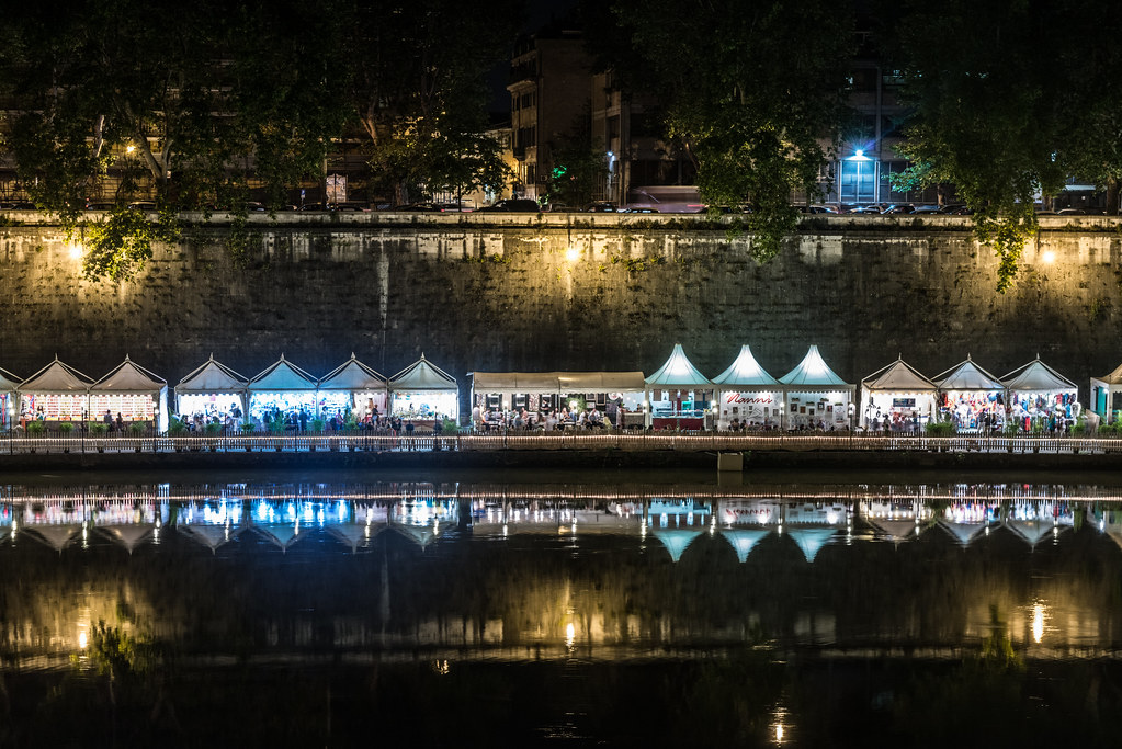 Untitled by TomOlson, on Flickr Untitled by TomOlson, on Flickr
|
|
#
?
Jul 28, 2014 18:38
|
|
|
If I had to pick one issue, I'd say that it's way too busy. It took me a bit to figure out what I was looking at and, to be honest, I still didn't really know until I saw your other photo of the same event, which I like a lot better. There's more depth and life, and the details (leaves, bricks, people) are much more clear.
|
|
#
?
Jul 28, 2014 18:48
|
|
|
RangerScum posted:Speaking of which, I really liked this shot and thought other people would like it more than they did. Anyone care to weigh in what feels off about it? Is this poo poo slightly crooked? I get not being a slave to thirds, but with something so cleanly cut into 3 horizontal pieces, laying it out the way you have makes it feel a touch bottom heavy to me. The whole scene seems to have a bit of an underbite. And the light not being centered over the building can't be helped, but drives me bonkers. It's a beautiful scene, though. Huxley fucked around with this message at 19:06 on Jul 28, 2014 |
|
#
?
Jul 28, 2014 19:03
|
|
|
Entenzahn posted:
you're right, i was in fact going for light/colors/texture. these are elements i think are pretty important for my photos, and for photos in general. thank you for your thoughts.
|
|
#
?
Jul 28, 2014 19:05
|
|
|
RangerScum posted:Speaking of which, I really liked this shot and thought other people would like it more than they did. Anyone care to weigh in what feels off about it? Is this poo poo slightly crooked? It looks like it tapers a little on the right, but judging from your other photo I'm guessing that's because it's curving towards you and is not completely straight anyways. I'm with the other guy on your other photo being much more interesting, I want to be able to pick out little details of the stands and people but I can't really, whereas in your other pic I love how the wall and stands curve from the bottom left to the upper right.
|
|
#
?
Jul 28, 2014 19:17
|
|
|
Huxley posted:I get not being a slave to thirds, but with something so cleanly cut into 3 horizontal pieces, laying it out the way you have makes it feel a touch bottom heavy to me. The whole scene seems to have a bit of an underbite. I feel the complete opposite, that it's a touch top heavy. The waterline, to me, splits the picture naturally into halves and not having the water line in the center throws off the top/bottom balance for me.
|
|
#
?
Jul 29, 2014 15:40
|
|

|

|
| # ? May 16, 2024 12:38 |
|
|
RangerScum posted:
I tend to agree with the top heavy sentiment. I think it would be a stronger image if you cropped to the top of the wall, particularly since the buildings on the top didn't catch a reflection in the river. Of course that might be a bit challenging to since it does not appears that the wall and river walk are naturally dead straight. Just eyeballing it, tilting the photo just a very slight bit left may make it appear straighter, but unless I am mistaking lens distortion for real world construction, it looks to me like the wall isn't holding precisely the same line as the tents on the river walk. I really appreciate the positive feed back on my prior submissions. Me and Tri-X have been having a difficult relationship, so I am glad I have finally been able to get the hang of working with the grain and not blowing it out. I recently bought an old Konica Auto-Reflex, with a half frame selector off e-bay. These are really test shots, but I had a concept in mind of combining contrasting subjects into side by side shots into one frame (since my scanner scans these as single frames anyway). I am sure I could do this in digital more effectively but I kind of like the idea of doing it on film in side by side shots.  Duality-2 by noonebutme2010, on Flickr Duality-2 by noonebutme2010, on Flickr Dual Flowers by noonebutme2010, on Flickr Dual Flowers by noonebutme2010, on FlickrThe first one demonstrates the concept much better but I was impressed with how well a $20 lens and a in camera meter that is probably over 45 years old did on the second shot.
|
|
#
?
Jul 29, 2014 17:45
|
|