


|
Shellman posted:I disagree, if he rotated to put the terrain straight across the bottom, the pole would look skewed and goofy and it is a stronger element in the picture. Yes, I that's true, but I just wondered if the picture could have been taken in a way where the horizon is closer to horizontal. I don't necessarily agree that the pole is the strongest element, because with the sun hanging over the straight road pointed straight at the sun, it really seemed to me that that was the main focus of the picture.
|
 #
?
Aug 30, 2014 20:00
#
?
Aug 30, 2014 20:00
|
|


|

|
| # ? May 16, 2024 22:54 |
|
|
Wooten posted:The first has better composition than the second. The river that runs in to the bottom tight of the first one creates a nice diagonal that leads my eye back into the frame. Both of them are way over saturated and sharpened, tone it down a bit and they will both improve. The clouds are a little over exposed, but not enough that I would worry about it. You can try underexposing a little to keep the detail in clouds most of the time. I didn't actually sharpen either of them. What makes them look over-sharpened, and how do I keep that from happening?
|
|
#
?
Sep 1, 2014 04:06
|
|
|
Boneitis posted:I didn't actually sharpen either of them. What makes them look over-sharpened, and how do I keep that from happening? Sharpening is fine, but you're getting artifacts from pushing the contrast/saturation too far. For example, check the first picture. On the left hand side where the rocks meet the sky you're getting a very noticeable halo and posterization of the clouds.
|
|
#
?
Sep 1, 2014 04:47
|
|

|
sw1gger posted:Recent pictures: These are pretty drat awesome so the only things I have to say are really small nit picks. 1) I feel like her face could be a little bit lower and to the left in the frame and possibly cropped a little closer. The mood is great and I wonder if you could brighten up the face/neck a little bit without ruining that. 2) Looks like excellent use of a strobe in day light to giver her face and body fill. The only down side is her hand is slightly brighter than her face. If anything I would want the face to be the brighteset part of hte photo. Also I think you could crop out some of the right side of hte frame or if shot again move the entire frame so she is on the right side and not dead center. -------- A few things from burning man. Trying out some new lightroom processing techniques: 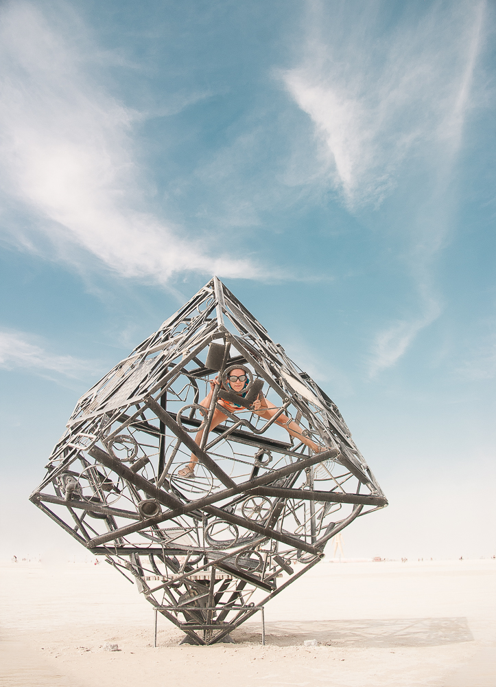 Edie Cube by jeff25rs, on Flickr  Steampunk AT-AT by jeff25rs, on Flickr 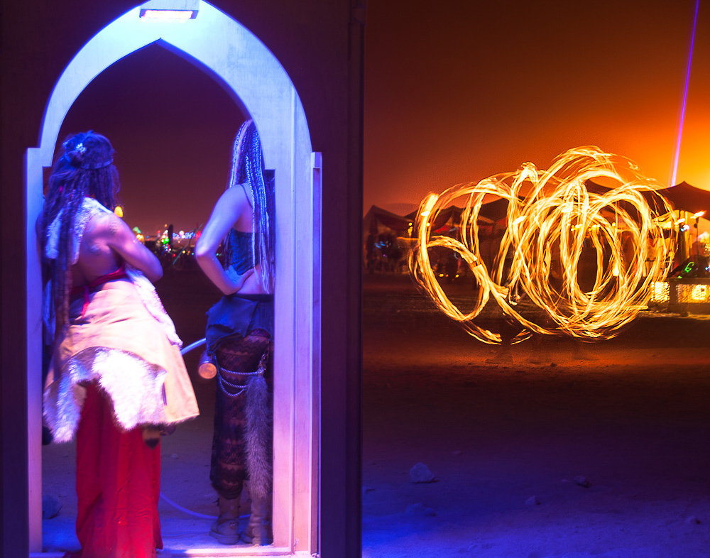 Fire at the Man by jeff25rs, on Flickr
|
|
#
?
Sep 4, 2014 03:24
|
|


|
CommunistCow posted:A few things from burning man. Trying out some new lightroom processing techniques: What were your goals with the composition on these? I think you missed it on each one.
|
|
#
?
Sep 4, 2014 03:29
|
|

|
RangerScum posted:What were your goals with the composition on these? I think you missed it on each one. 1) I didn't want completely centered as usually try and avoid that unless taking pictures of large buildings (like the temple). 2) I was going for a rule of thirds with the steampunk AT-AT and the person on it facing the left/open side of the frame. 3) This one is a little awkward but I didn't think it was terrible. I was trying to capture the two women on the left watching the fire on the right. Do you have any specific problems you see with the composition that you could elaborate on? Could you give suggestions on how you think they should be better?
|
|
#
?
Sep 4, 2014 04:38
|
|
|
CommunistCow posted:1) I didn't want completely centered as usually try and avoid that unless taking pictures of large buildings (like the temple). 1) Not cutting the shadow is correct, but I do think this could benefit from a center placement and more space. E: After fiddling around with this centered in photoshop, I'm not convinced I'm right, either. Cubes are hard to crop. 2) This one is really nice and I don't see any real complaint with it. Official disagree. 3) Aside from straightening that line on the right side of the ... portcullis? ... and just setting it dead center and making it a whole 50/50 thing I'm not sure what else you could do with it. Maybe the back of the girls' heads isn't the most interesting part of the photo, though they are the most dominant to my eye. Again, aside from just not having them in it, I'm not sure what your next move is. It's not bad, the least interesting of the three, though. Huxley fucked around with this message at 05:09 on Sep 4, 2014 |
|
#
?
Sep 4, 2014 05:01
|
|


|
I definitely think at least the first one would be better off centred. The cube is too big for it to work off-centre, unless maybe you had gone landscape so that the cube was in just the left-hand third rather than the left and centre. As it is, the symmetry of the cube would look a lot better if the photo were symmetrical too. This would also put the person off-centre which I think would work nicely. For the second I think you'd have been better off backing away a bit and getting the full length of the legs into the shot to emphasise the structure's height. Again, I think the subject is taking up too much of the frame and would probably look better with a bit more of its surroundings in the shot. The third just looks wrong split in half like that. Again, I think you needed to get further back and put it in thirds. The blurriness of the women is distracting too. All three are interesting subjects though, with better composition I think they would all be great shots. The first could be easily fixed with some cropping.
|
|
#
?
Sep 4, 2014 05:02
|
|


|
CommunistCow posted:A few things from burning man. Trying out some new lightroom processing techniques: I could've gone for the first one as a horizontal composition (still fine as is,) the second one would definitely be better if the feet of the thing weren't cut off, and not really feeling whatever is going on in the third one.
|
|
#
?
Sep 4, 2014 05:03
|
|

|
CommunistCow posted:1) I didn't want completely centered as usually try and avoid that unless taking pictures of large buildings (like the temple). Can't speak to the first one, but for your second, the Walker feels like it's "facing" the right edge of the frame, and the subject just feels kind of like it's exiting the frame rather than entering it. The person is facing the right way but the walker has a lot more visual weight and it has a pretty strong sense of direction and you should have composed it on the left, and possibly gone wider. As is, it's very snapshot-y. The third one feels very flat. The women and the fire seems to exist on the same plane and there's no dimension to it and thus you don't get the impression that they are watching the fire and it even seems like you just put two pictures together. Maybe you could have stepped to the left a bit and done an over the shoulder shot instead.
|
|
#
?
Sep 4, 2014 05:08
|
|

|
CommunistCow posted:-------- I very much like the first shot. The light shadows, the atmosphere, the expression and awkward position. The crop doesn't bother me in the slightest. On the second, I really wish you hadn't cut off that thing's 'ankles.'
|
|
#
?
Sep 4, 2014 19:17
|
|

|
I kinda like the second one, but I think it'd be a lot better if the whole thing was in frame or there was a better sense that it's really tall. The horizon being the very bottom of the frame, and how short it looks makes the picture feel a bit awkward. I hate the 3rd one, it's way too busy and that wall's light is doing absolutely nothing for it.
|
|
#
?
Sep 4, 2014 20:06
|
|

|
CommunistCow posted:1) I didn't want completely centered as usually try and avoid that unless taking pictures of large buildings (like the temple). I think the problem is the frames are crowded or off-balance in each photo. In the first one it feels crowded on the left hand side of the picture, and feels too bottom heavy. I'd sort of understand what you were going for if you said you were trying to balance the photo by including the shadow in the composition to center the object, but it doesn't hold enough weight to work. The sky at the top is just too much dead space and makes the photo look awkward. Also, why are you only okay with centering large buildings? What's the difference between a building and anything else? In the second one as other people said I think it looks bad to cut off the bottom of the at-at thing. It'd probably be a way more effective photo if you just took a few steps back and got the entire thing. As it looks, it just appears that you cut off a couple feet of legs. Maybe if you had taken it from a lower angle to give the illusion that it was taller then it would work better, but I don't really know for sure. It'd probably look better if you had just shot the whole structure. Another tip is don't ever list the rule of thirds as a reason for doing something, it makes it sound like you are just blindly following something you've read about without thinking about your composition in a meaningful way. In the third photo the left half of the frame is once again way too cramped on both the side and the top & bottom. You're filling up way too much of the frame with junk and I don't think it looks good how you shot the doorway straight on while sacrificing more of the scene on the right half of the photo. If anything I think you should have zoomed out / taken a few steps back again.
|
|
#
?
Sep 4, 2014 20:09
|
|
|
CommunistCow posted:These are pretty drat awesome so the only things I have to say are really small nit picks. 1: Not good,not bad. Crop to center next time. There's enough going on you didn't need all that sky. Should have made the person your primary goal and used the cube to frame her. Missed opportunity. 2. I would have went vertical on this. To get the whole AT-AT feel instead of cutting off heads and feet. Clone out the heads in the lower frame. Sadly its another "Missed opportunity". 3. Out of focus women come off blurry as gently caress. Too much going on with all that light. Sure, the fire dancer is kinda cool, should have just made that a shot, and then made those girls their own shot. Having them OOF ruins it. Theres no point to playing with presets/LR stuff if you cant compose a shot. Musket fucked around with this message at 20:28 on Sep 4, 2014 |
|
#
?
Sep 4, 2014 20:12
|
|
|
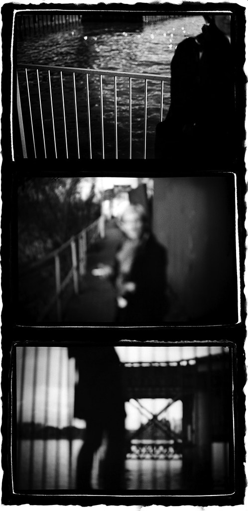
I have no photos from myself because I'm a horrible person who hasn't taken pictures in months.CommunistCow posted:A few things from burning man. Trying out some new lightroom processing techniques: I like this. It gives me the impression of a Storm Thorgerson album cover, or at least something in that direction. quote:
I'm not a fan of this. I think the few people in the foreground take away from the image. It'd be better with either no foreground people and desolation or lots of foreground people and a carnival feel. This straddles the two ideas not very well. McMadCow posted:
I appreciate the other comments you've received but I don't think I get the same level of narrative from the images. If it's memories fading or the relevance or understanding of an event fading then I'm not sure the narrative in the photos makes me think of a walk where something happened, rather events being jumped around from a particular evening. I think it's a very simple thing that's holding me back from getting a progressive story from the images. The in focus railings in the first shot are quite prominent, the out focus railings in the third shot make me think of it as a better progression narratively in setting than the second shot is. So it should be railings-railings-notrailings to give an impression of something happening on a walk. If you're suggesting that there's a loop going on here, where the railings of the last shot is supposed to indicate that this event will again progress to the first shot in a continuing repetition of the events then I think there's not enough indication or symbolism of that in the rest of the two images. Although there is water in both as well. Edit: On second look I like her face. Mrenda fucked around with this message at 05:30 on Sep 6, 2014 |
|
#
?
Sep 4, 2014 20:30
|
|

|
I cut off the legs of the Steampunk AT-AT thing because there were quite a few people milling around in it with bicycles and other crap. In generally I try and make my shots as clean as possible. Until someone pointed it out in this thread I didn't realize people's heads were still visible in the lower part of the frame. When my options are include all of something with distracting elements or cropping part of it and removing those elements, I will generally choose the latter. If I had my larger tripod and 9 stop ND filter I could have done a longer exposure to try remove the people moving around, but I didn't have those items with me. Do you guys think that including the legs with a bunch of people around would have been better?
|
|
#
?
Sep 4, 2014 22:24
|
|
|
CommunistCow posted:Do you guys think that including the legs with a bunch of people around would have been better? Personal preference, but I'd rather have the subject of the photo not be awkwardly cut off by the crop at the cost of having some small extraneous poo poo than the way it is now. Plus it's in the middle of the desert; that'd like the easiest clone stamp job ever to fix it.
|
|
#
?
Sep 4, 2014 22:35
|
|
|
CommunistCow posted:I cut off the legs of the Steampunk AT-AT thing because there were quite a few people milling around in it with bicycles and other crap. In generally I try and make my shots as clean as possible. Until someone pointed it out in this thread I didn't realize people's heads were still visible in the lower part of the frame. When my options are include all of something with distracting elements or cropping part of it and removing those elements, I will generally choose the latter. If I had my larger tripod and 9 stop ND filter I could have done a longer exposure to try remove the people moving around, but I didn't have those items with me. You were at burning man, you gotta deal with the people being there. It would have been a much better shot to see the whole ATAT even with people milling about. Deadpan street, makes you think 
|
|
#
?
Sep 4, 2014 22:43
|
|
|
CommunistCow posted:Do you guys think that including the legs with a bunch of people around would have been better? 100%. Especially since people at BM can be interesting looking.
|
|
#
?
Sep 5, 2014 14:06
|
|
|
Took my Rebel T3i out today for the first time. Total beginner at this, although I did take a photography class back in high school. I also pumped up the color a lot using photoshop. Is there anything that could have been improved in these shots? e: sorry, I'm brand new to this and had literally no idea what to provide as a critique. I like the balance of the last pic and feel like the diagonal lines painted on the wall really lead your eyes around the shot.   
Red and Black fucked around with this message at 15:45 on Sep 7, 2014 |
|
#
?
Sep 7, 2014 08:51
|
|
|
Migrating Wildebeest Chomskyan posted:Took my Rebel T3i out today for the first time. Total beginner at this, although I did take a photography class back in high school. I also pumped up the color a lot using photoshop. Is there anything that could have been improved in these shots? CommunistCow posted:A few things from burning man. Trying out some new lightroom processing techniques: 1. This is a really great shot and I like everything about it except where the cube is in the frame. At the very least it feels like there should be a bit more room on the left of the cube. 2. The guy leaning against the house-thing kind of wrecks this shot unfortunately. Without him there it would be an awesome apocalyptic/wasteland-type shot. 3. When I look at this one I feel like there are two very interesting shots that have been merged into one confusing shot.
|
|
#
?
Sep 7, 2014 15:16
|
|

|
Chomskyan posted:Took my Rebel T3i out today for the first time. Total beginner at this, although I did take a photography class back in high school. I also pumped up the color a lot using photoshop. Is there anything that could have been improved in these shots? You should do that thing that it says in the title of the thread before SoundMonkey finds out. But the shots are generally pretty boring, they're fine as photos to have your friends use as profile pics or something but it'd be pretty hard to have anyone else care about them.
|
|
#
?
Sep 7, 2014 15:23
|
|
|
InternetJunky posted:Migrating Wildebeest I like this shot, has more of an artistic quality than a lot of the more technically great shots you post. The blurred legs emphasizes the pace of the subjects and the elements of the subjects that allow us to identify them as wildebeasts (horns, mane) are in focus enough to be satisfying to the eye. I'm not sure how I feel about this and feel like I may have ruined the shot by not shooting a higher aperture to allow for the left edge of the window/wall to be in focus.  Hex by TCZPhotography, on Flickr Hex by TCZPhotography, on Flickr
|
|
#
?
Sep 8, 2014 19:48
|
|

|
Chomskyan posted:Took my Rebel T3i out today for the first time. Total beginner at this, although I did take a photography class back in high school. I also pumped up the color a lot using photoshop. Is there anything that could have been improved in these shots? Boring. Needs better composition. colors are too contrasty/off. Dont pump color on people. Boring. Needs better composition or the delete button. Background OOF person is a heavy distraction as well. Boring. Dont cut off feet. Take a step back. needs better composition. Dont push color that far on people. Also read the OP, you are breaking rules. Musket fucked around with this message at 21:11 on Sep 8, 2014 |
|
#
?
Sep 8, 2014 21:08
|
|
|
CommunistCow posted:
I feel that the cube is balanced with the shadows, both borders of the cube and the shadow are at equal distance from the frame border. I also feel that the cube balances out the slightly small strip of land versus the sky. Those things contributes to make me like this photo and it feels balanced in portrait, portrait also draws some attention to the photo.
|
|
#
?
Sep 8, 2014 22:35
|
|
|
InternetJunky posted:Migrating Wildebeest I really like this shot. I wish the wildebeest's head was in focus rather than it's back but I imagine that the head would be moving more. Did you happen to get any pictures of the front one in focus instead of the back one? ------------------- Some more burning man photos. Let me know if you guys think the composition is better on these.  Skeleton Tree by jeff25rs, on Flickr  Temple Entrance Chandelier by jeff25rs, on Flickr  metal flowers by jeff25rs, on Flickr This one I feel like I should have cropped the partial flowers on the right side of the frame. That would probably look cleaner.
|
|
#
?
Sep 8, 2014 23:12
|
|
|
VelociBacon posted:I'm not sure how I feel about this and feel like I may have ruined the shot by not shooting a higher aperture to allow for the left edge of the window/wall to be in focus. I don't think the spoilertexted bit really matters. I would not have noticed it if it wasn't mentioned and I don't really mind even now that it has been pointed out. The triangle/trapezoid light/shadow deal inside the hexes is far more interesting and that's captured well.
|
|
#
?
Sep 8, 2014 23:40
|
|


|
I like those flowers, but I think it would have been a better shot if you were about two steps back and one step to the left. The partial flower on the right wouldn't have been in frame, and you would have gotten all of the flower on the right instead of cutting it off.
|
|
#
?
Sep 8, 2014 23:46
|
|
|
InternetJunky posted:Just commenting on this one since I'm not sure what to say about the other two other than they are a bit boring (sorry). For this shot, I'm seeing a real magenta tint to the face. Also, the background is very busy and distracting. You should probably ease off on the "pumped up the color a lot". Geektox posted:You should do that thing that it says in the title of the thread before SoundMonkey finds out. Musket posted:Boring. Needs better composition. colors are too contrasty/off. Dont pump color on people. Thanks! I'll try to provide a better critique next time and not break the rules again. I also won't pump color so much on people anymore, and I'll remember not to cut off people's feet next time I'm doing a full body shot. Not really sure how to improve the composition though, are there any good beginner resources for that? Red and Black fucked around with this message at 17:39 on Sep 9, 2014 |
|
#
?
Sep 9, 2014 16:07
|
|
|
totalnewbie posted:People in this thread recommended two different books about composition, one a more "artistic" book and the other a more "methodical" book. whsa posted:I went for National Geographic Complete Photography which was decent for a beginner and The Nature of Photographs which wasn't straightforward and didn't offer much practical advice to a beginner but does contain beautiful photographs with some critique.
|
|
#
?
Sep 9, 2014 16:24
|
|
|
Chomskyan posted:Thanks! I'll try provide a better critique next time and not break the rules again. I also won't pump color so much on people anymore, and I'll remember not to cut off people's feet next time I'm doing a full body shot. Not really sure how to improve the composition though, are there any good beginner resources for that? The only way to improve is to keep shooting. Dont let bad crits bring you down. We all sucked at this for a long time. You can read books but that wont really do you any good if you dont go out and shoot every day.
|
|
#
?
Sep 9, 2014 17:34
|
|
|
Chomskyan posted:Not really sure how to improve the composition though, are there any good beginner resources for that? Look at images you love and dissect them to see what worked and what you're doing that isn't working. Find one thing, figure out how to do it right, and keep going.
|
|
#
?
Sep 9, 2014 18:28
|
|

|
VelociBacon posted:I'm not sure how I feel about this and feel like I may have ruined the shot by not shooting a higher aperture to allow for the left edge of the window/wall to be in focus. I think the aperture is fine. The softness of the left edge adds to the ethereal quality of the image. It's pleasing to the eye, and I agree with the earlier post noting that the interesting element is the shadows. I might have changed the composition to focus more on the hexes and their shadows, but I can't say for sure as I haven't seen the subject. Posed shots can be a real pain, so I've been playing around with candids lately.  Being Young by Jack_Lord, on Flickr Being Young by Jack_Lord, on Flickr
|
|
#
?
Sep 10, 2014 16:27
|
|
|
CommunistCow posted:
This is my favorite out of the bunch, I think that maybe a little more contrast in the shadows would add to the scene, but I love the angle and the glare of the sun in it - definitely feels like a dry, awful desert. CommunistCow posted:
The patterns are interesting, but constantly being overlaid on top of one another makes them kind of just blur into something I really have to strain to find. Maybe a different angle or a wider shot, but the similarity of color and pattern makes me feel crowded out. CommunistCow posted:
Yeah, I agree, and then the mountains at the bottom, I'd say either show more of them or lose them entirely. I like this one quite a bit too.  Sunset by soopadoop, on Flickr Sunset by soopadoop, on Flickr Emboss by soopadoop, on Flickr Emboss by soopadoop, on Flickr Friction by soopadoop, on Flickr Friction by soopadoop, on Flickr
|
|
#
?
Sep 10, 2014 16:32
|
|

|
Soopafly posted:
I'm really enjoying this one for the cleanness and simplicity. I do find that the stone block sticking out of the top left and the clouds on the bottom right somewhat distracting, they become a point of focus. Perhaps they should have been clone stamped out. Feel free to contest me on this if you disagree. Otherwise I find it to be a very solid shot.
|
|
#
?
Sep 10, 2014 17:19
|
|

|
Soopafly posted:
1. Seems crooked, exposure is good, but there's a better composition to be had. 3. You still need to control backgrounds for uncontrolled action.  Is it too overexposed?  Does the deadspace work?  Emotion, does it have it?
|
|
#
?
Sep 11, 2014 14:27
|
|

|
The Monk posted:1. Seems crooked, exposure is good, but there's a better composition to be had. Are you with the military or a photojournalist? I think for the last shot everyone seeing a smiling soldier in what looks like the middle east induces some eyerolls and consternation from the viewing audience - I personally am unable to distance myself from that emotion while viewing the shot. I love the second shot! Both the placement of the tank/TOW in the frame and the definition of the projectile being launched in contrast to the grey gradient behind it. The first one's exposure seems fine to me, the detail you get on the equipment and other soldier on the right is worth it. I wonder if you could take the highlights down to get more detail out of the mortar firing 'explosion'.
|
|
#
?
Sep 11, 2014 18:16
|
|
|
The Monk posted:1. Seems crooked, exposure is good, but there's a better composition to be had. I really dig the light for the first one. I feel that for shooting in pretty much all darkness except for the explosion being the only source of light, I think it turned out really well. I feel that that type of light is appropriate for the situation. It also gives a feeling of motion around the two soldiers. For the second one, I think it's an all around great shot. The foreground is interesting but subtle. The projectile and tank contrasted against the light look awesome. For the last one, not sure what kind of emotion you're trying to get out of it. I feel like the picture is your typical "1 2 3 smile" kind of thing. I think this might have turned out better with a more candid shot. As for me...  Panama 063 by esa_foto, on Flickr Panama 063 by esa_foto, on FlickrI think I could have gotten the full cup on the bottom right into the shot and shifted the focus a bit further back or forward so that the main focus didn't run along the center of the picture.  Panama 067 by esa_foto, on Flickr Panama 067 by esa_foto, on FlickrI really like this picture and surprised myself a little bit with the fact that I took it. I think it's pretty good but falls with all the other pictures that get popular on 500px and is pleasing to the eye but doesn't tell a story or inspire or anything like that.  Panama 061 by esa_foto, on Flickr Panama 061 by esa_foto, on FlickrI keep coming back to this picture and looking at it, not sure what to make of it. I think the gradient from light to dark blue is nice and the fact that all the negative space is sharp and in focus. I believe it could use a bit more of a foreground subject to focus on.
|
|
#
?
Sep 12, 2014 04:04
|
|

|
huhu posted:
A photo doesn't always need to tell a story. If you're working on something you haven't done before, you're improving your skills. Exposure and lighting are key, and this image helped you work on both. The "nighttime city scene with blurred taillights" is a bit of a clich�, but it's also cool and generally appealing to viewers. I probably would've have bumped up the saturation and composed the image so the road is centered, which would create a clearer vanishing point along with cutting out some of the parked cars on the left and adding more of the right hand side of the city. I also would've left the shutter open a bit longer. Out of curiosity, Were you using a VR lens or tripod/monopod? At my end, this photo was taken after a storm on just about the bleakest winter day I've ever encountered. Grim, overcast, and unnervingly stark. I used B&W to try to convey that.  Snow-Day by Jack_Lord, on Flickr Snow-Day by Jack_Lord, on Flickr
|
|
#
?
Sep 12, 2014 14:10
|
|
|

|
| # ? May 16, 2024 22:54 |
|
|
Lagrange posted:A photo doesn't always need to tell a story. If you're working on something you haven't done before, you're improving your skills. Exposure and lighting are key, and this image helped you work on both. The "nighttime city scene with blurred taillights" is a bit of a clich�, but it's also cool and generally appealing to viewers.  I was using a tripod with the kit lens. I left home for a few days without my other lens or else I would have tried shooting with that as well. I was using a tripod with the kit lens. I left home for a few days without my other lens or else I would have tried shooting with that as well.As for your picture, I think it's pretty well shot. I like the grey at the top and the area of the tree which you decided to capture. I've had an idea like this in my head for awhile to try and shoot without success and I think you nailed it. huhu fucked around with this message at 16:36 on Sep 12, 2014 |
|
#
?
Sep 12, 2014 16:33
|
|