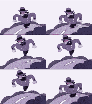
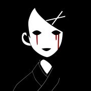
Al! posted:walking animations are hard Arms are good, but imo it need more torso movement, some hip/soulder twist. Should probably be a little leaned forward as well, centre of gravity is a little off.
|
|
|
|
|

|
| # ? Apr 27, 2024 20:35 |
|
Well, it's been a while since I posted. I got incredibly busy with my thesis and will likely remain such until the end of the month, so I was too tired in the evenings to draw. Today I had a plane flight to Malaga though, so I had two hours to spare. Started on another scenery, but didn't manage to finish it, so here's just a preliminary sketch for now: https://twitter.com/Shinmera/status/985515966770696192
|
|
|
|
https://twitter.com/rainbowfission/status/985565918637027329 https://twitter.com/rainbowfission/status/985566117648269312 This is great, it reminds me a lot of the city Nier Automata takes place in.
|
|
|
|
lofi posted:Arms are good, but imo it need more torso movement, some hip/soulder twist. Should probably be a little leaned forward as well, centre of gravity is a little off. thanks for the advice! still need to work on that walking animation to fix the center fo gravity but it's def an improvement: https://www.youtube.com/watch?v=qkxjLRCFckQ edit: here's my collaboration that i was working on as trade for the loops: https://twitter.com/the2dcat/status/985619836410761218 Al! fucked around with this message at 22:05 on Apr 15, 2018 |
|
|
|
Al! posted:walking animations are hard It's just that the proportions are off - here, I redlined it for ya: (uh sorry about the quality I hosed up saving it but you can still see what I mean)  The end of the hand will generally reach about mid-thigh on a normal person, and the girl has long legs, but stumpy arms comparatively. Your options are to bring up the legs or lengthen the arms. Personal preference note: I would leave the bobbing out. Even though humans do technically go up and down when walking, on a scale like this she looks a bit too bouncy, like she's got a happy skip in her step even though she's obviously a goth and far more likely to slouch ahead.
|
|
|
|

|
|
|
|
I like the attitude here
|
|
|
|
|
sigma please stop making people's noses too long.
|
|
|
|
Neon Noodle posted:sigma Part of the problem may be the eyes are too large, so the nose follows?
|
|
|
|
If the proportional division of the head is wrong, everything within those divisions will be wrong.
|
|
|
|
Neon Noodle posted:sigma Counter point: big long noses are good  (Though I agree, for the faces sigma is drawing the proportions, particularly the bridge of the nose here, are off)
|
|
|
Working through the Bargue plates. You're supposed to map out the highest/lowest, leftmost/rightmost points first and then draw connecting lines between them. No curved lines at all during construction. I can tell that this is a very useful exercise because it makes me feel uncomfortable as hell. 
|
|
|
|
|
dupersaurus posted:Have you tried frisket film? I absolutely have not nor have I ever heard of it! I'll look into it and whether or not I can translate that. Fun fact: when I was trying to find masking fluid (that I also had not heard of until Neon Noodle mentioned using it in one of their paintings) I was going up to the bookshop and craft shop and describing what it does to find it because I did not have a translation for the stuff. Did not find any, had to order it on amazon. The chickins never end! 
|
|
|
|
MTV Crib Death posted:Working through the Bargue plates. You're supposed to map out the highest/lowest, leftmost/rightmost points first and then draw connecting lines between them. No curved lines at all during construction. I can tell that this is a very useful exercise because it makes me feel uncomfortable as hell. These are loving awesome. How are you mapping these out? And do you use a ruler or are you free handing those lines, because everything is so dam crisp. Sharpest Crayon posted:I absolutely have not nor have I ever heard of it! I'll look into it and whether or not I can translate that. Fun fact: when I was trying to find masking fluid (that I also had not heard of until Neon Noodle mentioned using it in one of their paintings) I was going up to the bookshop and craft shop and describing what it does to find it because I did not have a translation for the stuff. Did not find any, had to order it on amazon. I like this one a lot. The more muted colour palette seems unusual for you, and that combined with the longer brush strokes lends a sort of 19th century children's book feel to it! EDIT: I feel like Im looking at a Scottish hen up in the highlands. It has that sort of austere beauty to it. d3c0y2 fucked around with this message at 23:53 on Apr 16, 2018 |
|
|
 Well pleased with how this is coming along. A7 is the best comic format. e: I'm gonna enlarge the text in the first page, I think. Still getting to grips with having to make the words happen myself with my hands.
|
|
|
|
d3c0y2 posted:These are loving awesome. How are you mapping these out? And do you use a ruler or are you free handing those lines, because everything is so dam crisp. Thanks! I only used a ruler to drop the initial cross for the three small faces and all of ears. I wasn't supposed to but it was getting near the end of lunch hour and I wanted to finish the whole plate.
|
|
|
|
|
 Did a very simple landscape for fun. It was inspired by some weird bad video game I can't even remember the name of which is why the palette is so odd.
|
|
|
Internet Kraken posted:
I wanna hug that sun and burn up forever.
|
|
|
|
|
Sharpest Crayon posted:I absolutely have not nor have I ever heard of it! I'll look into it and whether or not I can translate that. Fun fact: when I was trying to find masking fluid (that I also had not heard of until Neon Noodle mentioned using it in one of their paintings) I was going up to the bookshop and craft shop and describing what it does to find it because I did not have a translation for the stuff. Did not find any, had to order it on amazon. It's kinda like fancy masking tape, although now that I think of it I don't know if it's intended for wet media. I used it a bunch back in school with pastels.
|
|
|
|
Bored at work sketches sometimes go weird. Especially when I don't have any reference and I'm just drawing from my minds eye. 
|
|
|
|
https://twitter.com/rainbowfission/status/986309013624279040 https://twitter.com/rainbowfission/status/986309130808971264
|
|
|
More Bargue plates. First foot is horrendous in terms of proportion so I'll probably redo that one at some point.
|
|
|
|
|
I've been working on a commission for a friend of mine. Someday I'll figure out how to do backgrounds properly
|
|
|
|
I just finished a beginner's watercolor painting class, this is the piece i felt came out the best Criticism welcome, especially with how to get depth on the door (it looks so flat) and how to make the flowers go in front of the door without getting muddied up (mask?) but be gentle, this is the first art class I've done since I was 12 years old DrGonzo90 fucked around with this message at 04:40 on Apr 18, 2018 |
|
|
|
DrGonzo90 posted:I just finished a beginner's watercolor painting class, this is the piece i felt came out the best I think the biggest thing I would focus on would be varying the sizes and patterns of the leaves more, look at on the left side how the leaves start out larger and less evenly spread out near the top and get smaller and less clumped together as they come down. Layering things is harder, watercolor is a tricky unforgiving mofo when it comes to that, you kinda have to start with the things in the foreground and work back, which is the opposite of how other kinds of painting work so it's not very intuitive. I'm no good at watercolor so take that with a grain of salt. This head is kinda creepy and generic looking, but I mostly just made it to use as a mannequin for some different hairstyles (why the top/sides of the head aren't really shaded) so it's good enough for that 
|
|
|
|
Finally drew something again. Bored space hotdog.  sorry for the kinda lovely picture
|
|
|
|
https://twitter.com/rainbowfission/status/986673621698596864
|
|
|
|
Did a small off-the-cuff piece to try some thoughts I had
|
|
|
|
Wowporn posted:This head is kinda creepy and generic looking, but I mostly just made it to use as a mannequin for some different hairstyles (why the top/sides of the head aren't really shaded) so it's good enough for that It might seem somewhat inconsequential, but ensuring that the planes on the mannequin are good - especially on the top/sides - is important for convincing-looking hairstyles. You don't even have to shade them, necessarily; you can use cross-contour lines or edge indicators to show the various plane changes. The reason this is important is the principle of having a solid framework to hang the hair on. Hair naturally follows the planes of the head, and is usually drawn in large chunks or clusters, so being able to "see" where the hair is going to turn down, what could cause changes in its course, how it relates in terms of its position to the head (if you're doing something like spiked hair, bangs, etc.). I did a quick sketch based on your image to show what I mean:  Mapping out the side plane of the head especially makes it easier to place hair on top of the mannequin without too much fiddling or worrying about the shape, since you can compare the planes of the hair to the planes of your mannequin to more easily determine flow:  I say this only because I've learned the hard way that spending a bit of time on making the rougher stuff look good will save a lot of time later on when it comes to making the finished stuff look good. It doesn't have to be a Picasso (and it definitely shouldn't if all you're doing with the piece is some concept art), but making sure you've got that good framework to work off of will make your life a lot easier in the long run.
|
|
|
|
my buddy Superfly posted:This is great, it reminds me a lot of the city Nier Automata takes place in. It's based on what I remembered of a screenshot I made at one point. Speaking of, I flew back to Switzerland today, and spent the two flight hours finishing it up. It's still rough around a lot of edges, but whatever. https://twitter.com/Shinmera/status/986712028927709184
|
|
|
|
Noooo don't serve that latte it's so bad for them! (I love this Internet Kraken posted:
This is so happy aaaargh I want to bounce about in this happy pastel funland! DrGonzo90 posted:
Unfortunately, the only way to get the leaves in front of the door now is to ditch watercolours and move on to acrylics to get some opaqueness. Watercolours are firmly in the "should've thought of that earlier" camp of painting when it comes to adding stuff to the foreground. Your options would have been to paint them first, then very carefully paint the door in around them, or using the aforementioned masking fluid to mask out the parts where they will be, painting the door, then peeling the mask and painting the leaves in. The only reason the door looks flat when comparing is because of the 3d effect brought on by the bright light leaves covering the reference. If you just look at it without the reference, you've got wood grain and tone variation in the wood and shadows in the corners, it really doesn't look flat and you've done a good job bringing all that detail in. I also like how many different shades you've brought in the foliage! I agree with Wow in that adding larger leaves would even the picture out more, since the door is the biggest area of colour and getting some more coverage on the foliage would spread the attention more. I used to love to do lil details with tiny brushes, but try using a bigger brush with a proper sharp tip. That way, you can still do your detail when you carefully use just the tip of the brush, but when you want bigger shapes you just press down more to spread the brush on the paper. As for me, tiger study. 
|
|
|
|
Sharpest Crayon posted:Unfortunately, the only way to get the leaves in front of the door now is to ditch watercolours and move on to acrylics to get some opaqueness. Watercolours are firmly in the "should've thought of that earlier" camp of painting when it comes to adding stuff to the foreground.
|
|
|
|
Vermain posted:It might seem somewhat inconsequential, but ensuring that the planes on the mannequin are good - especially on the top/sides - is important for convincing-looking hairstyles. You don't even have to shade them, necessarily; you can use cross-contour lines or edge indicators to show the various plane changes. The reason this is important is the principle of having a solid framework to hang the hair on. Hair naturally follows the planes of the head, and is usually drawn in large chunks or clusters, so being able to "see" where the hair is going to turn down, what could cause changes in its course, how it relates in terms of its position to the head (if you're doing something like spiked hair, bangs, etc.). Yeah that's a good point, I have the hairline in the sketch layer still but I'll have all that stuff in the sketch for each hairstyle. I'm not amazing at drawing heads but I have a lot of experience styling weird hair so I hope it translates to this a little.
|
|
|
|
https://twitter.com/rainbowfission/status/987040063006617601
|
|
|
|
ThePlague-Daemon posted:I've been working on a commission for a friend of mine. Background looks pretty good to me. Can you talk a little about your process? I love the style of this piece. The guys pose gives me less-weird Aeon Flux vibes.
|
|
|
|

|
|
|
|
Today I just wanted to draw "the woman is bigger than the dude" edited to add: gently caress yesss now gimme some pink on that tongue
|
|
|
|
Exhausted as gently caress but I gotta draw. Here's some quick fan art of The Good Life -- I sure hope it gets funded! https://twitter.com/Shinmera/status/987096406405074944
|
|
|
|
Babby's first drawing, doing rock studies
|
|
|
|

|
| # ? Apr 27, 2024 20:35 |
|
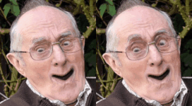
Hey art goons, I started drawing again after a pretty long art drought, so I decided to try out a portrait to get the gears turning again. This is graphite and CarbOthello black pastel, on ye olde printer paper. I'm pretty sure I hosed up the eye placement, but aside from that, any thoughts/suggestions? Also, trying to get a cell phone picture to reflect the value range of the actual page is a huge pain in the rear end.  04.19.2018 | Graphite + CarbOthello Pastel on Printer Paper by Kris Nicholson, on Flickr 04.19.2018 | Graphite + CarbOthello Pastel on Printer Paper by Kris Nicholson, on Flickr
|
|
|


