


|

|
 #
?
Jul 31, 2020 04:30
#
?
Jul 31, 2020 04:30
|
|


|

|
| # ? Apr 26, 2024 16:15 |
|
|
Noiiiiice
|
|
#
?
Jul 31, 2020 04:47
|
|


|
Absurd Alhazred posted:They do say that labyrinths are making a comeback: How do you get lost in a labyrinth? Just keep walking.
|
|
#
?
Jul 31, 2020 04:57
|
|


|
not all labyrinths are unicursal!!!
|
|
#
?
Jul 31, 2020 05:48
|
|


|
no true labyrinth...
|
|
#
?
Jul 31, 2020 05:59
|
|


|
Subjunctive posted:How do you get lost in a labyrinth? Just keep walking. Coz the cow man eats you.
|
|
#
?
Jul 31, 2020 06:05
|
|
|
Subjunctive posted:How do you get lost in a labyrinth? Just keep walking. 
|
|
#
?
Jul 31, 2020 07:14
|
|

|
Well today I found out professional labyrinth builder is a thing. Anyway just going to send some people some questions about where I might go about inquiring a miniator.
|
|
#
?
Jul 31, 2020 07:24
|
|

|
This is the full comic, for anyone who doesn�t remember it.
|
|
#
?
Jul 31, 2020 09:58
|
|

|
Platystemon posted:This is the full comic, for anyone who doesn�t remember it. Also for those that don't know, the comic is called Oglaf and is INSANELY not safe for work unless you work in the anthropomorphic semen elemental factory, I guess
|
|
#
?
Jul 31, 2020 10:10
|
|


|

|
|
#
?
Aug 1, 2020 00:45
|
|

|
lmbo always good to be reminded that you can definitely count on those abstract index rankings 
|
|
#
?
Aug 1, 2020 01:06
|
|
|
Well it's ability to respond, not willingness to respond, so technically correct? But yeah it's Forbes so 
|
|
#
?
Aug 1, 2020 01:17
|
|

 Yes, it's like a lava lamp.
|
excuse me it shows pandemic preparedness in 2019 not in 2020
|
|
#
?
Aug 1, 2020 01:45
|
|

|
Memento posted:Also for those that don't know, the comic is called Oglaf and is INSANELY not safe for work Since this is the charts thread, I would have to guess that in a venn diagram the intersection of "people who can browse webcomics while working" and "people who are not working from home" is going to be tiny these days.
|
|
#
?
Aug 1, 2020 07:23
|
|

|
https://twitter.com/cfidd/status/1288786454995402752
|
|
#
?
Aug 1, 2020 23:50
|
|


|
I won't understand the growth in labyrinth popularity until I see it visualised in a chart that is also a labyrinth
|
|
#
?
Aug 2, 2020 02:42
|
|

|
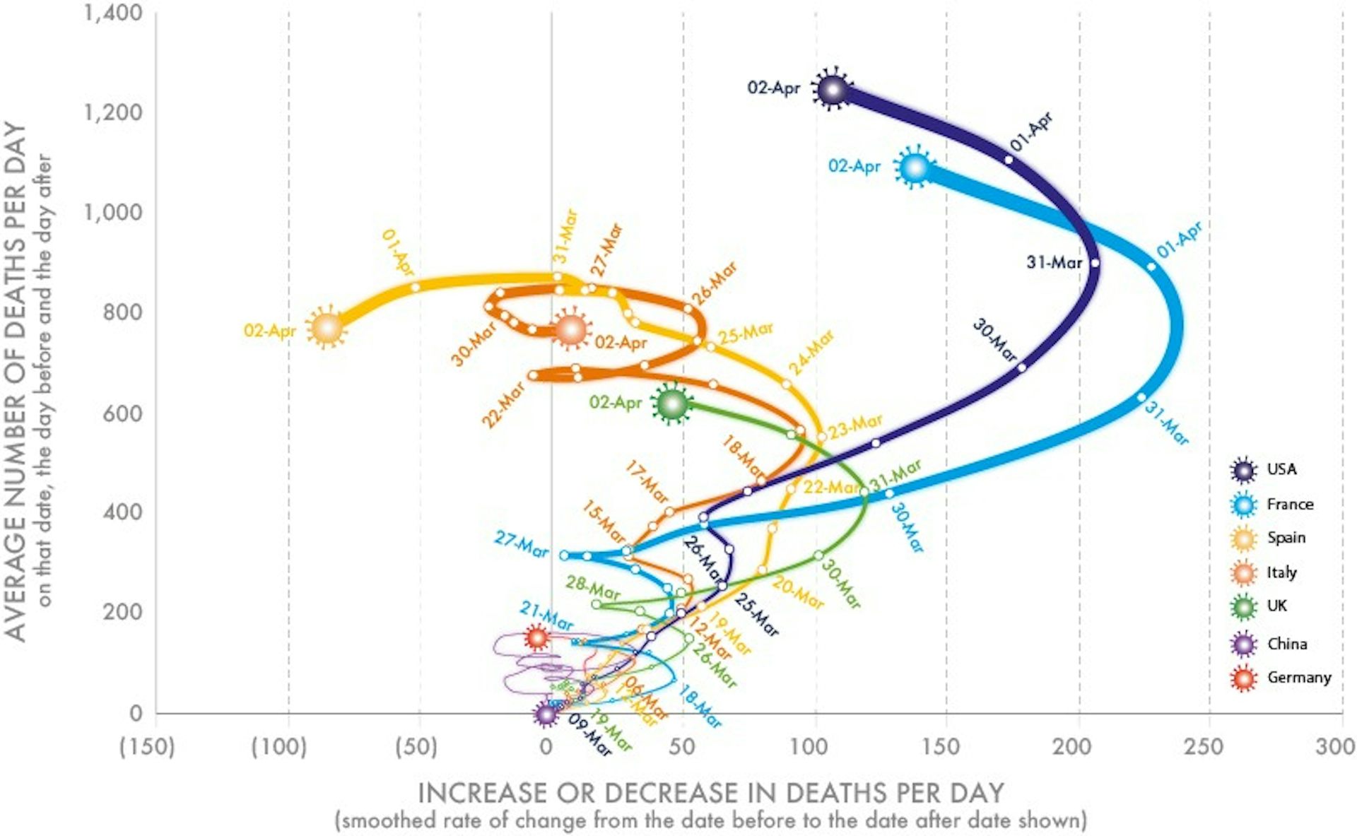 are these ever a good idea?
|
|
#
?
Aug 3, 2020 15:16
|
|

|
morallyobjected posted:
I'm not sure why difference of deaths per day is important enough to get it's own axis. Why not just show deaths vs time? You can visually see the change, that's the point of graphing it in the first place. Edit: and does the line thickness mean anything? I think this type of graph has its uses but it's pretty rare that time isn't an independent variable.
|
|
#
?
Aug 3, 2020 15:29
|
|

|
Count Roland posted:I'm not sure why difference of deaths per day is important enough to get it's own axis. Why not just show deaths vs time? You can visually see the change, that's the point of graphing it in the first place. Rate of change in a pandemic is often tied to number of cases, and the coordinate position on this graph effectively shows the R0. More useful than change in cases/time at least.
|
|
#
?
Aug 3, 2020 15:48
|
|

|
Count Roland posted:I'm not sure why difference of deaths per day is important enough to get it's own axis. When analyzing rate data it's often helpful to plot dx/dt vs x because it eliminates time. This way you can compare experiments done over disparate time scales and think about if they're caused by the same underlying mechanism. Things get literally loopy though if you smooth and average too much.
|
|
#
?
Aug 3, 2020 15:56
|
|

|
HardDiskD posted:excuse me it shows pandemic preparedness in 2019 not in 2020 The US did have a dedicated pandemic response team and extensive planning for it. Donnie disbanded all that, albeit in 2017 sooooo
|
|
#
?
Aug 3, 2020 15:56
|
|

|
Edgar Allen Ho posted:The US did have a dedicated pandemic response team and extensive planning for it. Donnie disbanded all that, albeit in 2017 sooooo its joke
|
|
#
?
Aug 3, 2020 16:14
|
|
|
morallyobjected posted:
https://getyarn.io/yarn-clip/25eec92f-07f0-4dbf-b4d6-0165042d8ed1
|
|
#
?
Aug 3, 2020 19:26
|
|

|
|
|
#
?
Aug 4, 2020 12:38
|
|
|
This reads like that old joke image that had you say the color of a given text out loud, but the text was a different colour name, like RED in big blue letters, BLUE in yellow, and so on.
|
|
#
?
Aug 4, 2020 15:23
|
|

|
Jiru posted:This reads like that old joke image that had you say the color of a given text out loud, but the text was a different colour name, like RED in big blue letters, BLUE in yellow, and so on.
|
|
#
?
Aug 4, 2020 15:43
|
|


|
dwarf74 posted:That's actually a pretty important finding of cognitive psychology, called the Stroop Effect. I used it when I taught psychology a couple years ago and watching kids try to read it out was marvelous
|
|
#
?
Aug 4, 2020 19:03
|
|
|

|
|
#
?
Aug 6, 2020 14:26
|
|


|
https://i.imgur.com/5Y8dsOt.mp4
|
|
#
?
Aug 6, 2020 14:37
|
|

|
Weak slope thus mild effect. Come back when your slope is above 1 and maybe I can get you published in the econ journal.
|
|
#
?
Aug 6, 2020 14:47
|
|

|
Wanna see the r value on that
|
|
#
?
Aug 6, 2020 15:01
|
|
|
Outrail posted:Wanna see the r value on that  https://twitter.com/AmihaiGlazer/status/1278561256589324288
|
|
#
?
Aug 6, 2020 15:51
|
|


|
https://twitter.com/laure_wynants/status/1291034571199467520
|
|
#
?
Aug 6, 2020 15:55
|
|
|
Why use P value when you can trust in Q? Vaccines bad! 
|
|
#
?
Aug 6, 2020 16:15
|
|
|
Salty statisticians are the best: R.A. Fisher posted:To consult the statistician after an experiment is finished is often merely to ask him to conduct a post mortem examination. He can perhaps say what the experiment died of.
|
|
#
?
Aug 6, 2020 17:50
|
|

|
Every vaguely scientific post grad includes a statistical methods course. But you can get a C+ by copying and pasting the Mythical and Unknown SAS Glyphs found on Google into your command line and cramming with the photo copied notes of the one person who actually understood the course.
|
|
#
?
Aug 6, 2020 17:58
|
|
|
Uh, in my graduate biostatistics analysis class we had to do the tests manually to show us how they worked and to remove any "black box number comes out". Only after we did the tests by hand (by setting up the math ourselves) were we allowed to use the "highlight yer data n' head for the data analysis toolpak". Luckily we didn't have to do CANOCO, cause that poo poo's just voodoo. Sadly, I've seen way too many students come up with completely nonsensical answers and just go with them because "that's what I got from the calculator ". So, you're telling me you found the mean of these numbers that range from 1.2 to 2.3 and it's 258.412? "That's what I got ". 
MrUnderbridge has a new favorite as of 20:28 on Aug 6, 2020 |
|
#
?
Aug 6, 2020 19:54
|
|
|
https://twitter.com/reina_sabah/status/1291509085855260672
|
|
#
?
Aug 7, 2020 15:42
|
|

|

|
| # ? Apr 26, 2024 16:15 |
|
|
https://twitter.com/haircut_hippie/status/1292231468538888192
|
|
#
?
Aug 9, 2020 02:59
|
|