


|
Here's a tinted gesso painting I did of my cat Bubby about 20 years ago
|
 #
¿
Jan 17, 2019 18:58
#
¿
Jan 17, 2019 18:58
|
|


|

|
| # ¿ Apr 26, 2024 16:36 |
|
|
sigma 6 posted:Gorgeous. I had to look really closely to see that it was actually a painting. Amazing work. A lot of people find this kind of realism boring. I think they are wrong. Most people who find realism boring either lack the skill or resent the skill it takes to make something so accurate with a paintbrush. Thanks! Oddly enough though, I'm kind of in the "realism is boring" camp these days, as I did realism a lot when I was 18-24 and that was a long time ago so I've developed my style into something that's more interesting to me. Nothing wrong with people doing realistic art, as you have to utilize a very advanced level of technique and skill, but I like to see brushstrokes and more stylistic flourishes instead of something that looks just like a photo. That being said, I think that most artists should learn solid and realistic techniques first before delving into stylistic approaches. When I was a teacher, I was always annoyed by students who were so influenced by anime and made all of their drawings in a cute anime style, it was super loving annoying. An exercise where they were supposed to reproduce Da Vinci's "Vitruvian Man" with graphite as well as they could (the curriculum was pretty sucky and I had to re-write a lot of it in my own time, yay) resulted in a lot of super kawaii huge anime eyes and ridiculous tiny noses and mouths. I tried to impart to them that while I have a personal distaste for anime/manga, the best artists in that genre (and any genre) learned how to do life drawing and studied anatomy before they moved on to stylization. Then I killed them all with a shotgun lmao
|
|
#
¿
Jan 24, 2019 19:11
|
|
|
New pen and ink evil wizard incantation:
|
|
#
¿
Feb 22, 2019 17:37
|
|
|
Busted out the ol' acrylic paints.
|
|
#
¿
Mar 8, 2019 04:30
|
|
|
Pencil drawing of a bebbeh and a teh mommeh
|
|
#
¿
Mar 25, 2019 16:40
|
|
|
Handen posted:I appreciate how you render tone. I just ordered this Koh-i-noor clutch pencil and was immediately reminded how difficult creating effective mass with a pencil can be. For pencil stuff I don't do as much smudging as doing really fine cross-hatching. I think that for the super-realism people have to use a wide variety of pencils and blending stumps and whatnot, I just tend to use charcoal and a regular #2 pencil since the graphite thing isn't really my bag. Big respect for artist who can attain that amazing realism, more so if it's a well-composed still-life or something with more meaning than simply a copy of a huge eyeball photograph.
|
|
#
¿
May 27, 2019 17:27
|
|


|
More ink madness, commission for a band Based on sacred geometry, Metatron's Cube to be exact Colors to come next but I don't post them in this thread because I do digital coloring.
|
|
#
¿
May 27, 2019 17:32
|
|
|
lofi posted:Wow, that's so cool! What size is the original? Thanks! It's 18" x 18". Here's my fingers for size reference (plus a huge cat hair on my hand for good measure):
|
|
#
¿
May 28, 2019 04:06
|
|
|
lofi posted:That's all? I'd been guessing twice that, you've got some sweet details going on there. What's the plan with colors? That's about all the larger that I go with drawings, although I did one which was 24" x 24". That took a while (see below). Colors, I have a general idea, but I have to figure out how to create a unifying theme and more focal points with all of the details going on. It's hard to envision sometimes because I have a tendency to get way too busy with the linework -- I always have to look at Mignola or similar artists to get back into a chiaroscuro groove, laying down the black.
|
|
#
¿
May 29, 2019 03:42
|
|
|
lofi posted:That's a really nice water effect, it really feels like choppy water. Haha, yeah, almost all of my band commissions are stoner/doom. It's my favorite kind of music (one of the only other threads I post in on here is the stoner one in NMD) but I'd do art for any band really. This one is for Forming The Void, cool band from Louisiana. https://www.youtube.com/watch?v=cLUvtkiaZFA Speaking of bong emperors, you obviously know about the whole thing with bong band names (I'm from Madison, WI and know the fellas in Bongzilla): I found this lil gem which takes it to the Nth degree by playing one riff for like 80 minutes. "The Wizard of Bong Mountain." https://www.youtube.com/watch?v=yzIe415YegE
|
|
#
¿
May 31, 2019 04:01
|
|
|
a hole-y ghost posted:jfc I am not worthy to look upon these... good job Haha, thanks much! ") Hey lofi, here are the digital colors I've completed. Took me quite some time, but I try to make the linework into something different and interesting. So yeah these were in Photoshop so I'm BREAKING THE RULES OF THE THREAD, SORRY
|
|
#
¿
Jun 15, 2019 03:29
|
|

|
a hole-y ghost posted:Also I just realized, in that second one I quoted, is the center motif based on the "tilm�tli te�acatl" symbol from the Codex Magliabechiano? looking it up it's a little different but it seems to fit the mesoamerican theme Yes, I did a lot of research into this, at least as much as I could on the internet. I was trying to be as respectful to the culture as I could, but obviously there are people who have PhD's in Mesoamerican studies who pointed out certain inaccuracies in the art. Which is fine by me, the initial reason I drew it was for my friend's stoner metal band, who were making an album about lots of "ancient aliens" and conspiracy theory themes, including Mayan apocalypse theories wherein the world would have ended in December 2012 due to the end of the Mayan Calendar (it didn't). The illustration uses a shitload of Mayan and Aztec themes, I thought the symbol in the middle was Mayan but it's actually Aztec. It was popularized later as the "Hunab Ku," which is the "galactic butterfly," also a symbol for a christian god (which I wasn't entirely aware about, I'm not religious but to each their own), eternity, etc. I mainly thought it looked cool. The piece was pretty popular and it had the unexpected and pretty amazing side effect of gaining lots of appreciation from Mexicans, Central Americans, and anyone with Mesoamerican heritage. This guy from LA contacted me on Facebook to ask permission to get it as a tattoo, to which I said "cool, go for it." He got it done as a huge chest piece over his heart, with another Mayan calendar/symbol on the other side:   (Sorry about the hairy nipple pic, lol) I'm a white dude from the Midwest so it was really fun to try to approximate some of the designs and style of the culture. Luckily I haven't been accused of cultural appropriation or whatever on Twitter or the like. Usually I'll integrate some kind of theme into the artwork from the idea from the band. This band DVNE from Scotland had an idea for a concept album which told the story about an alien world where two races were battling from the sides of technology and nature (or something a lot more deep, I'm not describing it correctly), so that one didn't have as many cultural themes, more like a sci-fi prog album landscape: 
|
|
#
¿
Jun 15, 2019 15:48
|
|

|
lofi posted:Holy poo poo, that's amazing! I would hella wear a t-shirt with that on it. Thanks for sharing, even if the feds are coming for you now. Thanks much, I appreciate it! The band will be making t-shirts of it I think, just depends on how to separate the colors. I think it would work best as 2 colors, linework plus highlights on a mid-toned shirt. That's how I've done my shirts so far. I still have a couple left, gotta do a new run soon.  
|
|
#
¿
Jun 15, 2019 15:51
|
|
|
Chernabog posted:At last I finished this thing. It was fun delving into both murals and art installations for the first time, maybe I'll get more chances to have a hand at them. That's really fuckin cool, I wish we could see it larger on the forums here! Can you describe what's going on in each step? I like the painting process, just kind of wondering what the "bars" theme is. Unless I read it wrong.
|
|
#
¿
Jun 15, 2019 19:13
|
|

|
Chernabog posted:Yeah sure thing. Groovy, thanks for sharing! I love seeing and hearing about process. sigma 6 posted:How can I buy this one?
|
|
#
¿
Jun 23, 2019 01:48
|
|
|
lofi posted:
Coolness! I don't post much on SA anymore so I haven't heard about the Artdome thing. Maybe be interested in the future I suppose. I've tried palette painting, it's really awesome if done well. I've definitely dabbled in oil painting but for some reason I've always applied the paint in too much of an anemic state. You really got the heavy texture going on there, good work!
|
|
#
¿
Jun 30, 2019 01:50
|
|

 (also
(also  )
)
|
Chernabog posted:Made this second mural for my niece. Very nice! Really dig the composition, great subject matter + colors for a tot's room New sketchbook drawing, I actually got to the bottom and was like "gently caress!" because I wanted to continue the composition so I taped another piece of paper to it, hence the vertical composition
|
|
#
¿
Jul 5, 2019 03:28
|
|

|
sigma 6 posted:I really love this. Except there is no shadow falling onto the hair. No shading to really make the profile of the face pop. I stared at it for 3 seconds before I reealized there was a figure and face. Your work is fantastic. Thanks! Yeah, I didn't really add much in the way of shading there. I tend to need to add more contrast to my work, on the other hand I like it to be mysterious and esoteric at times so that there is an aspect of discovery to the piece. And yeah, gotta straddle the line of abstraction vs. representational/realism, how much on either side is too much or too little. I love abstract art but sometimes when there's just NOTHING there, I tend to construe it as fuckin' laziness. So you're right, I definitely could have made that face pop more, but glad you liked it regardless I didn't think as much about this one as I'd really been belaboring that last big project with the mountain lion in the middle, so I wanted to do something breezy and noncommittal.
|
|
#
¿
Jul 12, 2019 03:39
|
|
|
Sketch til ya retch He's saying "indayhd" which is like how Michael Caine might say "indeed"
|
|
#
¿
Jul 28, 2019 17:31
|
|
|
sigma 6 posted:
Super cool! I'm assuming toned paper, what'd you use for highlights?
|
|
#
¿
Sep 7, 2019 21:21
|
|

|
lofi posted:
Cool! I love the little design work + mazes/shapes in the shading. I'm a fan of doing that myself. Finished the linework for another album cover, this time a gatefold so front/back horizontal landscape orientation. Color is almost done too, this one is 14" x 28" on bristol 
|
|
#
¿
Sep 10, 2019 03:57
|
|

|
sigma 6 posted:Sketch of an artdome piece I am working on. Coolness! I dig the depth you have going on there. Franchescanado posted:I painted the Evil Bong in gouache last night: I used gouache a bunch in art school way back when but haven't touched it for about 19 years. I like how you made it watercolor-y, I think I only used it in a fairly opaque sense. I know I could just Google it, but what the gently caress is an Evil Bong? Sounds like a band name
|
|
#
¿
Sep 22, 2019 04:52
|
|


|
Lil pen drawing
|
|
#
¿
Nov 3, 2019 02:44
|
|
|
Doin some lines up in heah
|
|
#
¿
Jan 15, 2020 05:01
|
|
|
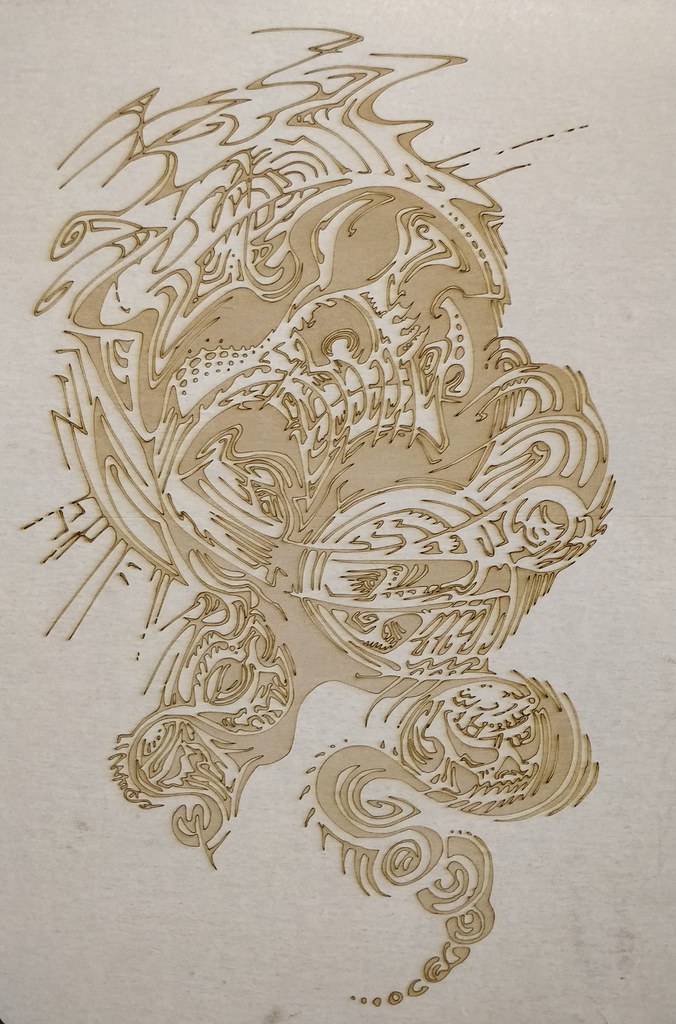
sigma 6 posted:Gonna be honest here. I really want to laser burn your stuff. Very high contrast / lack of shading is perfect to burn. Thanks! I'm not super knowledgeable on what laser burning is, I guess I'll have to Google it. I love those gifs, I do very little painting anymore but process vids/gifs are super fun to watch and very informative for those seeking advice. I've done them with portrait drawings I've done mainly because it's more interesting to share on social media. I just finished that in-progress one. Took a while 
|
|
#
¿
Jan 26, 2020 17:54
|
|


|
sigma 6 posted:Continuing to struggle with the laser burner. Getting some better results but midtones are a bitch. Groovy stuff, the laser burning is a really cool medium! Working on a lil' tattoo idea a friend requested, nice change from the huge-rear end drawing I was doing for months
|
|
#
¿
Feb 12, 2020 19:37
|
|

|
HungryMedusa posted:This is loving sweet syntaxrigger posted:This looks pretty dope! Thanks all! sigma 6 posted:xposted from the artdome thread. Great work! Even though I don't entirely get the technique, I could see how linework would work better than shading with color/graphite/etc. I got into pen and ink by wanting to be a comic book artist when I was younger, and then I got into the screenprinting craze a bit (only done it a few times but liked how the lines and highlights/mids were also utilizing linework) so I color my work with usually less gradients if I can. If you feel like doing any more laser burning, I have some pretty hi-res poo poo on my tumblr if you'd like to check: https://eliquinnart.tumblr.com/
|
|
#
¿
Feb 17, 2020 22:41
|
|


|
sigma 6 posted:Dooope. Yeah. Down for a sticker swap. Definitely. That's awesome! I love faceting forms into planes, and iridescence is one of my favorite surface qualities. Is that glass or plastic or....broken CDS?
|
|
#
¿
Mar 10, 2020 17:38
|
|


|
sigma 6 posted:I may need to try this to get a wider variety of fragments. I tried to break CDs with my hands and yes, it's quite an experience. A friend microwaved one once (on purpose) and it the interior parts cracked into a pretty cool pattern, whilst the CD stayed together. Awesome burns man, thanks again for presenting my stuff in a different way!
|
|
#
¿
Mar 20, 2020 19:33
|
|

|
Chernabog posted:Awesome stuff guys. Wow! Those are really awesome, I love kinetic art, especially when it's interactive like that. Initially I thought it was a 3d tiered effect where you were painting on static gears mounted on the canvas (cool in its own right), but seeing the video really pops it into context. I just did finished one of my crazy over-rendered portraits, this time it's one of my favorite people ever, Conan! 
|
|
#
¿
Apr 9, 2020 04:21
|
|

|
Trippy llama DMT trip
|
|
#
¿
Jun 20, 2020 15:48
|
|
|
sigma 6 posted:Crossposted from the daily drawing thread but maybe a better fit here. I love the coasters you sent me, man. Photos don't really do them justice as the texture, patina, and finish are amazing.
|
|
#
¿
Jun 24, 2020 19:09
|
|


|
Album cover in progress
|
|
#
¿
Jun 29, 2020 04:39
|
|
|
More progress
|
|
#
¿
Jul 6, 2020 20:16
|
|
|
sigma 6 posted:Another ink study of a Jordu Schell sculpt. Hell yeah man. Love me some op art. Those are ZBrush sculpts then? Do you follow him or get inspiration from Zbrush Central? I completed the linework for this one so it's on to digital coloring. So the traditional is done and Photoshop is next 
|
|
#
¿
Jul 15, 2020 20:25
|
|


|
Makeout Patrol posted:I'm trying to do some black-and-white comic art, using india ink with crow quill pens and brushes. The biggest obstacle right now is putting white lines on black fields. Ideally, I would be filling a black area with a brush and using white ink with the same type of pen nib I'm using for the black lines. Can anyone recommend an ink for this? I tried "Dr Ph. Martin's Bleed Proof White", but it's almost too thick for the nibs, and it stays sticky on the page forever, so if I ever stack the papers or close a sketchbook it smudges all over the place. I do this constantly in my work, since my style is to use india ink with a Hunt 102 crowquill (sometimes a Uniball and Micron thrown in there) and I like to use white over the black fields a lot, either to "erase out" of my lines, or to do stars and such. I'll share what I do but it's by no means a technique which may work for you. While it looks cooler in terms of texture and more consistent to use ink and a big brush for the black fields, I usually just fill them up with a big Sharpie/other permanent marker for simplicity (which, of course, is what many comic book artists have done for ages). I scan in my work to color it digitally so it doesn't really matter what the art looks like in an original sense on the bristol board. My absolute favorite pen to use for this is the Sakura Gelly Roll. They seemed to only offer one size for most of the years I've used them, which always worked for me, but now they have .10 and .08 (they could have always had these variations in size but I was unaware). They also have a .05 which I tried and it was too thin to get the ink flowing right, plus I simply didn't need such a thin line. I found that the pen is stubborn if you have a heavy hand -- if you try to use it in a light "rolling" sense over the surface, the ball will let the ink flow out much more nicely. I mean, it's the same with any sort of ballpoint/roller pen, but it's more noticeable with a paint pen. I recall in the older days trying to use a white-out pen with thick, messy lines; thick paint with a brush which was very hard to control; and using that Jae Lee/Sam Keith/Simon Bisley technique of dragging an X-Acto blade over the black fields to do a ragged tear, revealing some of the bristol underneath. Once I was turned on to the Gelly Rolls I've stuck with them, even while trying out other types of pens. I don't think that using a nib with a really opaque ink worked for me either with the clogging. The pens are only like 2 bucks each and last for a while so they're pretty cheap. The main issue I've had with this, either with the india ink or the Sharpie, is that the white pen can pull up some of the black and make the lines kind of gray. Even though they're both ostensibly waterproof once dry, it's surprising how much the black fields will still affect the line. Sometimes going over a marker field, it'll look totally awesome when the lines are laid in but after a day or two, the white starts to suck up the black and can take on a strange pinkish/purple tone. This can be ameliorated sometimes by finishing the black lines, making sure to erase any pencil lines, then spraying fixative over the artwork before going back in with white pen. So, for context, here's some detail on a B+W illustration I did recently and you can see all of the white I drew back into the black. They're also awesome for heightened drawings if you like doing those.
|
|
#
¿
Aug 17, 2020 23:41
|
|
|
Oops, double post, gaaaah
|
|
#
¿
Aug 17, 2020 23:42
|
|
|
Speaking of heightened drawing, doing a commission portrait of Bowie Baba Bowie
|
|
#
¿
Aug 17, 2020 23:43
|
|
|
Now it's finished. Fafa Fooey
|
|
#
¿
Aug 22, 2020 03:28
|
|
|

|
| # ¿ Apr 26, 2024 16:36 |
|
|
Trabant posted:^ Between your posts here and in the SDS thread, I absolutely love and recognize your style Thanks! I post in like 3 - 4 threads for the most part, but I still come back and check to see if there are like....1-9 new posts if that  I dig that linocut, super cool! Speaking of SDS, it looks like it'd be a cool Eyehategod shirt. Linocuts are one of those things which I'd like to try my hand at, but then I figure that I can just appreciate the skillful artists I see instead of diluting my focus. Not that I'm averse to trying new media, it's just that I'll see some awesome stained glass or something and I get some cool ideas about what I might do, then I remember that I'd have to start with it as a novice so I'd be taking away from other productivity. See also: wanting to be able to play classical guitar or banjo, learning some of the fundamentals but realizing that I'd have to train for years to play "Recuerdos de la Alhambra" sigma 6 posted:Moar coasters. Here's a pen and ink + ink wash drawing I just did for my friend's 48 hour film competition. I'm not super pleased with it because they gave me their reference photos really late in the process so I only had a few hours to get it done before the deadline. I was trying to do somewhat of an homage to Sergio Toppi and I was pissed because I certainly didn't pull it off, but it would take me more time to have to develop an awesome composition like he did.
|
|
#
¿
Sep 19, 2020 22:32
|
|

