|
Hurt Whitey Maybe posted:Have some good charts and graphs: Yeah almost every chart video by Jon Bois is great. Also his videos which do not feature charts, those are usually good as well. He also wrote an insane science fiction multimedia story that has many funny fictional charts and graphs about far-future american football. You will probably want to read this on a big-boy browser btw, a phone will probably not give you the best experience https://www.sbnation.com/a/17776-football
|
 #
?
Apr 30, 2019 01:47
#
?
Apr 30, 2019 01:47
|
|


|

|
| # ? Apr 28, 2024 13:18 |
|
|
Hurt Whitey Maybe posted:Have some good charts and graphs: Jon Bois is the hero we need but not the hero we deserve.
|
|
#
?
Apr 30, 2019 02:55
|
|
|
Lutha Mahtin posted:Yeah almost every chart video by Jon Bois is great. Also his videos which do not feature charts, those are usually good as well. Once you finish 17776, also go ahead and read the Tim Tebow CFL Chronicles. What I'm saying is Jon Bois is low-key a national treasure.
|
|
#
?
Apr 30, 2019 03:16
|
|


|
Poops Mcgoots posted:Once you finish 17776, also go ahead and read the Tim Tebow CFL Chronicles. I spent an entire morning laughing about that one bit in the first chapter of Tebow
|
|
#
?
Apr 30, 2019 04:16
|
|


|
Soricidus posted:you can tell it's a joke because the uk is highest and the context is nothing to do with beer temperature, colonial atrocities, or making really loving stupid decisions every goddamn time someone is dumb enough to let us vote on anything I'm a big fan of the implication that the OECD has calculated an average datapoint for colonial atrocities.
|
|
#
?
Apr 30, 2019 08:35
|
|


|
|
|
#
?
May 2, 2019 00:20
|
|

|
I wish it wasn't CNN that got tabbed to be the media enemy of our fascist overlords 'cause good god do they fuckin suck
|
|
#
?
May 2, 2019 00:28
|
|

|
 Edit: Sorry, did this on mobile, didn't realize it'd be gigantic. Dr. Arbitrary has a new favorite as of 06:31 on May 2, 2019 |
|
#
?
May 2, 2019 00:52
|
|

|
So they didn't poll zero people under 50, just a statistically insignificant number of people under 50. That changes things completely, thanks.
|
|
#
?
May 2, 2019 03:27
|
|


|
the "50-64" and "65+" groups have margins of error over 10% so yeah, not sure if i care about a poll where every candidate except the top 2 could be wiped out by the MoE
|
|
#
?
May 2, 2019 03:45
|
|
|
We could do the math here. That means there are at least 125 people in each of the 50-64 and 65+ and 45+ categories, but not in the 18-34 and 35-49 and under 45 categories. The 50-64 group broke for Biden over Sanders by 46-13, the 65+ by 50-9, and the 45+ by 45-11. Meanwhile the overall divide in the poll was 39-15. I'm not going to bother going through the math, but that tells me that Biden is nowhere near as popular among the younger demographics, who despite their significantly lower proportion in the poll, had conflicting preferences to a significant enough degree that they pulled the poll back down by 5-10 points.
|
|
#
?
May 2, 2019 05:57
|
|

|
All but the shittiest pollsters will weight by demographics so as to match the general population. Like, if there were equal numbers of blonds and brunettes in the general population but they got ten times as many blonde respondents, each brunette �Biden� counts the same as ten blonde �Biden�s.
|
|
#
?
May 2, 2019 06:13
|
|

|
I think the real problem is that they used N/A. They ought to have used an asterisk and explained it on every page, or just show the results and include the 15-20% margin of error.
|
|
#
?
May 2, 2019 06:39
|
|
|
And I am certain that a statistician could explain with very fancy words I don�t understand how a sample that is not significant when taken by itself is suddenly representative of the population when mixed with others, but I don�t have to buy it. People attribute to Mark Twain a lot of quotes he never said, and �there are lies, drat lies, and statistics� is possibly one of them.
|
|
#
?
May 2, 2019 06:41
|
|

|
I think what's really going on in this poll is that for that question, they named every single candidate and then asked people to pick their favorite. This gives very different results than when you don't provide names and ask for their preferred candidate. If you name them all first, you get big results for whatever name has been in the news in at least a generally positive light. If you don't, a huge chunk say "Don't know" There's another question in this same survey asking people how certain they are of their choice, it's something like 30%, with 60% saying they aren't sure who to pick yet.  Edit: Here's a similar poll from 2015. Let's not get too freaked out over this style of poll. 
Dr. Arbitrary has a new favorite as of 06:52 on May 2, 2019 |
|
#
?
May 2, 2019 06:46
|
|
|
Dr. Arbitrary posted:Here's a similar poll from 2015. Let's not get too freaked out over this style of poll. posts poll showing eventual winner gaining share quickly right after entering the race
|
|
#
?
May 2, 2019 12:48
|
|


|
I sometimes wish polls would ask for which candidate you dislike the most. An option for "Anyone but _____." Or perhaps a less forceful "Well, I could live with any of them but I really hope _____ doesn't come out on top because they're the worst of the lot."
|
|
#
?
May 2, 2019 18:08
|
|


|
When voting you get one "for" and one "against" vote and in the end only the candidates no one has ever heard of can win
|
|
#
?
May 2, 2019 18:11
|
|
|
Dr. Arbitrary posted:I think the real problem is that they used N/A. They ought to have used an asterisk and explained it on every page, or just show the results and include the 15-20% margin of error. If you show the margin of error you get think pieces about how Trump has a 100% approval rating among <some extremely specific crosstab of black voters> because the one person who answered the poll was a white 70 year old who accidentally hit the wrong number.
|
|
#
?
May 2, 2019 19:37
|
|
|
There was this giant poll during 2016 where they kept contacting people throughout the election season, and a lot of politics nerds got really mad about it because one of the respondents was an extremely obscure demographic. Apparently it was a guy in Chicago, under 30 years old, had a high income, and was black. He supported Trump, so zillions of armchair commenter Democrats were using this to say it was a bad poll and how could it possibly be any good if this guy is throwing off one of the subsamples so bad. In the end I think it turned out to be a pretty decent poll though. I believe the poll was done by the USC Dornsife school.
|
|
#
?
May 2, 2019 20:22
|
|
|
vyelkin posted:We could do the math here. That means there are at least 125 people in each of the 50-64 and 65+ and 45+ categories, but not in the 18-34 and 35-49 and under 45 categories. The 50-64 group broke for Biden over Sanders by 46-13, the 65+ by 50-9, and the 45+ by 45-11. Meanwhile the overall divide in the poll was 39-15. .578*x+.251*.46+.171*.50=.39 Which, solved, gives us about 32.7%. A similar calculation for Sanders' support gives us 17.6%.
|
|
#
?
May 4, 2019 19:03
|
|
|
spotted one on Google Fonts https://fonts.google.com/specimen/Rokkitt US is the most popular country, followed by ***, and then blank, with blank trailing in super last
|
|
#
?
May 9, 2019 17:36
|
|

|

|
|
#
?
May 10, 2019 16:54
|
|

|
polar coordinates?
|
|
#
?
May 10, 2019 17:01
|
|
|
i was going to say time cube
|
|
#
?
May 10, 2019 17:07
|
|
|
https://www.youtube.com/watch?v=0mhZBLUyybo
|
|
#
?
May 10, 2019 17:09
|
|


|
Subjunctive posted:polar coordinates?
|
|
#
?
May 10, 2019 18:13
|
|
|
If you believe that humanity is defined in 60 year cycles, then I guess this makes sense. If you think that time increases linearly, then just draw a normal graph. Also, not really polar coordinates, unless you are doing a modulus 60 operation on the year, which is back to believing humanity is defined on a 60 year cycles.
|
|
#
?
May 10, 2019 18:18
|
|
|
Polar-ish coordinates with the zero radial distance being 40 years. 72 is over double the radial distance of 52; this graph sucks in basically every way.
|
|
#
?
May 10, 2019 22:50
|
|

|
lol it also does the thing where the average is skewed by infant mortality because, y'know, lots and lots of ppl born in 1955 made it past 2007
|
|
#
?
May 10, 2019 23:32
|
|


|
Peanut Butler posted:lol it also does the thing where the average is skewed by infant mortality Isn't including infant mortality the normal way to calculate life expectancy?
|
|
#
?
May 11, 2019 09:23
|
|

|
Hippie Hedgehog posted:Isn't including infant mortality the normal way to calculate life expectancy? Only if you want to lie with statistics. If you actually want to express the age people should expect to live to, you�d go with the life expectancy at 5 or something to clean it of the infant mortality rate.
|
|
#
?
May 11, 2019 10:22
|
|
|
klafbang posted:Only if you want to lie with statistics. If you actually want to express the age people should expect to live to, you�d go with the life expectancy at 5 or something to clean it of the infant mortality rate. You're not wrong about how statistics work. Unfortunately, that's not how people and governments normally report life expectancy. Most reports on public health use Life Expectancy at Birth (LEB) despite its disadvantages. Very rarely will you see the CDC report e5 numbers. Example: https://www.cdc.gov/nchs/data/databriefs/db293.pdf quote:In 2016, life expectancy at birth was 78.6 years for the total U.S. population�a decrease of 0.1 year from 78.7 in 2015 (Figure 1). This is probably because for developed contries like the U.S, the numbers give a fairly small additional error. https://www.ssa.gov/oact/STATS/table4c6.html For males, LEB is 76.04 and e5 is 71.60. An error of half a year is probably acceptable for most purposes.
|
|
#
?
May 11, 2019 11:16
|
|
|
Hippie Hedgehog posted:For males, LEB is 76.04 and e5 is 71.60. An error of half a year is probably acceptable for most purposes. Probably, but that�s almost 5 years of difference, which seems more meaningful.
|
|
#
?
May 11, 2019 13:30
|
|
|
Those numbers are �years left to live�.
|
|
#
?
May 11, 2019 14:26
|
|
|
WithoutTheFezOn posted:Those numbers are �years left to live�. Ah! Well then. Quite.
|
|
#
?
May 11, 2019 14:55
|
|
|
Hippie Hedgehog posted:This is probably because for developed contries like the U.S, the numbers give a fairly small additional error. Sure, but that means you can only compare the values for developed countries in "recent times." Which is a) super limited and b) not what is happening. For example, here's a chart of LEB vs E10 for the US (white males only because that's what the first result I found had at the top). LEB says that life expectancy has doubled since 1850, E10 says it has increased from 58 years total to 77 years, or only by about a third. 
|
|
#
?
May 11, 2019 14:59
|
|
|

|
|
#
?
May 11, 2019 15:24
|
|


|
Attack of the 5'5" Latvian
|
|
#
?
May 11, 2019 15:52
|
|

|

|
| # ? Apr 28, 2024 13:18 |
|
|
Even expected age at 5 is misleading. In the past, people didn't live until life expectancy +/- a few years, they died at significant rates across their entire expected lifespan.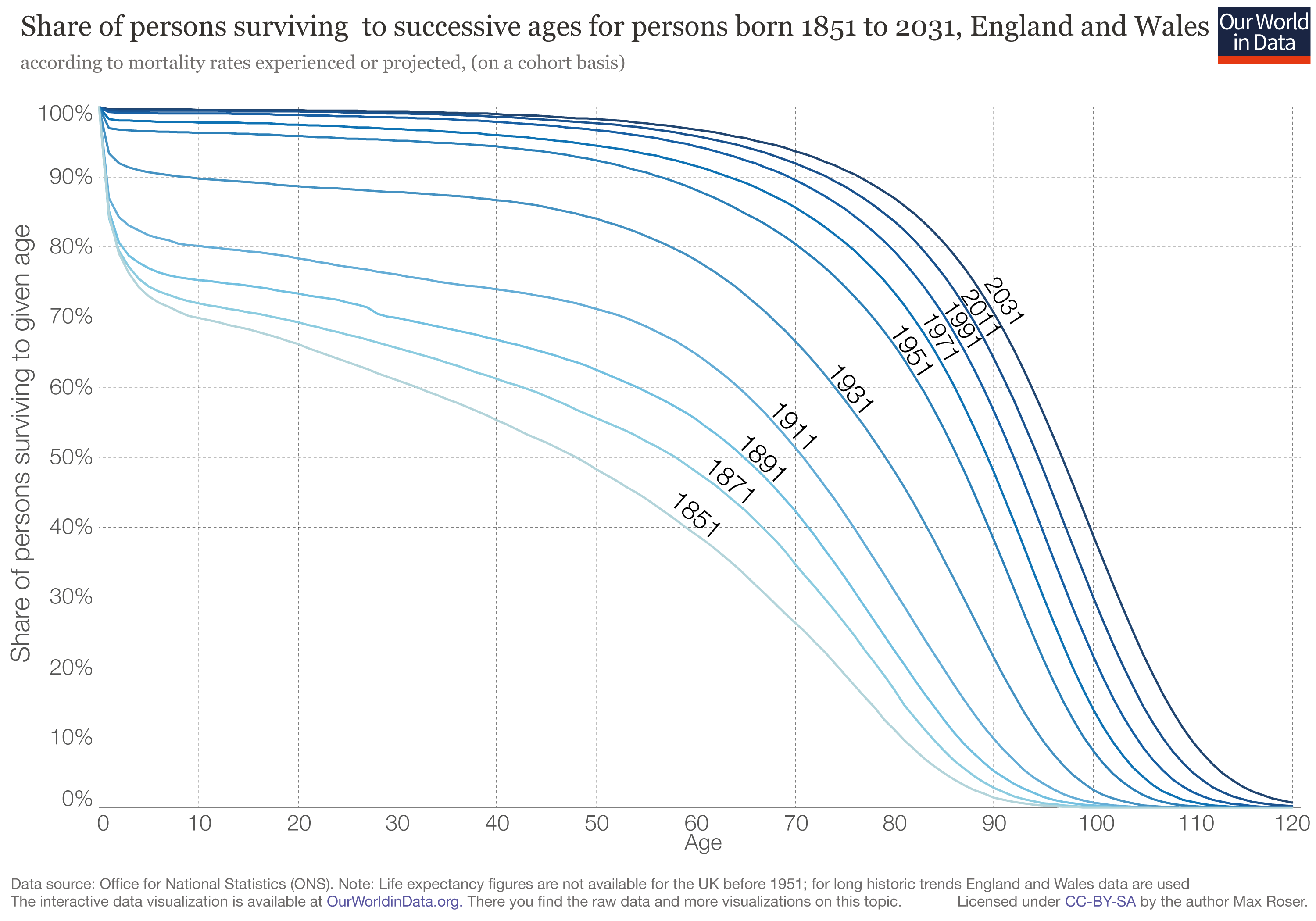 In 1861, a 20 year old has a significant chance of dying by age 30. Roughly speaking, if you have 8 friends you know at age 20, you'd expect at least 1 to be dead 10 years later. I can't even read what the comparable number would be today, because young-adult mortality is just that low. Improvements in life expectancy at age 10 aren't just due to old people getting a few more years in, it's a result of a lot fewer young people randomly dying.
|
|
#
?
May 11, 2019 17:52
|
|