


|
Darthemed posted:
Thing that bothers me most about all these is the coloring. The old ones were limited by printing processes and color registration issues on cheap paper but that first one bugs me the most. I hate that gradient airbrush look that so many modern colorists use.
|
 #
?
Jul 6, 2021 22:51
#
?
Jul 6, 2021 22:51
|
|


|

|
| # ? Apr 27, 2024 10:08 |
|
|
Fish Of Doom posted:The Galactus Christmas Special Earth's Biggest Cubs Fan
|
|
#
?
Jul 7, 2021 00:32
|
|

|
Keromaru5 posted:I think that's actually Johnny; he's the one they send into Galactus' ship to get the Ultimate Nullifier. No, that page is from "This Man, This Monster" and Reed is diving into the Negative Zone for the first time while a jealous scientist who has stolen Ben's powers is getting ready to murder Reed.
|
|
#
?
Jul 7, 2021 00:41
|
|


|
 Strange Tales #94 (1962) Pencils/Inks: Steve Ditko  Strange Tales #95 (1962) Pencils/Inks: Steve Ditko  Strange Tales #97 (1962) Pencils: Jack Kirby Inks: Dick Ayers  Strange Tales #97 (1962) Pencils/Inks: Steve Ditko Darthemed fucked around with this message at 18:17 on Jul 8, 2021 |
|
#
?
Jul 7, 2021 06:15
|
|


|
The Mladness
|
|
#
?
Jul 7, 2021 17:06
|
|
|
 Ghost Manor #36 (1978) Pencils/Inks: Sanho Kim   Warlock #11 (1976) Pencils: Jim Starlin Inks: Steve Leialoha
|
|
#
?
Jul 8, 2021 16:45
|
|
|
Darthemed posted:
Correction that's Kirby not Ditko, same issue. Darthemed posted:
MarxCarl fucked around with this message at 18:13 on Jul 8, 2021 |
|
#
?
Jul 8, 2021 18:08
|
|
|
Some more cool Thorgal covers:  
|
|
#
?
Jul 8, 2021 18:27
|
|


|
Steve Ditko never much grabbed me aside from some of his Dr. Strange stuff and even then. I don't know. His storytelling is great. You can tell what's happening on a page without any word balloons at all but I never found his panels to be particularly dynamic in a way that just leapt off the page like Kirby's or Eisner's stuff does. Everything is kind of of straight on, ground level, 90 degree angle composition and he never rarely seems to break up his compositions within the panels or suggest a lot of depth, although he uses zooms pretty well. His work reminds me of the ways older movies used to be filmed where they usually looked like plays more than movies (because they kind of were and were shot that way). I know he was a pioneer and all that and I'm not calling him poo poo by any means. There seems to be a noticeable difference in his work with different inkers too, which is true for a lot artists even now. And I always have to remind myself how much more difficult it must have been to draw anything at all during his heyday since reference material and photos were pretty hard to come by.
|
|
#
?
Jul 8, 2021 22:50
|
|
|
I don't have MU anymore to go through old issues on my phone but one thing I can remember off the top of my head is the famous sequence of Spider-Man lifting the machinery off himself in If This Be My Destiny...! The panel size starts off tight and claustrophobic and gets bigger the more he frees himself.
|
|
#
?
Jul 8, 2021 23:34
|
|


|
And a couple of two-page pin-ups. Giant-Size Defenders #1 (1974) Pencils/Inks: Sal Buscema  Duckman #1 (1994) Pencils/Inks: Everett Peck
|
|
#
?
Jul 9, 2021 04:46
|
|
|
BiggerBoat posted:Thing that bothers me most about all these is the coloring. The old ones were limited by printing processes and color registration issues on cheap paper but that first one bugs me the most. I hate that gradient airbrush look that so many modern colorists use. Agreed. The gradient airbrush coloring trend is absolutely hideous. The uncolored lines would be far more appealing.
|
|
#
?
Jul 10, 2021 09:23
|
|
|
 Ultimate Spider Man issue 4
|
|
#
?
Jul 11, 2021 04:35
|
|


|
Arguably not an art issue, but I just finished up reading the 2001 run of Exiles, and that poor series was just plagued by lettering/text errors. Here are a few of the more striking ones. Exiles #1 (2001) Lettering: Sharpefont, Paul Tutrone  Exiles #5 (2001) Lettering: Sharpefont, Paul Tutrone  Exiles #12 (2002) Lettering: Paul Tutrone Each of those boxes by a character is supposed to have some info on who they are. Also, Deadpool's speech balloon.  Exiles #70 (2005) Lettering: Dave Sharpe   Exiles #86 (2006) Lettering: Dave Sharpe And it even persisted into the follow-up series.  New Exiles #9 (2008) Lettering: Tom Orzechowski On a different note, very important to include these rear end details in this corpse-bearing scene.  Exiles #83 (2006) Pencils: Casey Jones Inks: Vince Russell And... this.  New Exiles #2 (2008) Pencils/Inks: Michael Golden
|
|
#
?
Jul 12, 2021 03:56
|
|
|
Almost all of the lettering issues there are a result of being digitized. They aren't like that in the original issues or the trades.
|
|
#
?
Jul 12, 2021 04:12
|
|

|
This threw me for a second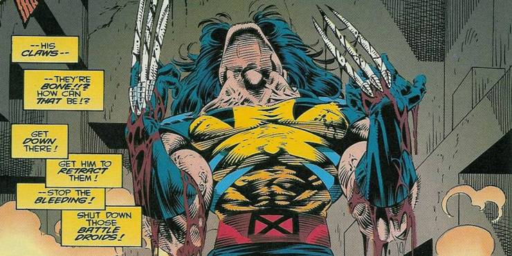
|
|
#
?
Jul 13, 2021 22:46
|
|
|
Absolutely begging for a Batman-style Dick Butt edit.
|
|
#
?
Jul 14, 2021 08:00
|
|

|
BiggerBoat posted:This threw me for a second Nice of Magneto to not remove the claw sheaths when he was yanking the rest of the metal out of Wolverine.
|
|
#
?
Jul 14, 2021 12:34
|
|
|
Random Stranger posted:Nice of Magneto to not remove the claw sheaths when he was yanking the rest of the metal out of Wolverine. That's because they're part of his gloves
|
|
#
?
Jul 14, 2021 14:05
|
|


|
They're just metalised plastic, he wasn't interested in aluminium.
|
|
#
?
Jul 14, 2021 14:48
|
|


|
goatface posted:They're just metalised plastic, he wasn't interested in aluminium. Plastic doesn't make any sense. Logan would tear right through those. Magneto probably just left them there to gently caress with him. I posted that picture because when I first looked at it, all I could see was a balding on top freak with a weird sort of mutated melting face and a big nose, plus a post it note taped to his forehead or under his skin. But I guess all those EXTREME 90's horizontal hatches are supposed to suggest form in a way that's clearly the underside of a neck. Adding more lines = better. Sincerely, The 90's
|
|
#
?
Jul 14, 2021 23:21
|
|
|
What's the deal with his mane? '90s look, or part of the post-trauma regeneration?
|
|
#
?
Jul 14, 2021 23:33
|
|
|
Wasn't that when he was getting hairier and more feral which means his nose disappears?
|
|
#
?
Jul 14, 2021 23:35
|
|

|
Push El Burrito posted:Wasn't that when he was getting hairier and more feral which means his nose disappears? I think that was later. But not by much.
|
|
#
?
Jul 15, 2021 02:26
|
|

|
Ragle Gumm posted:What's the deal with his mane? '90s look, or part of the post-trauma regeneration? Logan's hair was getting progressively more and more extreme until Hugh Jackman made it okay for artists to tone it down. In the 90s it was often hard to imagine him being able to walk through a doorway.
|
|
#
?
Jul 15, 2021 17:03
|
|

|
Splint Chesthair posted:Logan's hair was getting progressively more and more extreme until Hugh Jackman made it okay for artists to tone it down. In the 90s it was often hard to imagine him being able to walk through a doorway. Numerous covers of Marvel Comics Presents by Sam Keith with Logan looking like a reindeer just went flashing through my head.
|
|
#
?
Jul 15, 2021 17:05
|
|
|
X-O posted:Numerous covers of Marvel Comics Presents by Sam Keith with Logan looking like a reindeer just went flashing through my head. Sam Keith would have made him look like that anyway, to be fair. Even if you commissioned him to draw a picture of Hugh Jackman the actual human being, he would give him those insane hair wings.
|
|
#
?
Jul 15, 2021 17:17
|
|
|
Ragle Gumm posted:What's the deal with his mane? '90s look, or part of the post-trauma regeneration? EXTREME Wolverine!!! I mean even more than usual There's a documentary on Amazon Prime about Christ Claremont I can recommend and it touches on how in the 90's the new wave of artists (Liefeld, Lee, etc.) basically took over the writing by refusing to draw the stories that Claremont wrote. It's about an hour long and I enjoed it well enough. Say what you will about Claremont (I've heard he's problematic) but Marvel really hosed him over if you ask me after 15 years of taking a nothing comic and making it into Marvel's lynch pin title.
|
|
#
?
Jul 16, 2021 00:57
|
|
|
Claremont has his ups and downs but I wouldn't really say "problematic". His work is extremely horny, but typically not in a bad way. It's more just like, the X-Men will get turned into dragons or babies at a higher rate of frequency than you might normally expect. He's also essentially the cornerstone of the entire X-Men canon after the early 70s. His run on Uncanny is what almost all modern X-Men stories are built on, and it holds up very well to a modern reader.
|
|
#
?
Jul 16, 2021 02:43
|
|

|
He did have that problem where he forgot comic books are a visual medium so he would write people saying what they were doing at all times.
|
|
#
?
Jul 16, 2021 03:07
|
|
|
I think that's modality of the times as much as anything else. Decompression and minimal narration are popular now, but they aren't necessarily better than having lots of words on the page. Claremont could over-egg the narration (and in his 90s and 2000s era returns to the property, he often did) but usually it was an effective tool for telling a complicated story in a short span of time. He turned the X-Men into a melodrama, something it's thrived on being ever since, and he did that in large part through overwrought thought bubbles and narration boxes, describing the inner lives of the cast, peppered all over the book. The "Wolverine leaping, claws extended, while speaking three paragraphs" thing isn't really Claremont so much, more the early 90s heirs to the X-Men who took over from him when he left. He definitely did it sometimes, but it wasn't as frequent as it became.
|
|
#
?
Jul 16, 2021 03:47
|
|
|
 so busy,so ugly. so busy,so ugly.
|
|
#
?
Jul 16, 2021 12:00
|
|
|
Well you HAVE to have the cigarette holder because otherwise how will you know it's the Red Skull
|
|
#
?
Jul 16, 2021 12:04
|
|

|
 really nice image totally ruined by some pouty woman in the lower left. really nice image totally ruined by some pouty woman in the lower left.
|
|
#
?
Jul 16, 2021 12:17
|
|
|
 DICK PAWNCH! DICK PAWNCH!
|
|
#
?
Jul 16, 2021 12:20
|
|
|
Brazilianpeanutwar posted:
That shade near his hand makes it look like the top of his head is coming off.
|
|
#
?
Jul 16, 2021 12:24
|
|

|
 Another terrible Red skull drawing Another terrible Red skull drawing kinda love this kinda love this
|
|
#
?
Jul 16, 2021 12:34
|
|
|
Brazilianpeanutwar posted:
"No-one look at my giant forehead please".
|
|
#
?
Jul 16, 2021 12:41
|
|


|
Brazilianpeanutwar posted:so busy,so ugly. This is also how the employee newsletter captioned a picture of me. "Phew! It's hard work destroying the capitol!"
|
|
#
?
Jul 16, 2021 13:31
|
|
|

|
| # ? Apr 27, 2024 10:08 |
|
|
�Hey bone brain,dont you know only losers smoke?� � ��.He�s a what now?�
|
|
#
?
Jul 16, 2021 13:33
|
|