|
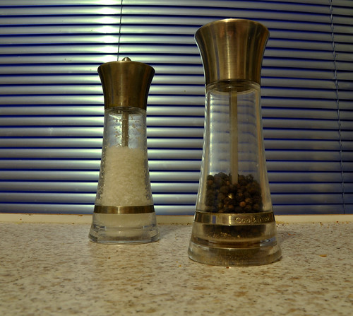
Pickman posted:Here is an attempt at a still-life: I think you need to put more thought towards your subject in this. This is a dead-on picture of a salt and pepper shaker on your counter in front of some window blinds. When you're taking a picture of something so mundane, try and at least come up with a more interesting composition that gives people something to look at. I would be surprised if anyone finds this photo interesting. Keep at it. ")
|
 #
¿
Dec 5, 2011 05:29
#
¿
Dec 5, 2011 05:29
|
|


|

|
| # ¿ Apr 29, 2024 18:45 |
|
|
KidDynamite posted:
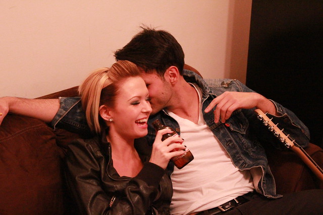
I feel like this photo holds value to you, and maybe to the people in it, but it has no chance of holding value to anyone else. This is a random shoot? It looks like a snapshot from a party. The composition is sloppy in that we don't really know what's going on. The girl is drinking beer, dude has a guitar, she's laughing. With his face obscured as such we don't know what he's doing. What's this supposed to show?
|
|
#
¿
Jan 9, 2012 20:21
|
|
|
Ok I'm going to count my last critique towards this photo. I'm kind of stuck with this image. I need something to make it a bit more memorable... but I'm not having a lot of ideas pop into my head. The only thing I can think of is to darken the whole scene and throw some directional light from the light fixture hanging above the pool table and give all of that a warmer hue... but that would probably look stupid with the massive bright windows in the back of the scene. Anyone have any ideas? 
|
|
#
¿
Jan 10, 2012 02:33
|
|
|
It's actually two completely different wall colors- white on the right and grey on the left, though light-wise yes it does get progressively darker as it goes to the left. This was a rented location picked out by some clients and there were about 2 hours of makeup and hair involved, so I won't be re-shooting this one. I could probably get rid of that weird ceiling light without too much work and I could probably fix 90% of the highlights on the table, but I am not going to go to that much work if it's not going to be a very interesting shot anyway. I shot it with a lot of room at the top of the photo because I liked the size of the room / windows. I think I'll probably have to do some exposure combining and darken everything and try to pump up the light coming in through the windows or something.
|
|
#
¿
Jan 10, 2012 03:16
|
|
|
Ambihelical Hexnut posted:I really like this series- between the strange shapes and colors it's a very alien looking landscape. AIIAZNSK8ER posted:Thing I found interesting tonight: I also think there is too much empty space in this. A square or even a 4x5 crop would benefit the photo as-is. Alternatively, just up your shadows a bit or dodge the very dark building a bit. I've viewed the photo on three different monitors and an iPad, and only when I look down at the screen at about a 160 degree angle can I start to make out any of the darker parts. Cyberbob posted:
I really like this portrait and I think the composition is fine as is, but I'd lose the vignette- at least at the top of the photo. It kills the detail in her hair which is a shame. I do like how it looks outside of the model though, so if you could just layers/masking to remove the vignette from her hair, I think that'd be optimal. Also I really like her outfit, nice styling. Three from me:  Untitled by Myotomy, on Flickr  Untitled by Myotomy, on Flickr  Untitled by Myotomy, on Flickr
|
|
#
¿
Apr 3, 2012 17:58
|
|
|
xzzy posted:I want to like this more, but the glow from the city lights doesn't sit well with the sky. It seems like the sky should be darker. It was taken at that special moment right before it starts getting dark. I always like shooting skylines then because you still have a lighter sky with the orange glow from street lights in addition to the building lights. I can see why you think it's a bit unnatural looking though, it doesn't look like that too often. It was from my old apartment's balcony so I got to see it pretty often, and it's why the angle is what it is.
|
|
#
¿
Apr 3, 2012 20:06
|
|

|
CarrotFlowers posted:
I like this, but I'd take the heal brush to her armpit to get rid of those wrinkles.
|
|
#
¿
Apr 4, 2012 04:36
|
|

|
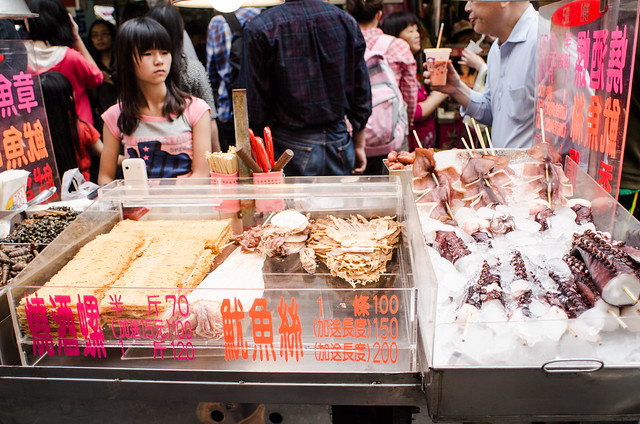
Sevn posted:Edit: One more because I was trying to do some street shots today, along with eating and being interesting to the people I was with. Largest octopus tentacle I have ever seen at a BBQ stand here, and one of the youngest workers I have seen, she couldn't have been older than 14. I am sure that things were very cramped when you were taking this, but I don't think either of the things you mentioned in your explanation of the photograph are emphasized in this. It's very busy and with all the people behind her, it's hard to tell that the girl is even a worker at the stand. Not to mention that the octopus tentacle you're mentioning is all the way over on the edge of the frame. Plus it's been shot at a goofy angle. Like I said, I'm sure it was cramped, but this photo has a lot of problems. TomR posted:I decided to take a photograph today: I know I already faved it on flickr, but I really like the composition here. One for me:  Untitled by Myotomy, on Flickr
|
|
#
¿
Apr 4, 2012 16:38
|
|
|
Hotwax Residue posted:I'm struggling with this one. It is two exposures blended manually, but I just can't seem to get it to look right to my eyes. If I were you I'd try taking the bright sky and blending it into the water reflection to brighten that part up a bit. I think there's too much a difference between the two and it's throwing things off.
|
|
#
¿
May 9, 2012 13:47
|
|

|
I think there's too much empty space in this photo. The whole shadow play part was lost to me because the subjects take up such a tiny portion of the photo that I didn't feel too compelled to pay them much attention. All that space at the top is wasted and you could stand to cut some off the sides, too.
|
|
#
¿
Jun 19, 2012 14:11
|
|

|
VomitOnLino posted:Disclaimer: I'm not happy with these & feeling kind of "blah" about them. I can't explicitly figure out what's wrong with them besides "boring subject matter", which is, as an explanation - kind of lacking. You are right, they do contain a boring subject. What drew you to take the photos of these objects in the first place? Reflecting on what specifically interested you about the object could maybe help you to realize what you need to focus on when shooting challenging subjects- make the viewer see what you see. Also, when you are shooting boring things head on, they will always look less lovely if you remove lens distortion. It's the most noticeable in your second shot. sw1gger posted:My contribution - a commercial art project: I saw this in the portraits thread and it really caught my eye. Like the other person who critiqued it, I don't really like what you did with the blur. I say blur all of the ivy or none of it. Also- I agree that the composition could use a bit of work. I think it's fine that she is in the center, but I think it'd be much more striking if you kept the square crop but zoomed it out a bit so I could see more of her legs. I think all of the green lighting is well done and I wouldn't recommend changing any of it. Also keep the floating dust, if that's what it is... I think it adds to the overall "mystery" of the picture. Shannow posted:
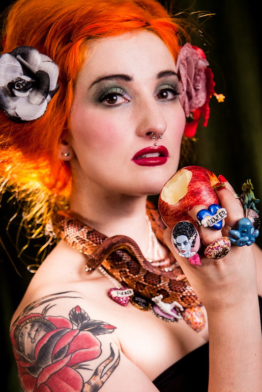
My two main grievances with this photo are the focus and the art direction. I'm not sure why you shot F5, as if you had stopped down a bit you probably could have had both the apple and her face in focus. Another option in the future is to step back a little and crop it afterwards. Anyway, I think if you could only choose one thing to focus on here, it should have been her face, and not the apple. Which of the two do you think people want to be able to see better? Regarding art direction, I think it's pretty bad / juvenile. It's as if you thought "hey this girl has really bright hair and a tattoo, let's see how much poo poo we can cram into this photo!" The rings? Lose them. Flowers in the hair? Lose them. Necklace? Lose it. Why do you need both a snake AND a silly looking necklace? But really the rings are the worst. They really take away from the fact that there is even a hand there. Awkward Davies posted:
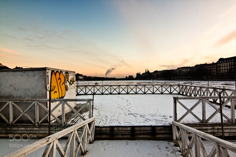
Really brief critique here, but avoid shots of musicians eating the mic. I think this shot has way more potential if you don't include all the junk in the foreground. Maybe that was your intention, I don't know, but it looks like you have a perfectly fine frozen lake thing lined with buildings just past it, as well as a pretty sky. That sounds like a decent start for a photo. *************** Here are three shots up for portfolio consideration: 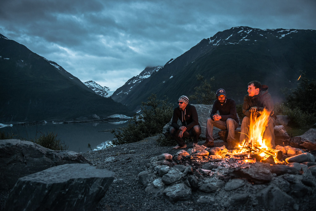 Camping at Worthington by Myotomy, on Flickr 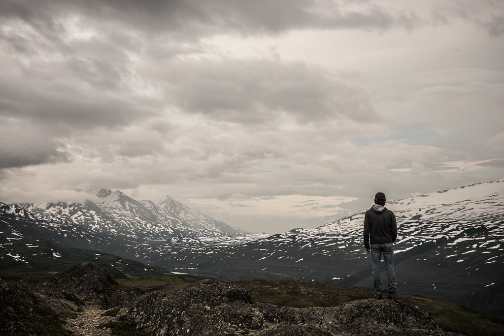 The Long Stare by Myotomy, on Flickr 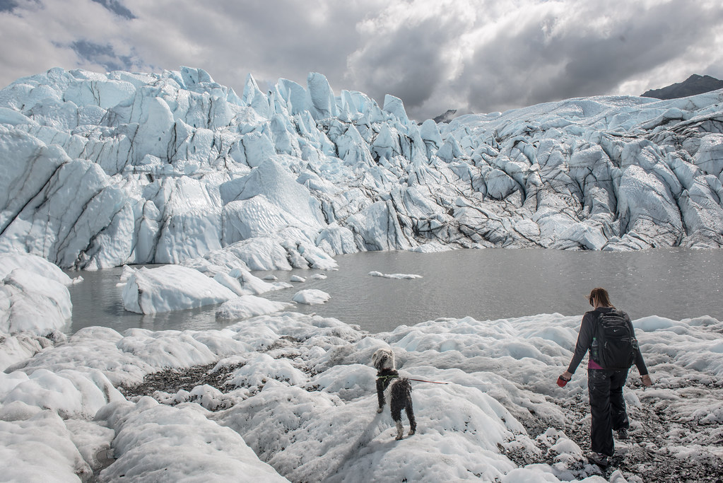 Snow Dog by Myotomy, on Flickr
|
|
#
¿
Jul 26, 2012 22:02
|
|


|
Awkward Davies posted:These are all good pictures, just thought I'd point out that they're all composed almost exactly the same: human/s on the right/bottom right and nature on the left. Thanks for this. I am pretty clearly getting too comfortable with that composition, and like it as I may, I need to make sure not to make it something I always fall back on. Much appreciated!
|
|
#
¿
Jul 29, 2012 18:55
|
|
|
Opals25 posted:
I feel like with these you were trying to make a dramatic statement in a pretty banal setting, which isn't working out too well. I think the third photograph is the strongest of the three, and I like how you composed it with the path leading the viewer through the park and to the river and bridge in the background. However, I think you should shelve the first two. I grew up in a smallish town where no matter how much searching I'd do, I couldn't really find a grand scene that really benefited from the compositions you used in photographs one and two. I still used those composition techniques, and had the same frustrating results that you're experiencing now. In hindsight, I think keeping in mind the work of classic photographers like William Eggleston and Stephen Shore, photographers whose bodies of work consist of lots of shots of simple looking towns, would have helped out greatly when I was confronted with photographing such a "boring" town. That's really just a long way of saying that after looking through some of your photos, I can see that you've had the opportunity to photograph some really cool, grand settings, and that it's important not to pigeonhole yourself into thinking that everything you shoot should have that look to it. Always try to think about what approach would suit your setting the best. It's a style I am still not fully comfortable with myself, but we grow the most when we're faced with doing something new. ******* That being said, I would appreciate it if someone (or some people) could tear this photo apart for me. I like it a lot, which always makes me feel uncomfortable/guilty, so please make me like it less.  Nuclear Dreamscape by Myotomy, on Flickr My main concern with it at the moment is the inconsistent exposure across the snow, which I will probably spend some time touching up. What else sucks about it? What could make it better?
|
|
#
¿
Feb 27, 2013 18:08
|
|

|
xzzy posted:
It's part of Indiana Dunes State park, about a one hour drive from Chicago, which after looking at your avatar I am guessing is probably somewhat close to you. Whitezombi posted:The balloons are pretty bad. Did you add the person and the dog? The light and shadow seem off. The person and the dog were comped in, but they were there with me and I had them in another shot of the plant so the angle/shadow is consistent... I just didn't like the other composition as much. They probably have a slightly different contrast level than their surrounding which could be screwing things up? As for the balloons, I grabbed them out of a different photo I had taken, and yeah that was a part of the photo that I struggled with. I like having them in there because it makes it all a bit more surreal, but I want the initial reaction to be something other than "those look bad." I dodged them to add highlights consistent with the scene's lighting, but I agree something is still somewhat off about them. Are they too bright/colorful? I could desaturate them a bit more. RangerScum fucked around with this message at 18:28 on Feb 27, 2013 |
|
#
¿
Feb 27, 2013 18:19
|
|

|
Mr. Despair posted:Yeah, this looks like you cropped in a nightime sky with a daytime smoke cloud and then added some balloons and it just feels really unnatural. I was going for "weird and ominous" if that helps to explain any styling decisions, though unfortunately I was not witty nor devoted enough to the photograph to research the power plant ahead of time, but I am ultimately okay with this since the imagery will probably call forth an idea of nuclear power in most people's minds. Spime Wrangler posted:The difference in value between the snow and the steam/sky throws me off quite a bit, in part because you don't get any sense of where the light could be coming from. IRL I'm guessing they're pretty similar, especially the snow and steam. It definitely makes it more surreal and oppressive feeling, but I feel like I have to actively work to suspend disbelief. I think lightening it just a little bit might help while still preserving the aesthetic. Whitezombi posted:Their shadow is lighter and at a different angle compared to the poles on the right. I do think the contrast is off - look at the dog and the snow patch it is on. Thank you- I am going to touch these parts up. I'm going to do my best with the balloons but I wouldn't be surprised if they will always stay a sore point for me no matter how good I get them to look. I think I'm pretty set in leaving the steam as is because although it clashes with the sky, I like its overall effect. Thanks everyone for sharing your thoughts!
|
|
#
¿
Feb 27, 2013 19:37
|
|

|
thetzar posted:
Fun series. I think the top quoted picture is the strongest, and the bottom quoted picture is the weakest of the group. I agree with your exposure choices and think they are spot on except for the aforementioned weakest photo. The problem I'm seeing is that while the red coat has a bit of punch to it in the other photos, in #3 it's really lacking that. It is still a pretty stark contrast, but due to the underexposure it doesn't seem to contain any highlights and looks muddy. Another thing to watch out for is that it looks like you're starting to repeat your compositions. I tend to do the same thing- on the same side even. I think if you kept the compositions really similar it could actually be a pretty cool thing, but if you go down that route, your first photo won't fit in as well. I think this one is the strongest of the three. However I'd like to address your editing of the spotlight. I don't think that what you did is inherently bad, but you should try playing around with your highlights and see if you can soften it up a bit. I think you can add a lot of great ambience with big soft spotlights casting beams of light. It looks like there might be another one just out of frame near the top right of the photo though, so maybe that interfered too much. I agree that the color in #2 is great. For the third photo, I think the most interesting thing is how you captured the drummer looking out through the center of his drum set like that. However it kind of gets lost since there's some extra space in the photo. This might be a good time to go for a closer crop- I don't think you'll lose anything if you take some off of the top and the left. Kasan posted:
I think this one is the strongest of your three. I think the angle works really well for this building, but it would look better if you were zoomed out a bit more. I think the biggest problem is that you're cutting off the top and the bottom of the building. This also looks like it could be a good candidate for a black and white conversion. I think your microchip shot has potential if the composition can be a bit more spot on and you fix some of the noise. Valdara posted:
These seem okay, but I think if you're wanting you step it up a notch you need to play with some alternate compositions and lighting. I'd go for some strong directional lighting to create some potentially interesting shadows. For a change in composition, can you get your camera lens down on the actual table and shoot it wide- so it'll look like you're actually at the scene itself and not just standing over a model? I don't know what your lens selection is, so I can see how this might not look too great if you don't have anything with a short focusing distance. (I probably wouldn't be able to do those types of shots with my gear.) That drat Satyr posted:
I like this but I think you shot it from too low of an angle. If the grass was all at a uniform height and was blocking your view of the house equally it might work, but just having a tuft obstructing your view here and there detracts from the image. It could also use some distortion correction. Chitin posted:
I don't think having the one thumb missing is as bad as you're making it out to be. I think if you don't point it out as a bad thing people won't take it as such, since it's the natural position for her thumb to be in anyhow. I think the lighting in this is executed nicely, but I disagree with the use of the red light. The magenta colors on her face and left arm don't really go with the photo too well. I can't really decide if they don't look good because of the contrast with the blue light, or if it's something else. Also there are a couple of red dots in the top right corner that should probably get cleaned up. This would be really cool in conjunction with a fog machine. This could be cool as a part of a series, but I think by itself it's a bit underwhelming. I think as a standalone photo it would be stronger without the inclusion of that dark blue stuff down in the bottom right hand corner. It kind of disrupts the serene, peaceful vibe of the rest of the photo- but maybe that is the point. Without a series or a title though, I'm going to assume not. ------------------------------------------ I shot this the other day as a part of a series I am working on. I need to clean up some highlights around one of the balloons, but I first wanted to get some critique on the image to see what else might need some adjusting. I suppose one more thing I'd like to point out is that there isn't a better angle to shoot the bridge from due to the really thick vegetation surrounding it. There is going to be some obstruction from the ground level no matter where I stand. I think overall it's fine as the obstruction adds a little mystery to it, but if you feel like there's too much, or that it totally ruins the photo, I'd be interested to hear. As a whole I want the series to have a sort of dream-like cinematic look to it, if that'll help you get an idea of what I'm going for. I don't think this photo is perfect, but I like it a lot, so please destroy it. Thanks! 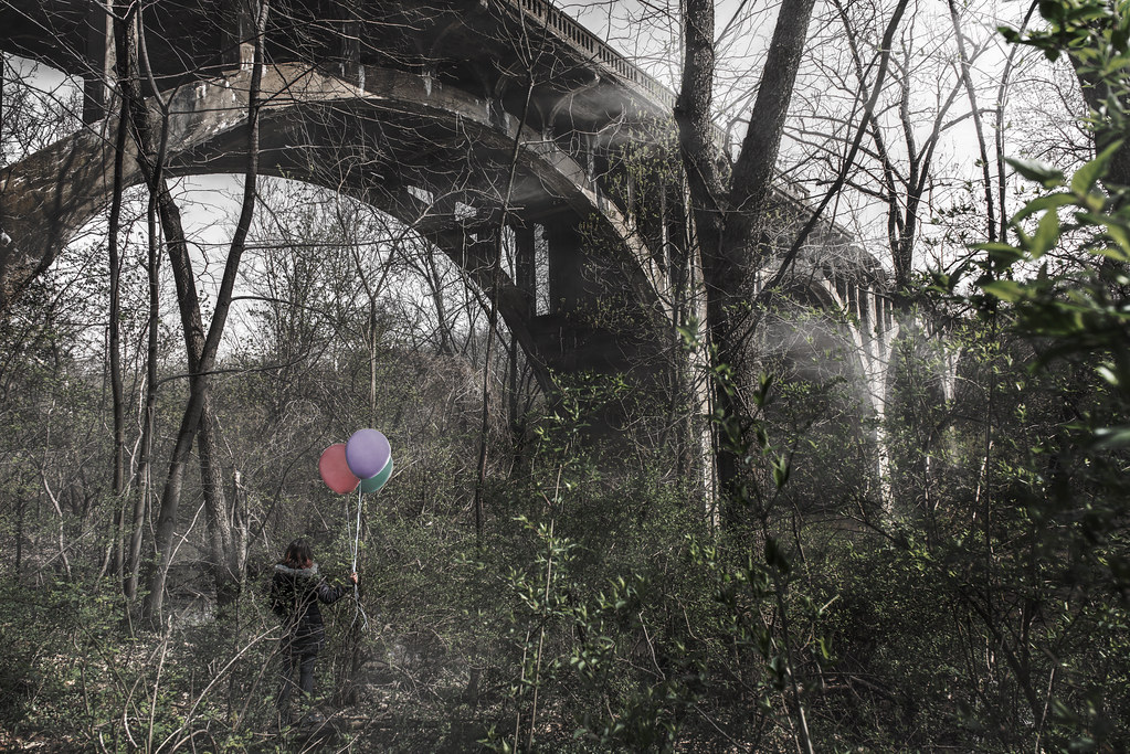 The Bridge to Someplace New by Myotomy, on Flickr
|
|
#
¿
Apr 23, 2013 22:23
|
|


|
xenilk posted:... and one that's a bit out of my usual style. I think the choice to obscure the face strengthens the photo, but with a subject like this you aren't gaining anything by placing the model off-center.
|
|
#
¿
Jun 27, 2013 02:42
|
|

|
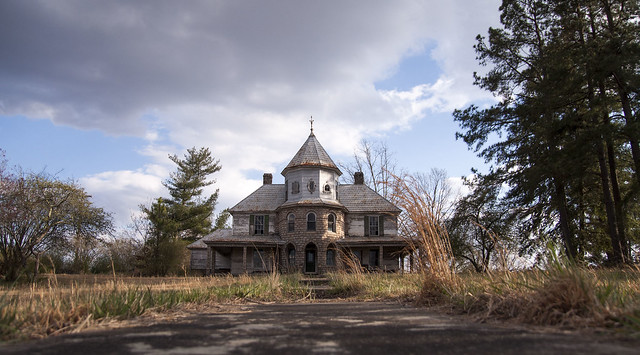
StarkingBarfish posted:
I like this shot because I think it is an interesting subject and I like the composition you have chosen. The tree that's blocking a good chunk of the house is an unfortunate distraction, but I don't think it's a big enough deal to write the photo off entirely. If I was going to improve the shot- the first thing I would do is work on minimizing the problems the diffusion has caused. I'd get rid of all (or most) of the blue in the photo straight up, and then I'd tone down the aqua a bit as well. I think if you tried some dodging and burning some of the foreground trees that could help liven the photo up a bit, and then maybe try masking a bit of the house to bring up the exposure levels on it just a bit. I think you have a lot to work with and this is well on its way to being a pretty cool photo- I like the location for sure! I'd be interested to hear critiques on this photo of mine:  The Land by TomOlson, on Flickr
|
|
#
¿
Sep 22, 2013 17:25
|
|
|
If it helps any, I'm doing a series involving the same theme and this is something like the 7th or 8th image, but thank you.
|
|
#
¿
Sep 23, 2013 06:08
|
|
|
Wafflecopper posted:
Yo dawg, I think this is p tight. Just wanted to give you a shout out. Gullous posted:Shot from a moving, foggy ferris wheel. The windscreen added some distortion, but I'm happy with the perspective. I like this, and I think you should fix the vertical distortoin a bit. If you have to do some crazy photoshoppin to make the picture taller and do some comp poo poo with the sky it would be worth it. I personally like the hazy feel the ferris wheel's glass adds.
|
|
#
¿
Dec 4, 2013 21:49
|
|
|
Jesus Christ posted:First post so not exactly sure of the proper format. I decided to start taking a few photos with my cell phone everyday and loving around with my favorite one in photoshop to re-learn the program. Here are a few derp-a-derp ones from this week, all taken from a lovely cell phone camera. I have a point and shoot but lost the charger :| I think these are really really loving good and I'd like to see more of your work and talk to you about your craft.
|
|
#
¿
Jan 23, 2014 22:35
|
|


|
Magic Hate Ball posted:Like this, maybe? Between the composition and the exposure, I think this looks disgusting.
|
|
#
¿
Feb 17, 2014 16:34
|
|
|
FistLips posted:Echoing what others have said - this is beautiful and I love the colours in the sky. There is something strange about the outline of the tree on the left though? Not sure quite what, but it looks strange. I think it's kind of interesting that you specifically mention Amsterdam for photos that could have been taken in any hotel room.
|
|
#
¿
Feb 22, 2014 05:45
|
|


|
grack posted:
I just want to say that I admire your use of the rule of thirds here- really stunning shot.
|
|
#
¿
Apr 28, 2014 18:30
|
|
|
beneatsfood posted:What I actually meant is that Crewdson has a camera at a fixed point, and then takes multiple images and then shops in all of the individual parts that are all in focus into one. Since he's shooting inanimate objects, it's not as outlandish as you think. You also get to keep shooting with your current camera! Where exactly are you getting this "information" from?
|
|
#
¿
Jul 24, 2014 19:00
|
|
|
Entenzahn posted:It looks nice, I just don't think it's super exciting. *Proceeds to post 3 images that don't look nice and aren't "exciting" at all.* My main point of useful advice for you is to pretty much never do Dutch angles unless the shot requires it, which is not the case in your bridge photo.
|
|
#
¿
Jul 28, 2014 02:11
|
|
|
Entenzahn posted:I'm really sorry I didn't like the beach picture. My point isn't that you should like the beach photo, but that saying something isn't exciting is a really lovely critique, as can be seen by your follow up question of "Can you tell me what it is that you dislike about my other images?" I conveyed no useful information to you. I take it you find your images to be plenty exciting? Well I don't. I find ducks and spoons to be really boring. Is that a critique that is going to help you to be a better photographer? Furthermore, saying that something isn't exciting is not only unhelpful, but it is also assuming that all photographs need to be exciting, which is incorrect. The fact of the matter is we all have different tastes, so rather than saying something is boring, ask what they were wanting to show, or what drew them to the scene. It might help you appreciate the photo more, or it'll just further cement that you and the poster have different tastes and that you can leave it alone, or posit a way that you think could improve things. Don't write something off because it doesn't instantly click with you. I think you overdid the contrast in your duck photo. The colors are hosed up and your shadows are all too dark and muddled. The composition is telling me you want me to look at the ducks and the wake/ripples of the water, but I don't think they are placed very well in the scene. Also this is why I think the high contrast hurts the photo- there isn't a lot to look at already and you are taking even more away. This could work in some cases but I don't think your subjects are isolated enough to feel like abstract objects. The coffee spoon one is okay in regards to shapes and colors, but it's not my cup of tea pun unintended so I'm not going to say much about it. I think your composition works okay for this though. Probably another problem I have with the photos is that they are all over the place. You go from something medium range concrete to close up abstract(ish) out to wide angle landscape. I know this isn't the "post your series" thread, but in the future maybe consider the order in which you present your photos. I'd have probably gone with the spoon picture first, followed by the ducks, followed by the bridge photo just so there is some form of continuity. In this thread it's can sometimes be hard to critique things beyond their technical merits because of a lack of context. To expand upon your bridge photo a bit more- once again I think there is too much contrast, and I think the photo would probably look better if it were shot in a landscape orientation. I would personally find it more aesthetically appealing if you had the bridge / bridge's shadow in the center of the photo and overexposed empty space framing it on both sides, rather than just two little dollops of sky in the upper right and left. I am definitely biased about this though, because at the moment I get a total boner for centered symmetrical compositions. Speaking of which, I really liked this shot and thought other people would like it more than they did. Anyone care to weigh in what feels off about it? Is this poo poo slightly crooked?  Untitled by TomOlson, on Flickr Untitled by TomOlson, on Flickr
|
|
#
¿
Jul 28, 2014 18:38
|
|
|
totalnewbie posted:The horizon is not level and the sun/road is not centered in the picture. I wish this was a troll. Neither of the things you said are necessary for the photo you are quoting. Also the earth isn't flat. hth
|
|
#
¿
Aug 29, 2014 14:54
|
|
|
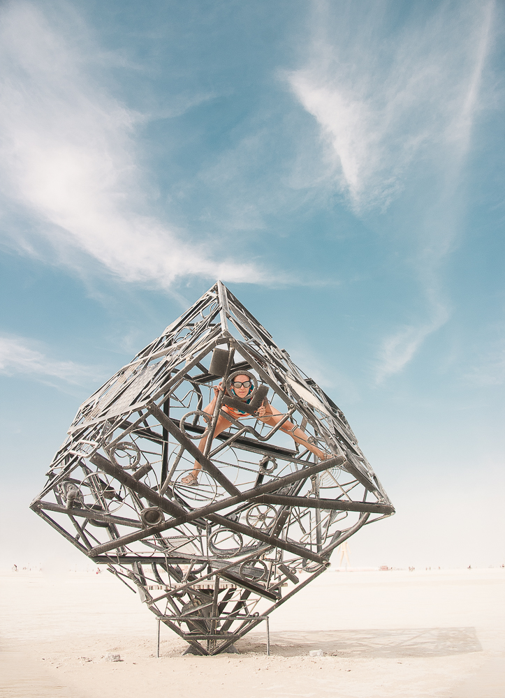
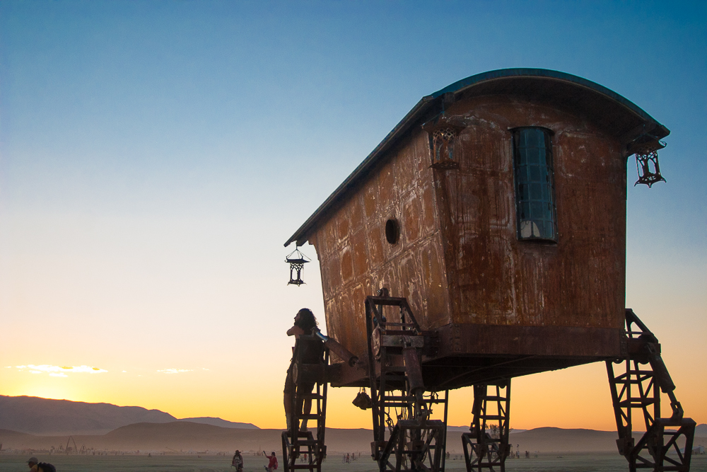
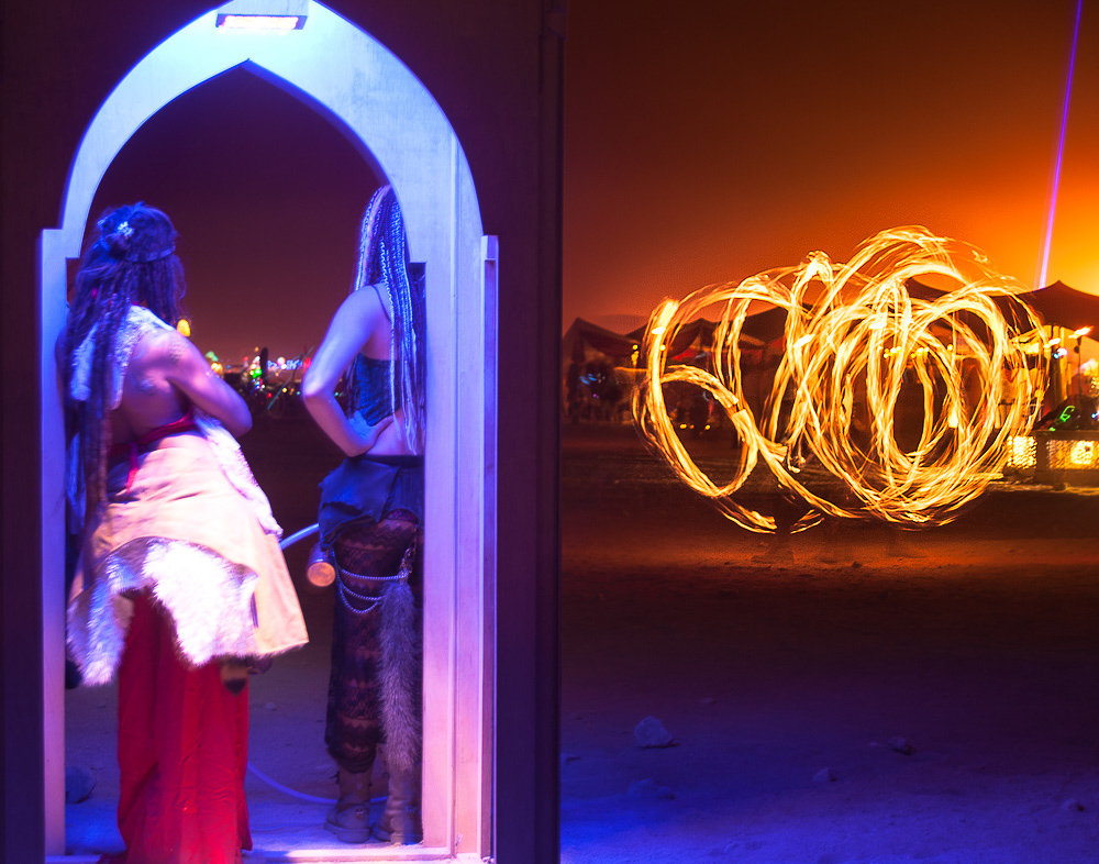
CommunistCow posted:A few things from burning man. Trying out some new lightroom processing techniques: What were your goals with the composition on these? I think you missed it on each one.
|
|
#
¿
Sep 4, 2014 03:29
|
|
|
CommunistCow posted:1) I didn't want completely centered as usually try and avoid that unless taking pictures of large buildings (like the temple). I think the problem is the frames are crowded or off-balance in each photo. In the first one it feels crowded on the left hand side of the picture, and feels too bottom heavy. I'd sort of understand what you were going for if you said you were trying to balance the photo by including the shadow in the composition to center the object, but it doesn't hold enough weight to work. The sky at the top is just too much dead space and makes the photo look awkward. Also, why are you only okay with centering large buildings? What's the difference between a building and anything else? In the second one as other people said I think it looks bad to cut off the bottom of the at-at thing. It'd probably be a way more effective photo if you just took a few steps back and got the entire thing. As it looks, it just appears that you cut off a couple feet of legs. Maybe if you had taken it from a lower angle to give the illusion that it was taller then it would work better, but I don't really know for sure. It'd probably look better if you had just shot the whole structure. Another tip is don't ever list the rule of thirds as a reason for doing something, it makes it sound like you are just blindly following something you've read about without thinking about your composition in a meaningful way. In the third photo the left half of the frame is once again way too cramped on both the side and the top & bottom. You're filling up way too much of the frame with junk and I don't think it looks good how you shot the doorway straight on while sacrificing more of the scene on the right half of the photo. If anything I think you should have zoomed out / taken a few steps back again.
|
|
#
¿
Sep 4, 2014 20:09
|
|
|
CommunistCow posted:Do you guys think that including the legs with a bunch of people around would have been better? 100%. Especially since people at BM can be interesting looking.
|
|
#
¿
Sep 5, 2014 14:06
|
|
|
iSheep posted:- Is this just gimmicky bullshit that should be left alone anyway? I'm REALLY digging the look right now. What? If you like it then loving shoot it and stop giving a drat what other people think. The first one is the better of the two because you are right, the second pose kinda sucks. The first photo might have been better if she'd kept her hand down, but no biggy, it at least gives me context that your friend that you wanna boink is married, you scandalous bastard.  If you want to make sure your subject's eyes are in focus next time, what you have to do is change your autofocus setting to the one where you can select the specific area of focus, and then place it over her eye. It's that simple! I think your exposure for both of these is fine, but you might want a bigger flash modifier, maybe a decent sized beauty dish for that contrasty look. I think with your current diffuser the light falloff going from the face to the arms, hell, even to the neck- is too drastic, especially in the second shot.
|
|
#
¿
Sep 22, 2014 15:04
|
|
|
crime fighting hog posted:
I like this one the best, and honestly if you hadn't said they were salad shakers I probably wouldn't have figured it out anyway. Actually I still don't know what a salad shaker is. I'd have shot them straight on if that was possible, but I think showing more of them increases the effect of the installation or whatever you call it.
|
|
#
¿
Sep 22, 2014 20:28
|
|

|
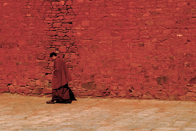
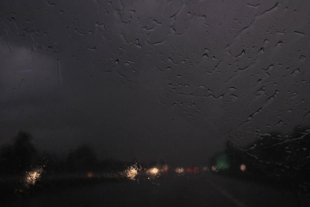
wowitsstephen posted:I've spent years trying to fall in love with this picture. Definitely keep the color one, it's a way better look than the b&w. I do think the monk would look better either centered or on the right side of the photo so he has some more room to travel through, but it doesn't kill the shot. Magic Hate Ball posted:
First one: Okay because of the name and the pattern of the windshield wiper I'm able to deduce that you are the passenger in a moving car on a stormy day, but beyond that there's nothing else so my interest in the photo stops. What was your goal here? Second one: Pretty decent clouds and the composition is okay (though a little awkward), but I am not a huge fan of the colors or the exposure / contrast in the scene. It might be a valid candidate for some b&w, but all in all I think this one is just going to stay in the "decent but nothing too great" range. I'm only saying that to save you the time of messing around with re-editing it. It's missing something else, maybe a hint of what's beyond the trees, or something of interest in the foreground. It just falls a little flat is all. Third one: It's a gradient photo with a weird name. What kind of critique are you expecting for this exactly?
|
|
#
¿
Sep 24, 2014 02:32
|
|
|
single-mode fiber posted:
In this one I would lower your highlights and desat the yellows, and maybe the greens too, just a bit.
|
|
#
¿
Oct 3, 2014 13:50
|
|
|
Leandros posted:The angle is because I wanted to capture both the majority of the flare as well as the entire shadow of the traffic sign (plus some padding) and I was fully zoomed out, standing on the edge of an overpass.  Sometimes you just can't get the shot. In those cases it's better to curse your luck and wait for the next one.
|
|
#
¿
Jan 18, 2015 03:58
|
|
|
threnody posted:I would totally normally agree with this, but for some reason I really love it cranked when it's architecture. As someone who used to do HDR photography when first starting out, I have to say that HDR shots like those are at best a really boring lovely gimmick, and at worst a crime against humanity.
|
|
#
¿
Mar 25, 2015 23:25
|
|
|
Nameless Dread posted:
my critique is that your photograph is too blurry
|
|
#
¿
Apr 16, 2015 18:16
|
|
|
ansel autisms posted:Who gives a gently caress because that's dope as hell just because you don't shoot charts like i do and actually give a crap about sharpness doesn't mean you need to be an a$$hole
|
|
#
¿
Apr 17, 2015 03:09
|
|
|

|
| # ¿ Apr 29, 2024 18:45 |
|
|
thetzar posted:
Why do you think you chose to compose this the way you did?
|
|
#
¿
May 4, 2015 15:45
|
|